
Auckland Variable Serif: a six-weight serif family for branding and social layouts
Design style
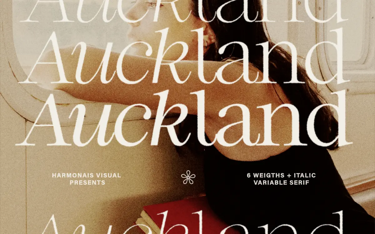
Auckland sits in the modern-serif camp: moderate contrast between thick and thin strokes, bracketed serifs that are trimmed rather than bulky, and a vertical stress that keeps the letters upright and calm. It doesn’t chase the mannerisms of a display face — no exaggerated ball terminals, no swash flourishes. Instead the personality shows up in restraint. At Regular the x-height sits comfortably tall, which gives the face a slightly contemporary, editorial feel rather than a period one. The italic is a true companion cut rather than a slanted roman, with some cursive entry strokes on letters like a and e, which helps it read as an intentional pairing rather than an afterthought.
Where the family earns its keep is across the weight range. Thin and Black are genuinely different objects — the Thin is close to hairline, useful for oversized display type where the serifs almost disappear into texture, while Black turns the same skeleton into something dense enough for tight headline work. The middle weights, SemiBold in particular, are where the serif detailing is easiest to see without either extreme distorting it.
Character set and features
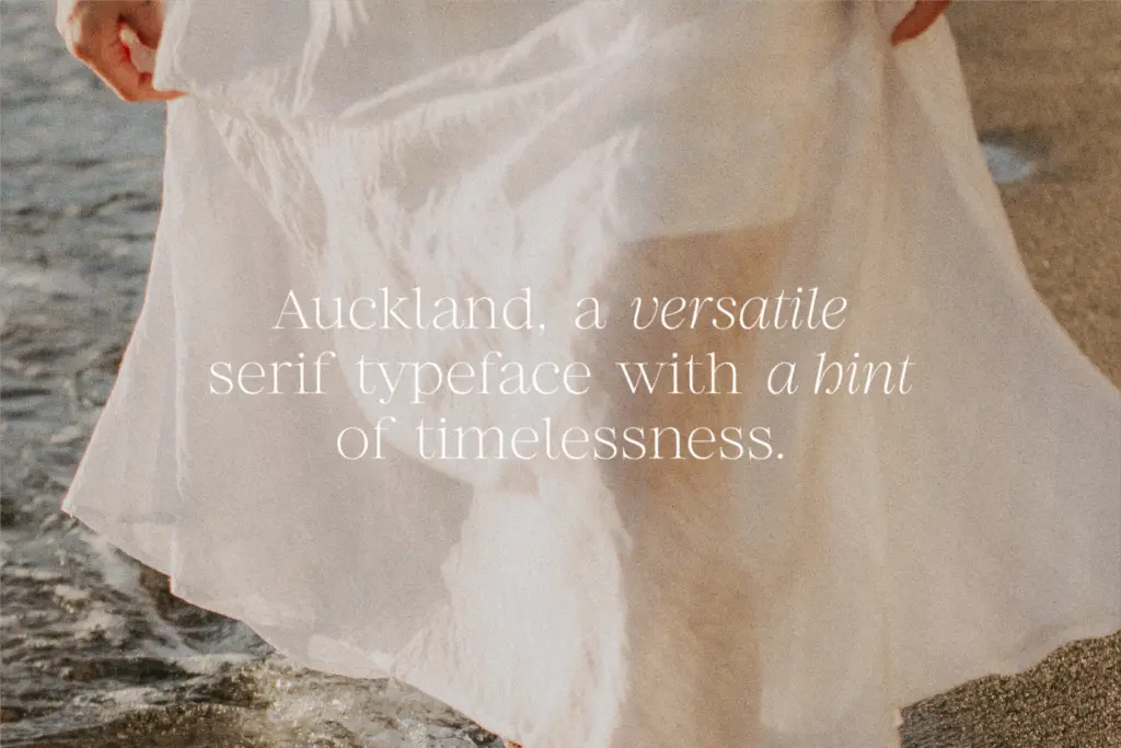
The family ships as twelve static styles (six weights, roman and italic) plus a variable font with a matching variable italic. That’s a sensible way to package a serif built for flexibility: designers who want a fixed weight for print or a logo lockup can grab the static file, while anyone working in a variable-font-aware environment — increasingly common in web and app design — can dial in intermediate weights rather than settling for the nearest static step. The variable axis appears to be weight only, so don’t expect optical size or width adjustments; this is a family for controlling boldness, not proportion.
Letterform construction is consistent across the weight range, which matters more than it sounds — a lot of variable serifs get wobbly in the middle interpolations, with serifs that thin out unevenly or curves that pinch. Auckland’s mid-weights hold their shape reasonably well, though as with most variable serifs the extremes (Thin and Black) are where you should proof carefully, since interpolation artefacts tend to surface at the ends of an axis rather than the middle.
Use cases
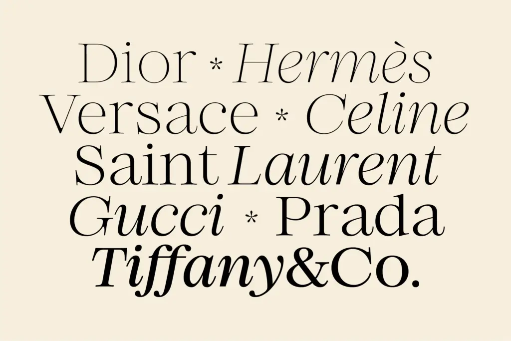
This is a branding and social-media serif first, and a body-text serif only in a pinch. The Regular and SemiBold weights work at headline and subhead sizes for packaging, Instagram carousels, pitch decks and logotypes — anywhere a brand wants a serif that reads as considered rather than heritage or ornamental. The Black weight is strong enough to carry a wordmark on its own. Because the italic is a genuine cut rather than a slant, it’s usable for pull quotes or accent text without looking mismatched.
At small sizes — captions, footnotes, dense paragraphs — the moderate contrast and tall x-height hold up acceptably but aren’t optimised for it; there’s no sign of a text-specific optical cut, so long-form setting will show more stroke-weight fluctuation than a dedicated text serif would. Treat Auckland as a display and identity tool with unusual weight range, not a full editorial system.

What we liked, and what we didn’t
Strengths
- Six weights plus a genuine italic cut give real range for branding systems
- Variable font option makes fine-tuned weight control practical for web and app work
- Extreme weights (Thin, Black) are distinct enough to serve different display roles
Trade-offs
- No optical size adjustment, so it isn't tuned for long-form text at small sizes
- Character at the weight extremes needs proofing, as with most variable serif interpolations
Auckland is a competent modern serif whose real value is the weight range and the variable-font option, not any single standout letterform. It's best suited to branding, social and headline work rather than body text, where a dedicated text serif would still do more.
Verdict

Tantype reviews typefaces in depth — every font is tested in real branding, editorial and screen layouts before a word gets written. 555+ fonts reviewed and counting.