
The Softly Serif: a high-contrast italic serif for editorial and fashion branding
Design style
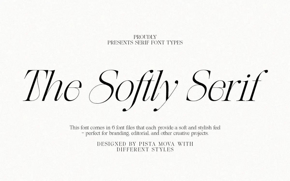
The Softly Serif is an italic-only serif built around the kind of high-contrast strokes that read as fashion-editorial almost by reflex. Thick vertical stems taper into fine hairlines, and the curves lean forward with a consistent slant that gives every line of text a sense of motion rather than sitting flat on the baseline. This is a design lineage that owes a debt to mid-century magazine mastheads and the high-fashion serifs that followed them: thin serifs, generous swashes on the terminals, and a general willingness to let letters swoop rather than stay buttoned up.
What separates it from a generic contrast italic is the restraint in the body text weight paired with the flourish in the caps and alternates. The lowercase is drawn tightly, with short extenders and a compact x-height that keeps paragraphs from feeling loose, while the capitals and swash variants are where the personality lives. It’s a typeface that knows where to be quiet and where to perform.
Character set and features
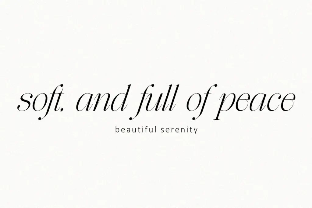
The set includes a full range of alternate characters, which is really the point of buying an italic serif like this one. The alternates let you swap in a swashier capital at the start of a word, or a more restrained lowercase where the flourish would crowd a neighbouring letter. Used well, these substitutions are what keep a headline from reading as a single ornamental blur, since the base characters carry the reading and the swashes carry the attitude.
Contrast is high enough that hairline strokes thin out considerably at small sizes, and that’s the trade-off buyers should understand going in. This is a display-weight italic serif, not a text face pretending to be one. The alternates and ligatures are generous, but the letterforms are calibrated for headline and pull-quote sizes, not for dense paragraphs of body copy. Punctuation and basic numerals are covered, and the overall glyph set is built around a single italic weight rather than a family of widths or weights, so there’s no bold or upright companion to fall back on for hierarchy.
Use cases
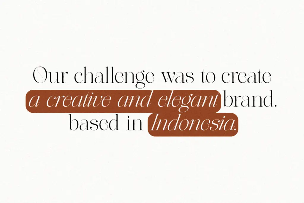
This is a font for the front of the magazine, not the back. It suits mastheads, cover lines, pull quotes, and the kind of fashion or beauty branding where a single elegant word carries visual weight. Logotypes for boutique labels, wedding stationery headers, and quote graphics for social media all sit comfortably in its register. The swash alternates give it enough range to feel bespoke on a monogram or a short brand name, rather than looking like a stock italic dropped into a template.
Where it runs into limits is anywhere the type needs to do quiet, structural work. Long-form editorial body text, dense product packaging copy, or any UI context where legibility at small sizes matters will strain the design past its comfort zone. Without a companion weight, designers pairing this with body copy will need to source a separate serif or sans for paragraph text, which adds a step to any project that isn’t purely headline-driven. Treated as a display face for short bursts of elegant type, though, it does its job with some real personality behind it.
What we liked, and what we didn’t
Strengths
- Generous swash alternates let you tune the flourish level word by word
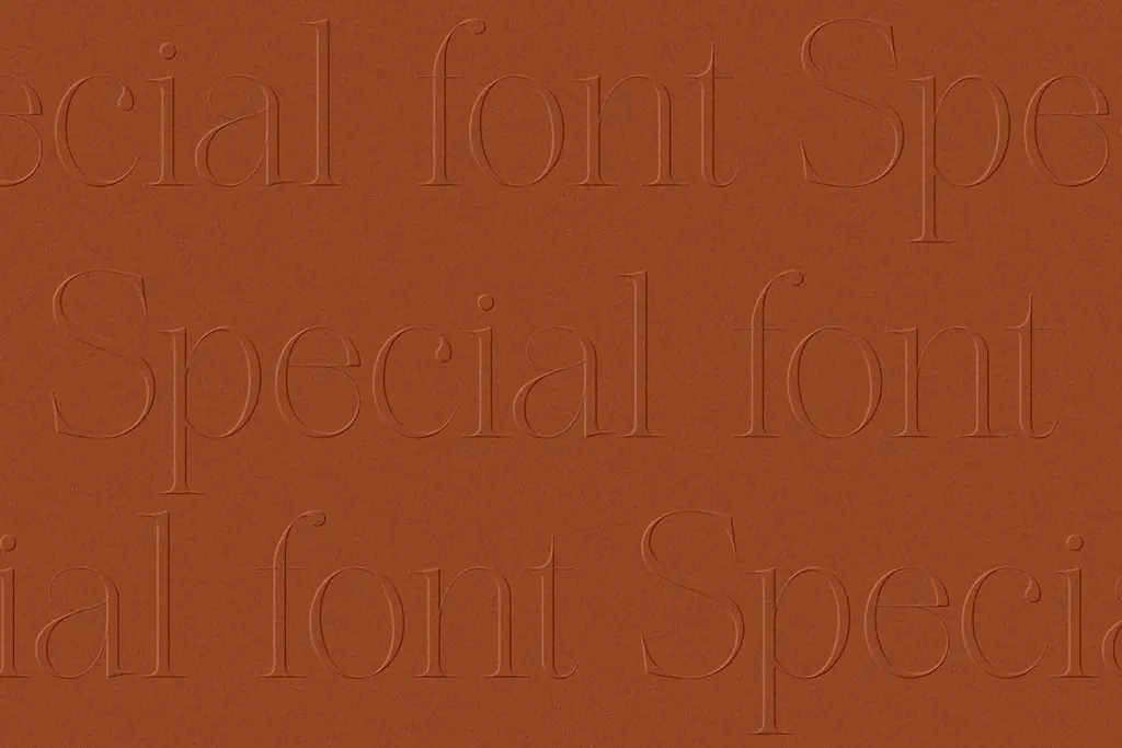
- High contrast strokes give headlines and logotypes real presence
- Compact lowercase keeps short lines of display text from feeling loose
Trade-offs
- No upright or bold companion, so pairing for body copy falls entirely on the designer
- Fine hairlines thin out too much for comfortable reading below headline sizes
The Softly Serif is a confident display italic with genuine personality in its swashes and alternates, best suited to headlines, logotypes, and short editorial moments. It isn't built for body text or small sizes, and the absence of a companion weight means designers will need to look elsewhere to complete a full hierarchy.
Verdict

Tantype reviews typefaces in depth — every font is tested in real branding, editorial and screen layouts before a word gets written. 555+ fonts reviewed and counting.