
Gravesend Sans Font Free Download
There is no official Gravesend Sans font free download. Gravesend Sans is a commercial typeface by Rian Hughes, published by his foundry Device, and we found no free, demo or personal-use version from the designer. As of October 2026, MyFonts sells single styles from $39 and the complete 9-font family for $219. Creative Market sells it too, for $179 per seat with a Desktop licence. The closest free Google Fonts matches are Josefin Sans, Jost and Kumbh Sans.
Gravesend Sans font free download: is there a legal free version?
No. Neither store that sells it offers a trial or personal-use files. Sites offering a free Gravesend Sans are handing out copies the foundry never released, and they can’t give you a licence. On MyFonts’ Gravesend Sans family page each style is $39 for one desktop user and the Complete Family of 9 fonts is $219, against $351 for all nine bought one at a time. The Creative Market listing, sold by Device, charges $179 per seat for a Desktop licence. Its page doesn’t list which styles are in the download.
Buy Gravesend Sans (MyFonts) From $39 per style, $219 for all 9 fonts
Gravesend Sans at a glance
- Designer: Rian Hughes
- Foundry: Device (Device Fonts, Hughes’ own label in West London)
- Released: MyFonts gives its debut as 24 January 2019
- Style: capitals-only sans based on Southern Railway station signs
- Family: 9 fonts: Fine, Light, Medium, Bold, Heavy, Inline, Cameo, Shadow and Rimmed Shadow
- Price: $39 per style or $219 for the family on MyFonts; $179 per seat on Creative Market (October 2026)
- Free alternatives: Josefin Sans, Jost, Kumbh Sans
Where the design comes from
MyFonts’ description, written by the foundry, says Gravesend Sans is based on “the unique typeface used for the iconic grass-green signage for the Southern Railway”. That railway ran from 1923 until nationalisation in 1948, linking London with the Channel ports, South West England, the south coast resorts and Kent. The same lettering, in black on yellow, appeared on the London, Midland and Scottish Railway’s “hawkeye” signs.
Hughes took each letter from vintage “target” station nameplates and other platform signs. The description notes that the rarest letters were Q (from Queens Road Battersea), X (East Brixton) and Z (Maze Hill). Because the original signs were made by hand, their letters often varied in width and thickness, and there was no lowercase. The railway’s numbers varied too much to copy, so the figures come from Smokebox, a Device font named after the front of the steam engine, where such numbers were also used.
The foundry also links it to William Caslon IV’s caps-only “Two Lines English Egyptian” of 1816, credited as the first Latin sans serif type. Neither store explains the Gravesend name.
Design and character
On MyFonts’ specimens, O, C, G and D are wide and round. E, F and S are much narrower. A and V come to sharp points, and the A’s crossbar sits low. Strokes are nearly even in thickness, so the heavier weights read well from a distance.
The decorative styles are where the railway theme shows most. Inline cuts a thin white line through each stroke. Shadow and Rimmed Shadow add a dropped 3D shadow. Cameo puts each capital in its own tile and adds banner ends, so you can build ticket-style headings letter by letter.
What’s in the Gravesend Sans family
- Fine, Light, Medium, Bold, Heavy and Inline: 381 glyphs each, per MyFonts’ tech specs.
- Cameo: 444 glyphs, including the banner and tile pieces.
- Shadow and Rimmed Shadow: 269 glyphs each, without the stylistic alternates.
- Format: OpenType CFF (.otf), version 2.000
There is no true lowercase. On MyFonts’ glyph chart, the lowercase keys are mapped to the same capitals, so typing in lowercase still gives you capitals. The chart also shows pointing-hand manicules, arrows with feathered tails and circle-and-bar symbols in the style of the old station nameplates.
Language support and OpenType features
MyFonts lists support for well over 100 Latin-script languages, including English, French, German, Spanish, Polish, Czech, Icelandic and Welsh. We found no Cyrillic or Greek. The Rimmed Shadow list leaves out German, so test umlauts and ß in that style before you rely on it.
The main OpenType features MyFonts reports, in plain words:
- Discretionary ligatures (dlig): the railway abbreviations. MyFonts’ specimen shows more than 20, such as St (Saint or Street), Rd (Road), Jn (Junction), Ave, Bwy, Gdn, Stn and Yd, set with small raised letters over dots the way old signs did.
- Stylistic alternates (salt) and Stylistic Set 1 (ss01): swap in different shapes for some characters.
- Fractions, superscripts and ordinals (frac, sups, ordn): proper ½, raised numbers, and 1º-style ordinals.
To reach the ligatures and alternates you need an app with an OpenType panel, such as Adobe Illustrator, InDesign, Photoshop, Affinity or Figma. Canva and Cricut Design Space don’t expose these features, so in those apps you get the default letters and no “St.” or “Rd.” ligatures.
Gravesend Sans font pairings and best uses
Being capitals only, Gravesend Sans suits short text: signs, wayfinding, posters, packaging labels, menus and album covers. MyFonts’ mock-ups include a perfume bag, a marmalade label and a vinyl sleeve.
- With a serif for body text: Libre Baskerville or Lora give a period feel under Gravesend headings.
- With a sans for body text: Source Sans 3 stays neutral and readable at small sizes.
- Within the family: a Bold headline over a Light subtitle, with Inline or Cameo for one word of emphasis.
Licensing: personal and commercial use
There is no personal-use licence, so even a school project or personal poster needs a paid one. MyFonts sells Desktop (from 1 user), Company Desktop, Webfonts, App, Electronic Doc, Digital Ad/Email and Server licences; for one style, Desktop starts at $39 and Webfonts at $39 for 10,000 pageviews a month. Creative Market lists Desktop at $179 per seat, Webfont at $645 and E-pub at $268 before its discounts, with enterprise terms on request.
Logos, apps and Canva uploads can fall under different licence types, so read the store’s licence first. This is general information, not legal advice.
How to download and install Gravesend Sans
- Buy from MyFonts or Creative Market, download the ZIP from your account and unzip the .otf files.
- Windows: right-click the .otf files and choose Install (or Install for all users).
- Mac: double-click each file and click Install Font in Font Book.
- Restart open apps. Each style shows up as its own family name, for example “Gravesend Sans Bold”.
For Cricut Design Space, install the font on your computer first and then pick it from the system fonts list. For Canva, paid plans can upload fonts through the Brand Kit, and Canva’s upload requirements say the font’s licence has to allow it.
Free fonts similar to Gravesend Sans
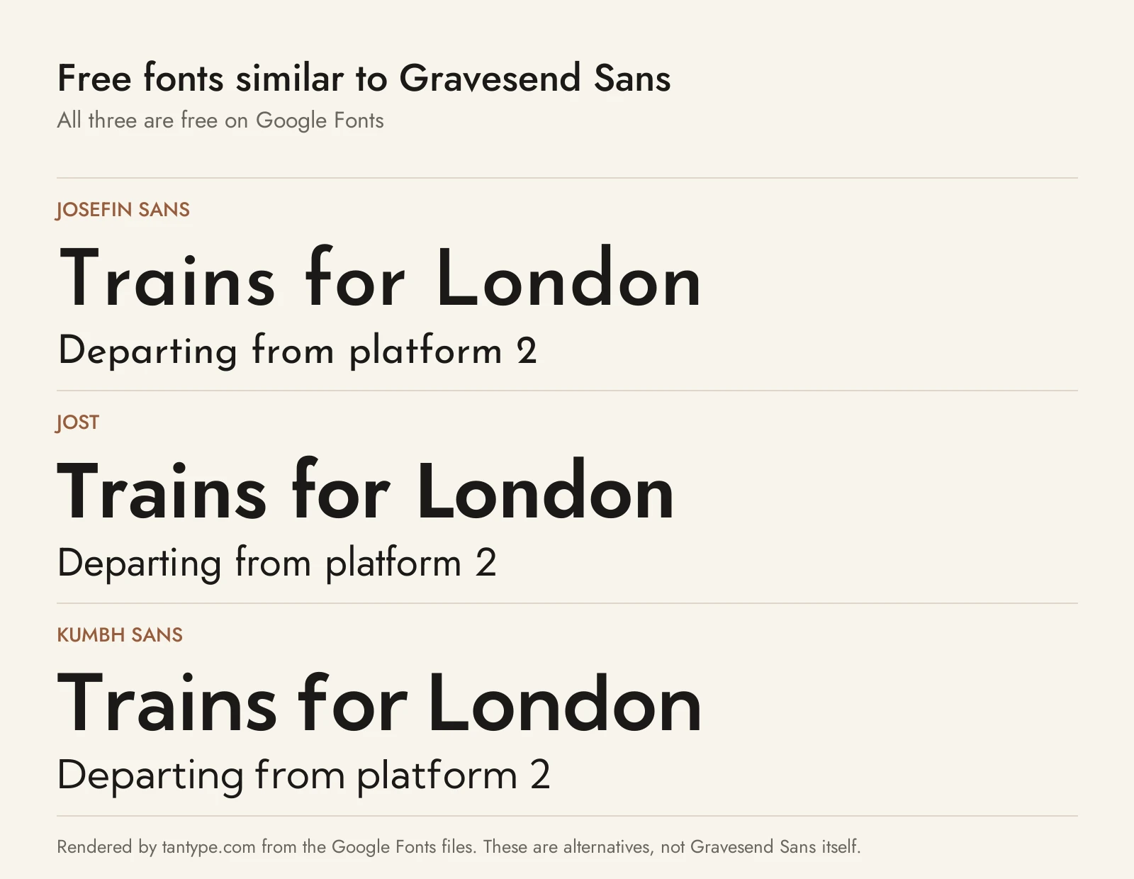
None of these is Gravesend Sans, and none has its ligatures, inline or shadow styles. They are free under the SIL Open Font License, which allows commercial use, and come closest to its letter shapes in capitals.
- Josefin Sans: the closest match. Google Fonts describes it as geometric and elegant “with a vintage feeling”, inspired by 1920s sans serifs. Its capitals share Gravesend’s wide O, narrow E and S, pointed A and low crossbar. Weights run from Thin to Bold, so it covers Fine to Bold but has no Heavy.
- Jost: inspired by 1920s German sans serifs, in the Futura mould. Its capitals are more strictly geometric than Gravesend’s, and its range from Thin to Black covers the Heavy weight that Josefin Sans lacks.
- Kumbh Sans: a modern geometric sans with slight contrast. Its letters are wider and more even, so it looks less period, and it runs from Thin to Black.
For related faces, see our guides to Futura, the 1927 geometric sans, Frutiger, which began as airport signage lettering, and Apercu, a sans that blends Johnston, Gill Sans and other classic grotesques.
Gravesend Sans FAQ
Is Gravesend Sans font free?
No. It is a commercial Device font with no free or demo version. It costs $39 per style or $219 for the family on MyFonts (October 2026).
Who designed Gravesend Sans?
Rian Hughes, the London-based designer behind Device Fonts. MyFonts lists its debut as January 2019.
What is Gravesend Sans based on?
The hand-made lettering on Southern Railway station signs (1923 to 1948), according to the foundry. The figures come from Device’s Smokebox font.
Does Gravesend Sans have lowercase letters?
No. It is capitals only, like the signs it is based on, and the lowercase keys type capitals.
Can I use Gravesend Sans in Canva or Cricut?
Yes, if your licence covers it: upload it to a paid Canva Brand Kit, or install it on your computer for Cricut. The ligatures and alternates won’t be reachable in either app.
What is the closest free font to Gravesend Sans?
Josefin Sans is closest in proportions and pointed capitals. Jost is a good substitute when you need a heavier weight.
