
Akzidenz-Grotesk Font Free Download
There is no official Akzidenz-Grotesk font free download. It is a commercial Berthold typeface, owned by Monotype since 2022. On MyFonts, single styles start at $79.99 and the full 30-font Akzidenz-Grotesk Pro family costs $1,095 (as of October 2026). The one exception is Akzidenz-Grotesk Next, which comes with paid Adobe Creative Cloud plans at no extra charge.
Akzidenz-Grotesk font free download: the honest answer
Berthold has never released Akzidenz-Grotesk as freeware, a demo or a personal-use font. MyFonts’ Akzidenz-Grotesk page sells it under Desktop, Webfont, App and other paid licences. A “free” ZIP from a download site is an unlicensed copy, and using one in a logo or client project is a real risk.
Three legal ways to use akzidenz grotesk without buying a font licence:
- Adobe Fonts: Akzidenz-Grotesk Next is on Adobe Fonts with all 42 styles. It is in the full library, not the free tier, so you need a paid Creative Cloud plan.
- CC Accidenz Commons: in 2019 Creative Commons released CC Accidenz Commons, “a contemporary, versatile, and neutral version of Akzidenz Grotesk” by the Archetypo collective. It is a single Medium .otf under CC BY-SA, and a separate redrawing, not Berthold’s font.
- Free look-alikes: the Google Fonts listed below are free for commercial use.
License Akzidenz-Grotesk (MyFonts) Commercial font, from $79.99 per style
Akzidenz-Grotesk at a glance
- Foundry: H. Berthold AG, Berlin. The library is now owned by Monotype.
- First released: 1898 or 1896, depending on the source (see below)
- Classification: grotesque sans serif
- Later work: extended by Günter Gerhard Lange from the late 1950s; redrawn as Akzidenz-Grotesk Next by Bernd Möllenstädt and Dieter Hofrichter in 2006
- Akzidenz-Grotesk Pro: 30 fonts, from $79.99 per style or $1,095 for the family on MyFonts
- Akzidenz-Grotesk Next: 42 fonts, from $79.99 per style or $1,099.99 for the family on MyFonts; included in paid Adobe Fonts plans
- Free alternatives: Work Sans, Hanken Grotesk, Inter
What “Akzidenz” means
Akzidenz is German for jobbing or commercial printing: short runs of ads, tickets and forms, as opposed to books. Grotesk was the usual 19th-century German word for a sans serif. Wikipedia’s history of the typeface translates the full name as “jobbing sans-serif”, and the MyFonts field guide gives the same reading: a font “for simple, usually one sheet, jobs.”
Where Akzidenz-Grotesk came from
Hermann Berthold founded his Berlin firm in 1858 to make brass printer’s rules, according to MyFonts’ Berthold foundry page. The release date of Akzidenz-Grotesk is disputed. MyFonts and Adobe Fonts say Berthold “first published Akzidenz-Grotesk in 1896”. Fonts In Use gives April 1898 and says it was issued by Berthold and its subsidiary Bauer & Co as “Accidenz-Grotesk”. Wikipedia also uses 1898, the year two design patents were filed.
The designer is disputed too. MyFonts credits Ferdinand Theinhardt’s Royal-Grotesk, following Lange’s account. Fonts In Use calls that refuted, citing research by Indra Kupferschmid and Dan Reynolds, and traces the design to Schattierte Grotesk, a shaded sans from Bauer & Co. The original cutters are unknown.
Günter Gerhard Lange, Berthold’s artistic director from 1961 to 1990, expanded the family from the late 1950s, adding AG Extra Bold (1966) and AG Super (1968), then Super Italic and Extra Bold Italic in 2001. Berthold went bankrupt in 1993. Berthold Types of Chicago then released the OpenType Akzidenz-Grotesk Pro in 2006, and Monotype bought the library in 2022.
Akzidenz-Grotesk, Helvetica, Univers and the Swiss Style
After the war, Swiss designers such as Josef Müller-Brockmann, Armin Hofmann and Karl Gerstner chose Akzidenz-Grotesk for what became the International Typographic Style, or Swiss Style. Fonts In Use documents Müller-Brockmann’s 1955 posters for the Zurich Town Hall, set in Akzidenz-Grotesk alone, as well as the cover of the Swiss journal Neue Grafik (1958–65), which used its Medium weight for the masthead.
That success led to three rival faces in 1957. Max Miedinger at the Haas foundry used it as the model for Neue Haas-Grotesk, renamed Helvetica in 1961, with a higher x-height, tighter spacing and flatter terminals. Adrian Frutiger’s Univers and Bauer’s Folio also drew on it. In the United States it was sold as “Standard”, and Fonts In Use lists more than 440 documented uses.
Design and character
Akzidenz-Grotesk has even stroke weight and a “folded-up” structure, so the openings of a, c, e and s are fairly closed, similar to the Didone serifs of the 19th century. The capitals are wide and fairly even in width. Compared with Helvetica it has a lower x-height and stroke endings that are less consistently horizontal or vertical.
The MyFonts field guide for Akzidenz-Grotesk Next picks out a few identifying letters: an A with a low crossbar, a t with a tail, a top-heavy 2, and somewhat condensed lowercase. Its specimen shows a single-storey g. Because the original family came from several sources, its weights don’t always match, and critics note that its capitals look slightly too dark beside the lowercase.
Which Akzidenz-Grotesk to buy: Pro or Next
Akzidenz-Grotesk Pro (the original)
This is the digitised Berthold original, with its historical quirks. MyFonts lists 30 fonts in three packs:
- Normal pack, 12 fonts, $400: Light, Regular, Medium, Bold, ExtraBold and Super, each with an italic
- Condensed pack, 10 fonts, $400: Light to ExtraBold with italics
- Extended pack, 8 fonts, $350: Light to Bold with italics
Single styles cost $79.99, and the full family is $1,095 (Desktop licence, as of October 2026). For posters and headlines, look at Akzidenz Grotesk Bold, ExtraBold and Super; MyFonts calls Super “an excellent choice for headlines”.
Akzidenz-Grotesk Next (2006)
Next is a consistent redesign. A December 2006 Berthold announcement reported by CreativePro says the original was “compiled from several, formerly independent sources”, so Möllenstädt and Hofrichter readjusted its x-height and weights to match across the family. MyFonts sells Next as 42 fonts: seven weights (ExtraLight to Black) with italics in regular, condensed and extended widths. Prices are $79.99 per style, $695 per 14-font width pack, or $1,099.99 for all 42.
Choose Pro if you want the authentic Swiss-poster look. Choose Next for interfaces, reports and brand systems that need many weights to match, or if you already pay for Creative Cloud.
Get Akzidenz-Grotesk Next (MyFonts)
Language support and OpenType features
At launch, Next came in PostScript and TrueType OpenType formats with “over 500 glyphs” and support for Central European, Baltic, Turkish, Welsh and Esperanto, according to the 2006 announcement. For Pro, Berthold added Cyrillic and Greek to all 30 fonts in 2007 as “Akzidenz-Grotesk Pro+”. MyFonts’ public pages don’t list current character sets, so check the Tech Specs tab if you need Cyrillic or Greek.
OpenType features are extra glyphs, such as alternate figures or fractions, that apps like InDesign, Illustrator and Figma can switch on. Canva and Cricut Design Space can’t reach OpenType alternates, so in those apps you get the default letters only.
Akzidenz Grotesk font pairings and best uses
Akzidenz-Grotesk is at its best in grid-based layouts: posters, exhibition graphics, book covers, annual reports and wayfinding.
- Serif pairings from MyFonts: the field guide suggests Frutiger Serif, Macklin Serif, Palatino Nova and Serifa with Next.
- Free serif partners: Source Serif 4 or Lora work well for body text.
Licensing: personal vs commercial use
There is no free personal-use licence. A MyFonts Desktop licence covers personal and commercial graphic work, including logos, packaging, posters, videos and social posts, and it is priced by the number of users. It does not cover websites, apps, ebooks, digital ads or installing the font on a server. Adobe Fonts clears its library for personal and commercial design work, web projects, PDFs and video. This is general information, not legal advice.
How to download and install Akzidenz-Grotesk legally
- Pick a version: Pro or Next on MyFonts, or activate Next in Adobe Fonts if you already have a paid Creative Cloud plan.
- On MyFonts, choose a style or pack, the licence type and number of users, then download from your account.
- Windows: unzip, select the .otf files, right-click and choose Install.
- Mac: double-click each file and click Install Font in Font Book.
- Adobe Fonts: click Add family on the Akzidenz-Grotesk Next page; the Creative Cloud app installs it for you.
We couldn’t confirm Akzidenz-Grotesk in Canva’s built-in library. Canva Pro lets you upload fonts, but that places the file on Canva’s servers, so read your licence first.
Free fonts similar to Akzidenz-Grotesk
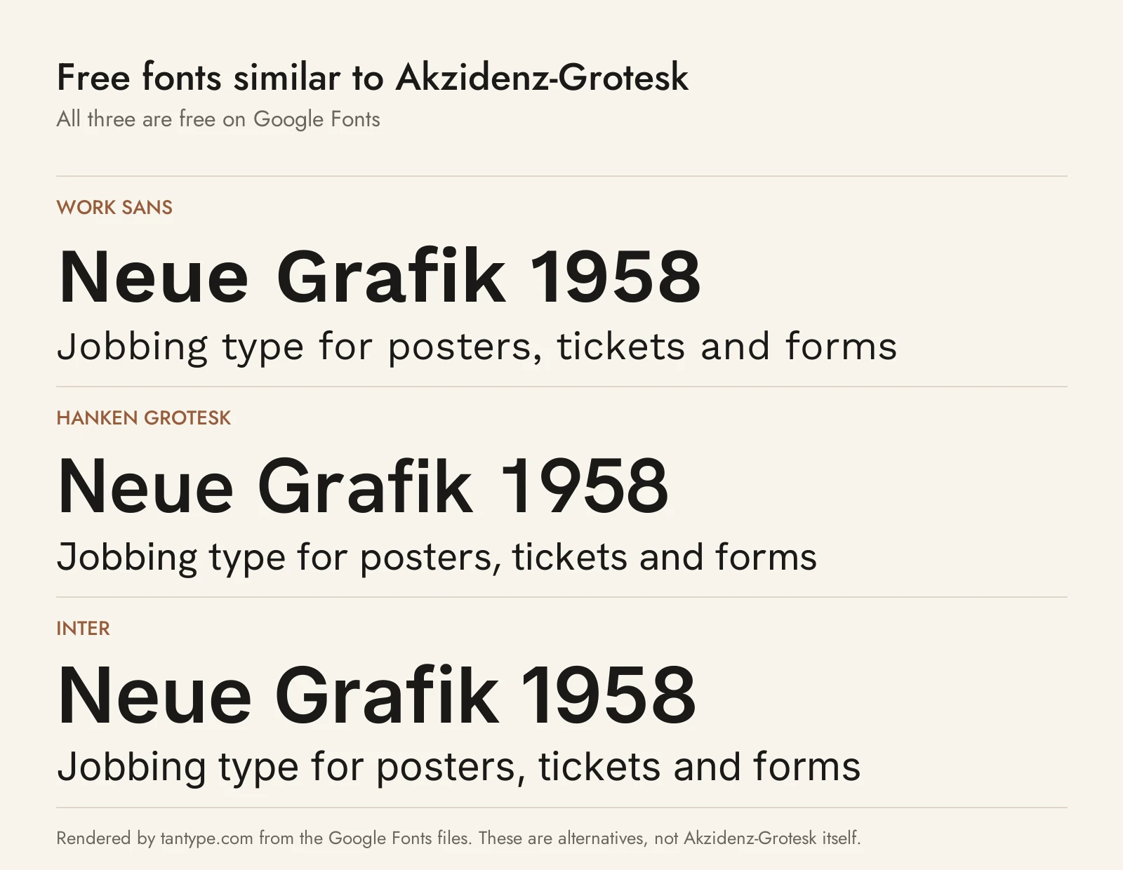
These three Google Fonts come closest to Akzidenz grotesk. All use the SIL Open Font License, which allows commercial use.
- Work Sans: Google Fonts describes it as “based loosely on early Grotesques”, including those of the Bauer foundry, so it has the closest family history. It runs from Thin to Black but has no condensed or extended widths.
- Hanken Grotesk: a sans “inspired by the classic grotesques”, updated for signage, books and screens. It has nine weights but only one width.
- Inter: Fonts In Use lists it among typefaces related to Akzidenz-Grotesk. Its x-height is much taller, built for screens, and it covers Cyrillic and Greek.
Among paid fonts we cover, Frutiger is the later humanist sans from the designer of Univers, Trade Gothic Next is a revived American gothic of the same era, and Whitney is a humanist sans for signage and editorial work.
Akzidenz-Grotesk font FAQ
Is Akzidenz-Grotesk free?
No. It is a commercial Berthold font sold through MyFonts, from $79.99 per style. Akzidenz-Grotesk Next comes with paid Adobe Creative Cloud plans, and CC Accidenz Commons is a free, openly licensed redrawing.
Is Akzidenz-Grotesk on Adobe Fonts?
Akzidenz-Grotesk Next is, with 42 styles, on paid plans only. We found no Adobe Fonts listing for the original Pro family.
Is Akzidenz-Grotesk the same as Helvetica?
No. Helvetica (1957) was modelled on Akzidenz-Grotesk but has a higher x-height, tighter spacing and more uniform horizontal stroke endings.
Who designed Akzidenz-Grotesk?
The original cutters are unknown. Günter Gerhard Lange expanded it from the late 1950s, and Bernd Möllenstädt and Dieter Hofrichter drew Akzidenz-Grotesk Next.
What does Akzidenz-Grotesk mean?
Roughly “jobbing sans serif”: a sans serif for commercial print jobs such as ads, tickets and forms.
What is the closest free font to Akzidenz-Grotesk?
Work Sans is closest in origin and feel. Inter is the better choice for screens and multilingual text.
