
Evergreen: a hand-drawn all-caps sans for outdoor and craft branding
Design style
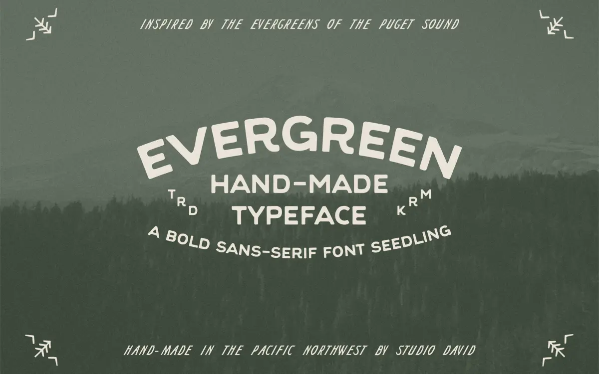
Evergreen is an uppercase-only sans with a hand-built quality — strokes aren’t mechanically even, corners have a slight give to them, and the overall rhythm reads more carved than drawn with a ruling pen. It sits in that familiar territory of outdoor and craft-adjacent lettering: thick, confident strokes, minimal contrast, and letterforms that feel like they were cut from a stencil then softened at the edges. There’s nothing fussy about it. The designer has kept ornamentation out of the picture and let the roughness of the linework do the personality work.
What separates it from a lot of lookalike “rustic outdoor” faces is restraint. The letters aren’t over-distressed, there’s no forced texture layer slapped on top, and the strokes stay consistent enough that the face doesn’t collapse into novelty at small sizes. It reads as handmade without reading as messy.
Character set and features
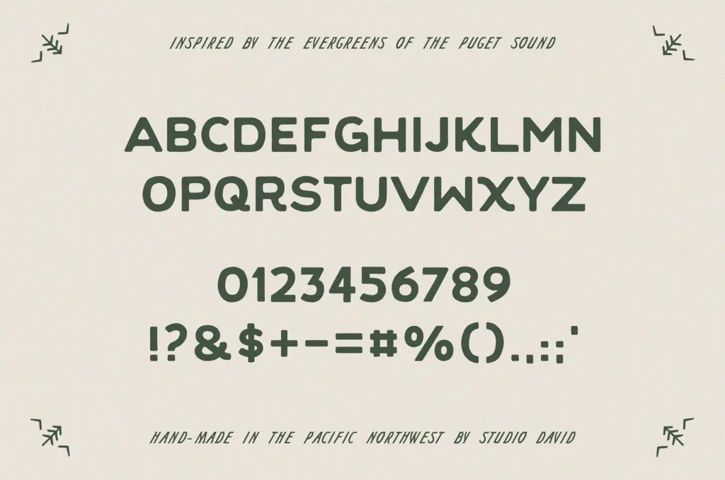
Evergreen is capitals only — there’s no lowercase to fall back on, which is worth knowing before you build a paragraph around it. The set does cover numerals and basic punctuation, so it can carry short lines of copy, prices, dates, or a tagline, but it isn’t built for body text or anything beyond a phrase or two. The character sparseness makes sense for what it’s aiming at: a workhorse letterform for headlines and marks, not a full editorial typeface.
Because every glyph is uppercase, spacing does a lot of the heavy lifting. Kerning between the wider letters (W, M) versus the narrower ones (I, L) needs a careful eye when you’re hand-setting a wordmark — the default spacing gets you most of the way but tight compositions may need manual nudging, which is normal for a display face like this.
Use cases
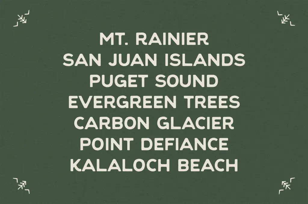
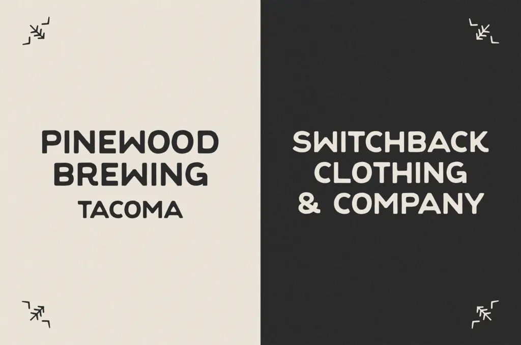
This is a logo and label typeface first. Think craft breweries, campgrounds, outdoor gear, lodge signage, holiday cards with a rustic bent — anywhere a short, punchy word needs to look like it was stamped onto a wood sign or a paper label rather than typed. The all-caps constraint actually helps here: badge layouts, circular lockups, and packaging call-outs tend to want caps anyway, so the format lines up with the job.
It won’t do the job of a body-copy font, and pairing it with something more neutral for supporting text is the obvious move — a plain sans or serif underneath keeps the Evergreen headline from having to carry the whole layout. Where it struggles is anywhere you need lowercase, anywhere you need long lines of text, or any brand that wants a cleaner, less textured voice. But for the narrow lane it’s built for — outdoor, artisanal, seasonal branding with a handmade edge — it does the job cleanly and without pretension.
What we liked, and what we didn’t
Strengths
- Consistent, hand-built stroke quality that avoids looking over-distressed
- Numerals and punctuation extend it beyond just a wordmark tool
- Fits naturally into badge, label and lockup layouts without extra styling
Trade-offs
- No lowercase means it can't function beyond short headlines or marks
- Wide-to-narrow letter spacing needs manual kerning in tight compositions
Evergreen is a solid, unfussy hand-drawn caps face built for outdoor and craft branding work. It does its narrow job — logos, labels, badges — well, but the all-caps-only set limits it to short-form use.
Verdict

Tantype reviews typefaces in depth — every font is tested in real branding, editorial and screen layouts before a word gets written. 555+ fonts reviewed and counting.