
Gameday: a collegiate sans built for sports branding and jersey numbers
Design style
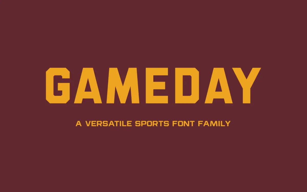
Gameday belongs to the collegiate-athletic lineage of sans serifs: blocky, confident letterforms with the squared-off terminals and heavy stroke junctions you’d expect from a varsity jacket or a stadium scoreboard. The letters are built for impact rather than nuance. Counters are kept open and generous, strokes are even in weight across a given style, and there’s no attempt at calligraphic flourish or humanist warmth. This is a font that wants to sit on a helmet decal or a team crest, not in a paragraph of running text.
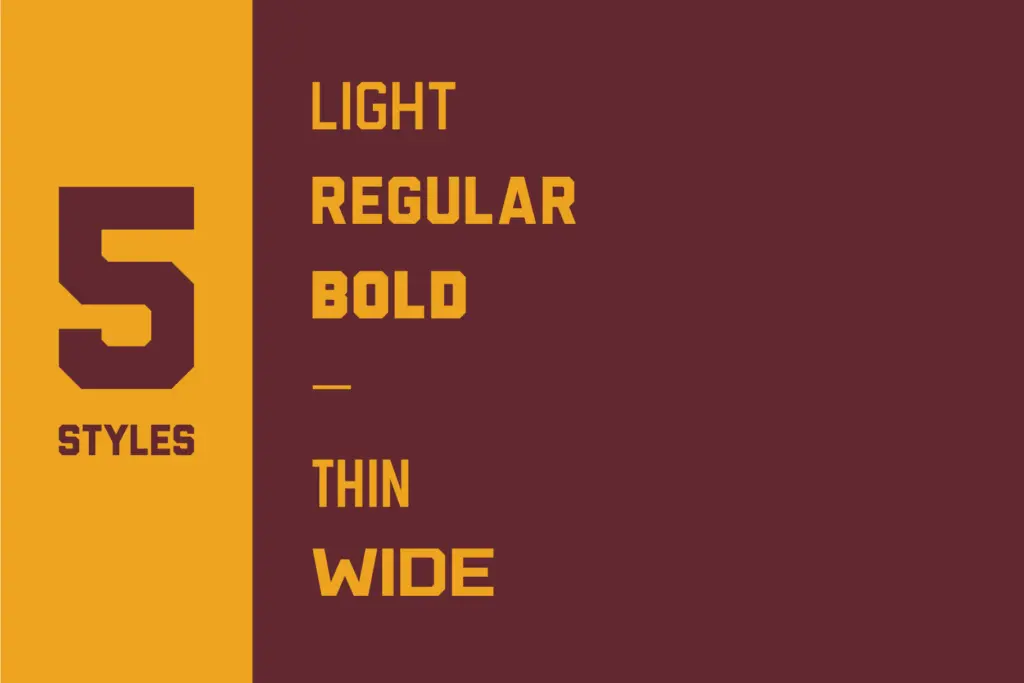
The five-style spread — Thin, Light, Regular, Bold and Wide — gives the family more range than most fonts pitched at this market, which often ship as a single heavy weight and call it done. The Wide cut in particular reads as the family’s real personality: it’s the one that looks most at home stencilled across a chest or blown up on a banner. The lighter weights feel more like a concession to versatility than a strong idea in their own right; they’re serviceable, but the design’s conviction lives in the bolder end.
Character set and features
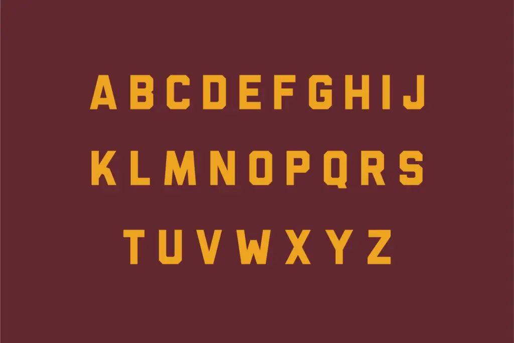
As a working sans built around uppercase-driven applications, Gameday’s letterforms are consistent and its spacing is even, which matters more than ornamentation here. There’s nothing eccentric in the construction — no swash capitals, no alternate characters mentioned — and that restraint is appropriate. A typeface meant to sit inside a circular crest or next to a mascot illustration doesn’t need extra decoration; it needs to hold its shape at small sizes and not fight with whatever graphic surrounds it.
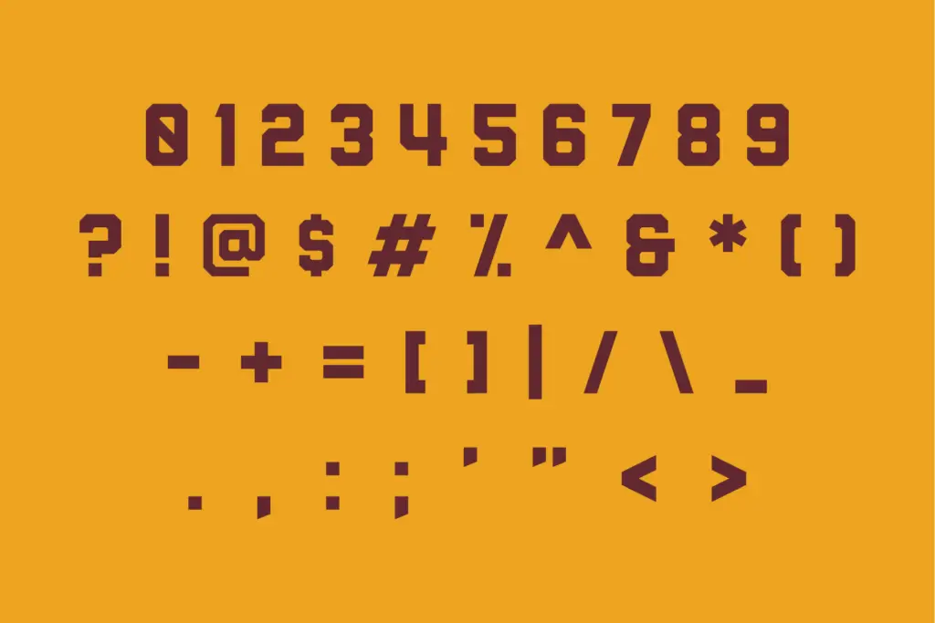
Numerals are where a font like this earns its keep, since jersey numbers, scores and dates are the actual daily use case, and Gameday’s figures are drawn with the same squared, sturdy discipline as the letters. Whether the family extends beyond basic Latin characters isn’t something the brief specifies, so treat multilingual reach as unconfirmed and test before committing to a project with extended character needs.
Use cases
Gameday is aimed squarely at sports branding: team wordmarks, schedule graphics, roster boards, merchandise, and the kind of poster that announces a homecoming game. It will also do decent work in general collegiate or retro-Americana contexts — summer camp logos, varsity-style merch, gym branding — anywhere the brief calls for that squared-off, athletic voice rather than something more neutral or editorial.
It is not a body-text font, and nobody drawing five weights this blocky intended it to be one. Even the Light and Thin cuts read as display styles rather than text styles; push them below a few words and the personality that makes the family work starts to feel heavy-handed. Pair it with a plainer, quieter sans for anything that needs to be actually read at length — Gameday’s job is the headline, the number, the crest, not the paragraph underneath it.
What we liked, and what we didn’t
Strengths
- Five weights give real range for a sports-branding font
- Wide and Bold cuts have genuine character for crests and wordmarks
- Numerals are drawn with the sturdiness jersey and scoreboard work needs
Trade-offs
- Lighter weights lack the conviction of the bolder styles and feel secondary
- Not suited to body copy or any setting beyond short display text
Gameday does one job well: squared-off, confident athletic branding across five weights. It's not built for body text and the lighter weights feel like an afterthought, but for team logos, jersey numbers and collegiate merch it's a solid, no-nonsense choice.
Verdict

Tantype reviews typefaces in depth — every font is tested in real branding, editorial and screen layouts before a word gets written. 555+ fonts reviewed and counting.