
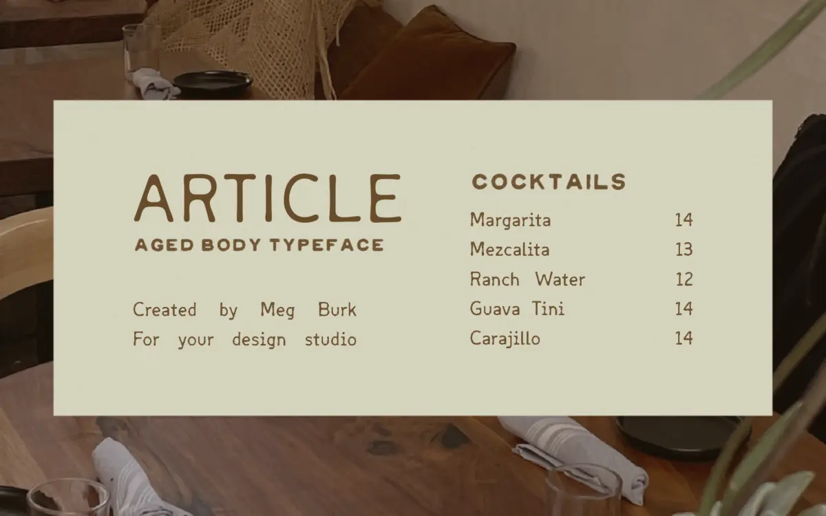
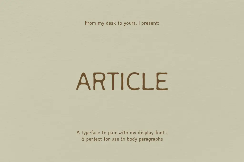
Article: a mono-inspired sans built to sit quietly beside bolder display type
Design style
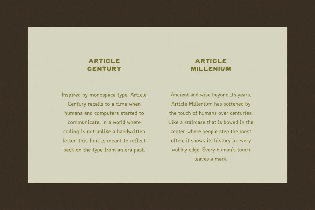
Article takes its structure from monospace type but refuses the sterility that usually comes with it. The proportions and rhythm of a mono face are visible in the letterforms, but the widths breathe rather than lock into a grid, so it reads more like a considered sans than a coding font wearing a costume. It comes in two cuts. Century is the cleaner of the pair, with even strokes and a steady, almost typewritten cadence. Millennium takes the same skeleton and roughs it up, softening corners and adding a worn, uneven edge to strokes, as if the letters had been handled for a long time before you got them. The designer’s own comparison, a staircase bowed by years of footsteps, is a fair description of what’s happening at the terminals and joins.
Neither version is loud. That’s the point. Article is pitched as a supporting player, meant to sit next to something with more visual weight and hold its own without competing for attention. The drawing has enough personality to avoid feeling generic, but it doesn’t reach for a strong signature the way a display face would.
Character set and features
The two styles share a spacing logic that nods to monospace without being strictly monospaced, which gives you some of that typewriter regularity while keeping normal proportional kerning underneath. Century is the more neutral, better-behaved of the two — a workhorse. Millennium’s texture is hand-applied rather than algorithmic-looking, with irregularities that vary letter to letter instead of repeating in an obvious pattern, which is what keeps it from reading as a generic grunge filter over a clean face.
Because the two versions are drawn from the same underlying structure, they mix cleanly if you want to combine a clean line of Century with a distressed word or two in Millennium for emphasis, rather than reaching outside the family for contrast.
Use cases
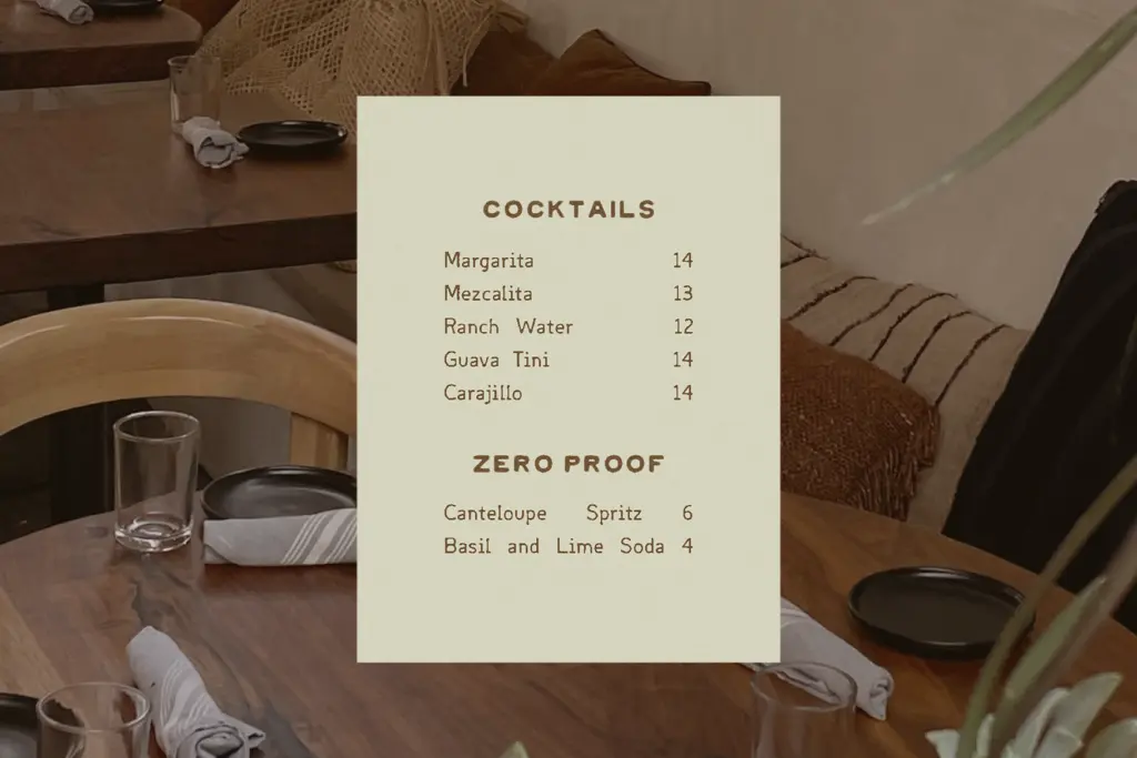
This is a secondary typeface, and it works best treated as one. Century suits body copy, captions, and supporting text in editorial layouts or packaging where you need something legible but slightly warmer than a standard grotesque. Its mono ancestry gives it a nice fit in anything referencing code, archives, or technical documentation, without going full terminal-font pastiche.
Millennium is the one to reach for when you want a bit of age or handmade texture without switching to a script or a full distressed display face — vintage packaging, zine-style editorial, small-batch product labeling, anything trading on a sense of history or wear. Neither version is built to headline on its own at large display sizes; the personality is subtle and works better in support of a stronger display companion, which is exactly the role the designer intended for it.
What we liked, and what we didn’t
Strengths
- Two related cuts let you mix clean and worn texture within one family
- Mono-inspired proportions give it a distinct rhythm without tipping into gimmick
- Millennium's wear looks hand-applied rather than templated, avoiding an obvious repeat pattern
Trade-offs
- Not built to headline at large display sizes on its own
- The subtlety that makes it a good sidekick also makes it easy to overlook in a lineup
Article does one job well: being a quiet, slightly textured companion to louder display type. It won't carry a headline on its own, but as supporting text with a mono-derived personality, both cuts earn their keep.
Verdict

Tantype reviews typefaces in depth — every font is tested in real branding, editorial and screen layouts before a word gets written. 555+ fonts reviewed and counting.