
Darksport: a six-weight variable sans built for sports branding
Design style
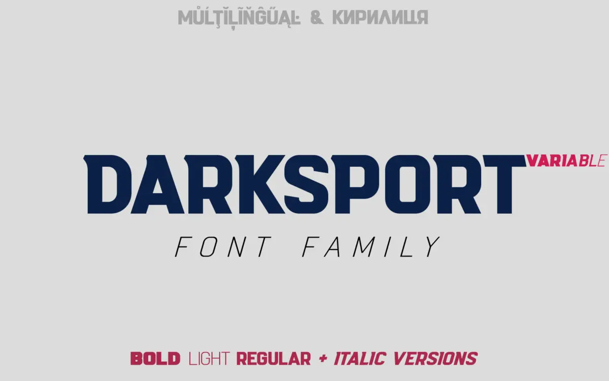
Darksport belongs to the family of condensed, angular sans serifs that borrow their vocabulary from stadium signage and team jerseys rather than editorial type design. The letterforms lean into hard angles and slightly chamfered corners, the kind of shape you get when a letter is cut for a numbered jersey rather than a paragraph. It reads as a display face first, built to be big, bold and read from a distance.
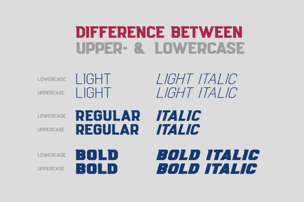
What sets it apart from the usual sport-font template is the deliberate split between uppercase and lowercase behaviour. Rather than treating the lowercase as a scaled-down version of the caps, the designer has given it its own rhythm — looser curves, different terminal treatment — so the two cases don’t just coexist, they do different jobs. That’s a sensible move for a font whose caps will end up on a badge and whose lowercase might end up on a tagline underneath it.
Character set and features
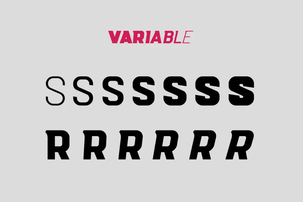
The family ships as six weights plus a variable font, which means you get a genuine range from a lean, wiry cut through to something dense enough to hold its own as a solid mark on a jersey or a can label. Having the variable axis in the file is useful in practice: you can dial in the exact density a logo needs instead of settling for whichever static weight is closest.
Language support is broad, covering Latin Pro along with Slavic Cyrillic, with coverage extending across a long list of Central and Eastern European languages plus Russian, Ukrainian and Belarusian. For a font pitched at sports branding, that Cyrillic support is a genuine point of difference — a lot of competitors in this niche stop at basic Latin, and teams and leagues working in Cyrillic-using markets are usually left substituting a different face entirely.
The shadow treatment referenced in the seller’s materials suggests a layered or extruded companion style, which fits the genre — badges and jersey numerals often want that dimensional pop rather than a flat mark.
Use cases
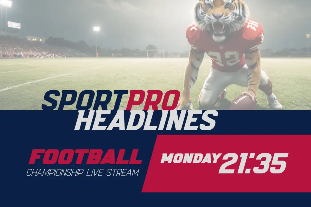
This is a font for logotypes, team badges, jersey numbering, poster headlines and packaging that wants to signal energy and competition rather than restraint. The angularity and weight range make it well suited to short bursts of text — a team name, a event date, a product line — rather than anything that needs to be read in quantity. Because the caps and lowercase behave differently, designers should test both in situ rather than assuming one will simply be a smaller version of the other.
It won’t suit editorial layouts, long-form web copy, or brands after a quieter, more neutral voice — the angularity is too assertive and too specific to sport and competition contexts to sit comfortably in other territory. Where it belongs is on the front of a kit, the top of a poster, or the lockup of a league identity, especially one that needs Cyrillic support alongside Latin.
What we liked, and what we didn’t
Strengths
- Six weights plus a variable font give real control over density for badges and lockups.
- Genuine Cyrillic coverage across many Eastern European languages, unusual for a sports-genre font.
- Uppercase and lowercase are drawn with distinct behaviour rather than one scaled from the other.
Trade-offs
- The angular, condensed structure limits it almost entirely to display sizes, not body text.
- Its sport-branding character is too specific for brands wanting a neutral or quiet voice.
Darksport does one job well: it looks like a team badge or a jersey number before you've even set any words in it. The variable axis and genuine Cyrillic support make it more flexible than most fonts in this niche, but it's a specialist tool, not a general-purpose sans.
Verdict

Tantype reviews typefaces in depth — every font is tested in real branding, editorial and screen layouts before a word gets written. 555+ fonts reviewed and counting.