
Mesaca and Kaxes: a rustic sans duo for vintage signage and branding work
Design style
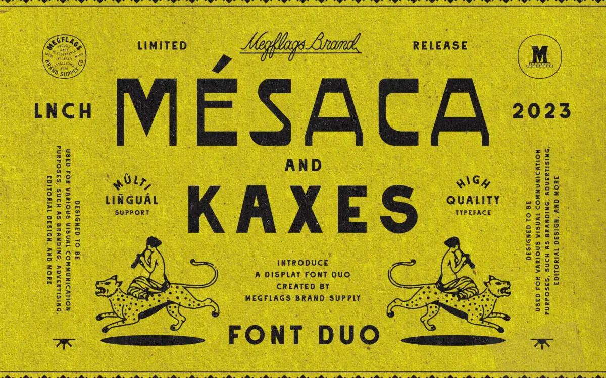
Mesaca and Kaxes take their cue from painted storefronts and hand-lettered signage of western Mexico, and that lineage shows in the details rather than in any overt decoration. This is not a font pretending to be a brush script or a stencil — it is a sans serif pairing built around slightly irregular stroke widths, blunt terminals and a general sense of having been cut or painted by hand rather than plotted on a grid. Mesaca reads as the sturdier of the two, with squarer proportions and a confident, almost blocky presence. Kaxes sits lighter and looser, closer to a companion or accent face than a body text option.
The rustic quality is deliberate but restrained. Neither face tips into novelty territory — there’s no exaggerated wear texture or distressing baked into the outlines, which means the vintage feeling comes from proportion and stroke treatment rather than gimmick. That’s a smart choice: it ages better and works at more sizes than a heavily distressed alternative would.
Character set and features
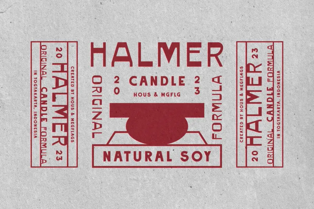
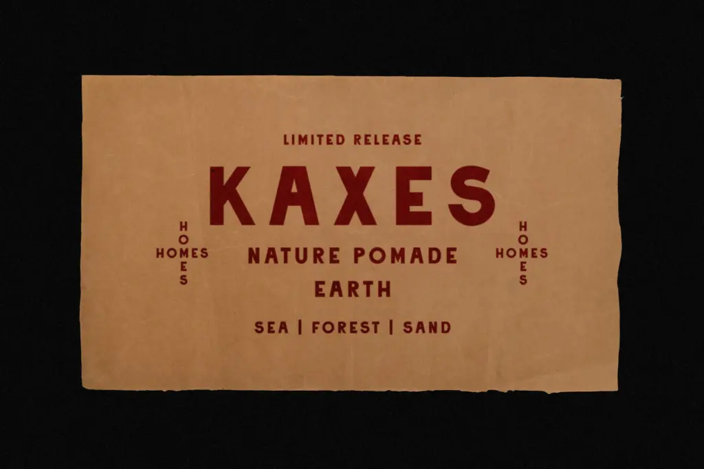
As a duo, the pairing is built to be used together — Mesaca carrying weight and structure, Kaxes providing contrast and a hand-finished accent. Used side by side in a lockup, the two create the kind of layered signage look you’d see on an old shopfront: a bold primary word with a lighter, more casual secondary line underneath or beside it. Used separately, Mesaca can carry more conventional branding or wordmark duties on its own, while Kaxes works better in short bursts — a tagline, a stamp, a single word — where its looser rhythm doesn’t have to sustain a paragraph.
Neither face is suited to long-form reading. The irregularity that gives them character at display sizes becomes noise once you drop below a headline or subhead scale. This is a pairing built for a handful of words at a time, not for setting body copy or dense information.
Use cases
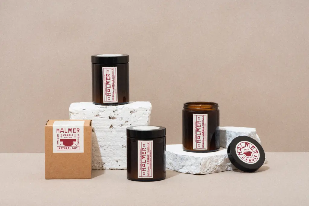
This duo makes the most sense for branding and packaging projects that want a lived-in, regional feel without going full western saloon or full Mexican folk-art pastiche — think taquerias, mezcal labels, artisanal food packaging, small-batch retail signage, market stalls. It also suits logotypes and wordmarks for brands trying to signal handmade authenticity or a specific geographic story, where the pairing’s slight roughness reads as intentional rather than accidental.
It’s less at home in corporate or tech-adjacent branding, where the irregularity would read as noise rather than character, and it won’t do any heavy lifting in editorial layouts beyond a masthead or section header. Signage designers and package designers looking for a quick way to suggest a specific place and era will get the most mileage out of it; anyone needing a flexible workhorse across a full brand system will need to pair it with something more neutral to carry everything else.
What we liked, and what we didn’t
Strengths
- Rustic character comes from proportion and stroke treatment rather than applied texture, so it holds up cleanly at various sizes.
- The two faces are genuinely complementary in weight and rhythm, working well as a layered signage lockup.
- Strong, specific point of view for regional and artisanal branding work.
Trade-offs
- Not suited to body copy or dense text — legibility drops quickly below display sizes.
- The regional aesthetic is distinctive enough that it won't suit corporate or neutral branding contexts.
Mesaca and Kaxes deliver a specific, well-observed regional signage feel without leaning on distressing or novelty tricks. It's a display pairing for short bursts of text on packaging and branding, not a system built for reading at length or across a full brand identity.
Verdict

Tantype reviews typefaces in depth — every font is tested in real branding, editorial and screen layouts before a word gets written. 555+ fonts reviewed and counting.