
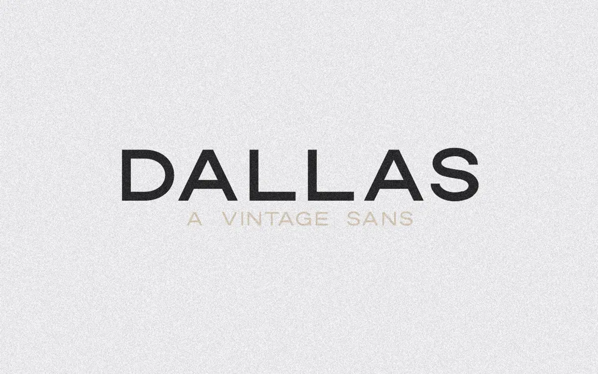
Dallas: an all-caps vintage sans built for badges and logo work
Design style
Dallas is an uppercase-only sans with a dry, workmanlike character that leans on mid-century sign painting and printer’s type rather than anything geometric or Swiss. The letters are slightly condensed, the strokes are even, and the joins are square rather than rounded, which gives it a stamped, cut-from-metal quality instead of a soft, friendly one. It doesn’t try to charm you the way a lot of vintage-flavoured scripts do — it reads as sturdy and a little blunt, which is the point.
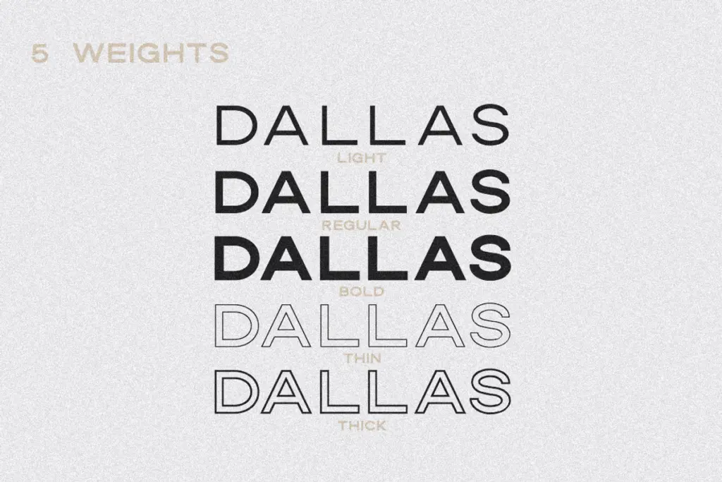
What makes it more than a single weight is the five-way structure: Light, Regular, Bold, and two outline variants (Thin and Thick). The outlines aren’t afterthoughts stroked from the solid weights at a fixed width — they’re built to sit convincingly behind or in front of the solid styles, so layering a thick outline behind a bold solid, or a thin outline over a light base, produces a dimensional, printed-badge effect without extra software tricks. That layering habit is really the design’s whole reason for being a family rather than a font.
Character set and features
Dallas covers uppercase letters, numerals, and standard punctuation, with foreign language support built in, so accented Latin characters are available for European-language setting. There’s no lowercase — this is a caps-only display face, and treating it as anything else will disappoint you. The five weights give you a working tonal range from a light, almost stencil-thin outline up through a solid bold, but because everything is capitals, there isn’t the kind of nuanced pacing you’d get from mixed-case text; rhythm here comes from tracking, weight contrast, and layering rather than from ascenders and descenders.
Spacing is even and a touch generous, which keeps the letters from clotting together at small badge sizes, though it also means tight-set headlines can look gappy if you don’t adjust tracking yourself. The five weights are consistent in proportion, which matters more than it sounds — swapping between Light and Bold in the same lockup doesn’t shift the character widths oddly, so logo marks hold their shape as you experiment with contrast.
Use cases
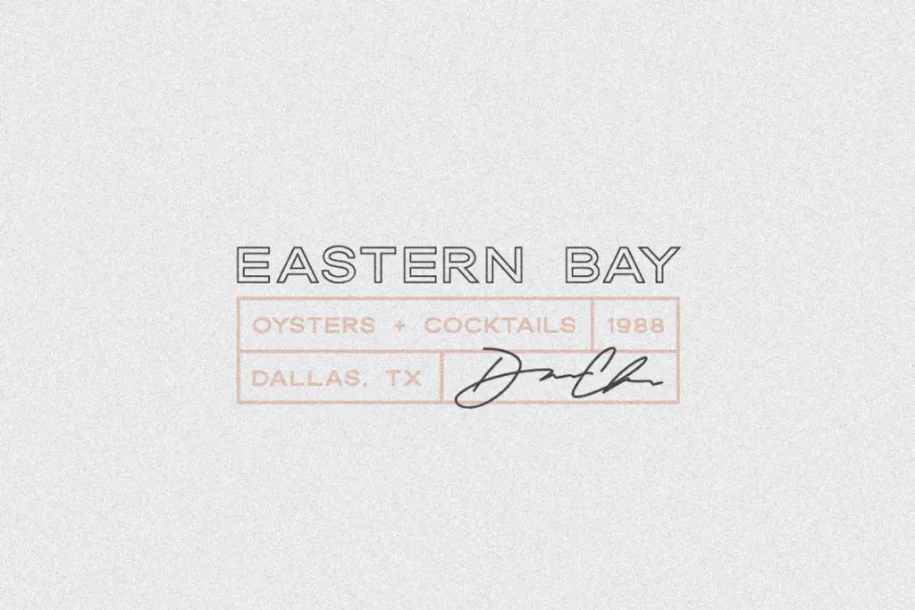
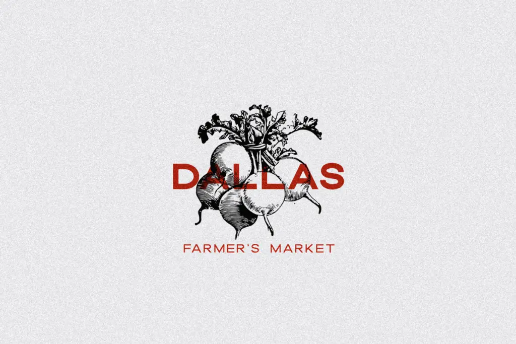
This is a font built for short bursts of text: logotypes, stamp-style badges, business cards, packaging labels, and social graphics where a handful of capitalised words need to look printed rather than typed. The outline styles are genuinely useful for badge and crest work, letting you build depth without a second typeface. It also does fine work as an all-caps subhead or a small amount of display text layered over a script for wedding stationery or invitations, where a plain, slightly retro sans grounds a more decorative headline.
It’s not suited to paragraphs or long-form reading — there’s no lowercase to fall back on, and stretches of all-caps setting fatigue the eye quickly regardless of the typeface. Treat it as a badge and logotype tool, pair it with a proper text face for body copy, and it does its job cleanly.
What we liked, and what we didn’t
Strengths
- Five coordinated weights, including two outline styles built specifically for layering.
- Consistent letter proportions across weights keep logo lockups stable when you swap contrast.
- Even spacing prevents clogging at small badge and business-card sizes.
Trade-offs
- Uppercase only, with no lowercase for body text or longer headlines.
- Generous default spacing can look gappy in tightly set logotypes without manual tracking adjustments.
Dallas is a solid, single-purpose display face: five weights that layer well for badge and logo work, but strictly capitals-only, so it needs a text-face partner for anything longer than a headline. It does its narrow job cleanly without trying to be more than it is.
Verdict

Tantype reviews typefaces in depth — every font is tested in real branding, editorial and screen layouts before a word gets written. 555+ fonts reviewed and counting.