
Brigends Expanded Font Free Download
Is Brigends Expanded free to download?
Brigends Expanded is a commercial font sold on Creative Market, so the full version needs a paid license. Get it from the official listing: Brigends Expanded font download.
Need something free? These sans serif fonts from Google Fonts are free for personal and commercial use:
Design style
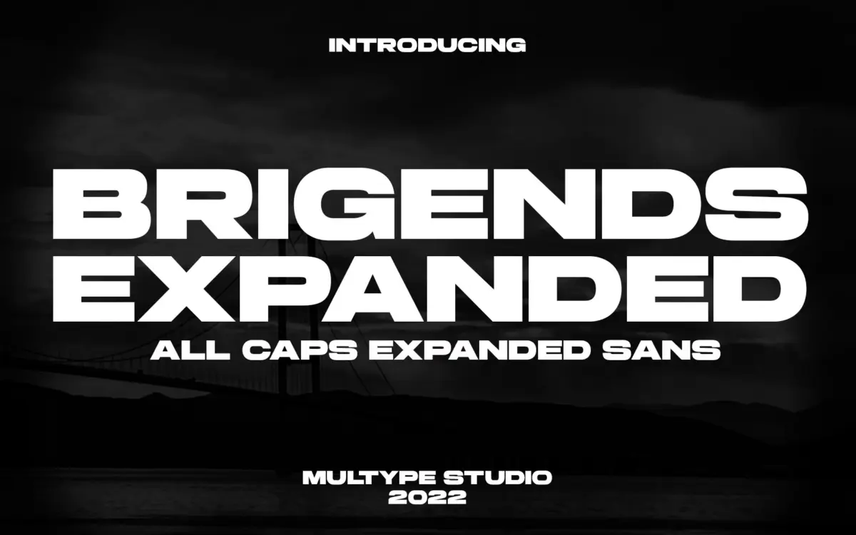
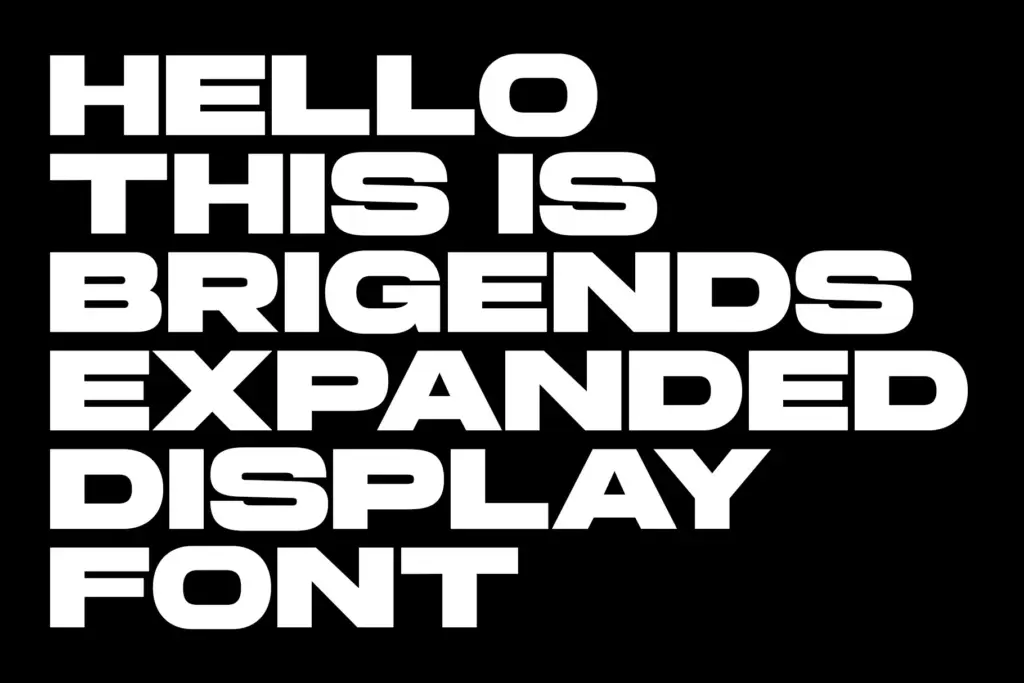
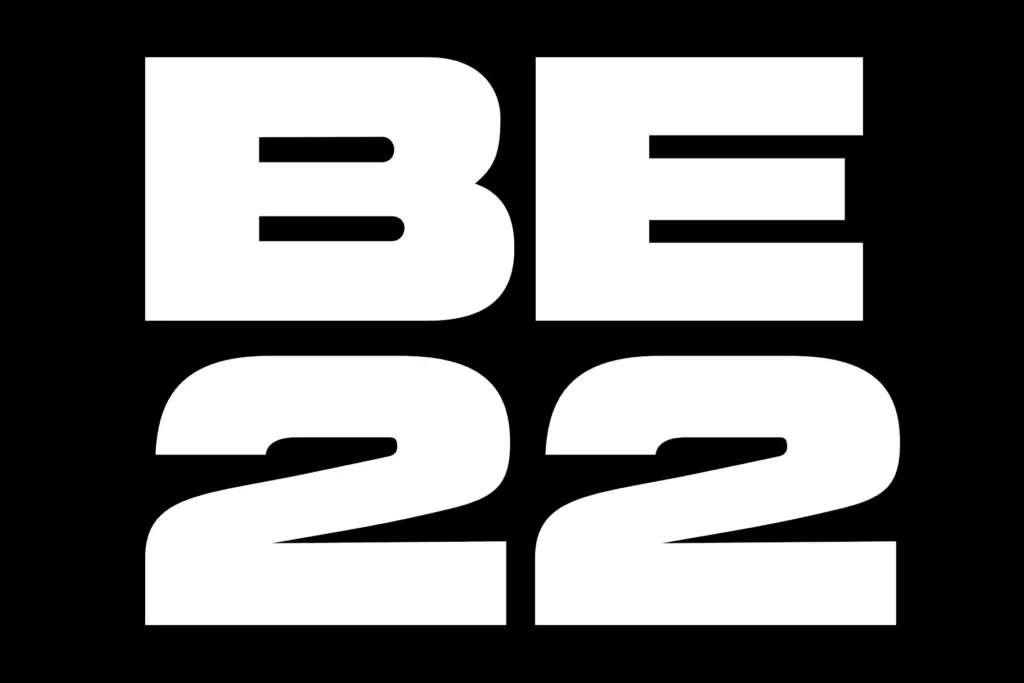
Brigends Expanded is a heavyweight, all-caps sans built for width. The letters are stretched out and squared off, with thick, even strokes and almost no contrast between thick and thin. There’s a confident, industrial feel to it — the kind of sans that looks like it was cut with a ruler rather than drawn with a pen. Counters are kept open and generous given the weight, which helps stop the letterforms from clogging up when set tight.
The expanded width is the whole point here. It’s not a condensed face stretched digitally; the proportions feel deliberate, with wide bowls on the O and C and a squared, almost mechanical R and K. There’s a slight nod to motorsport and stencil lettering in the way terminals are cut flat rather than rounded, which gives it a sense of speed without tipping into novelty.
Character set and features
This is an uppercase-only font — there’s no lowercase to speak of, so it’s built around capitals, numerals and basic symbols. That’s a deliberate trade-off: you get a consistent, monumental look across every word, but no option for sentence case or mixed-case nuance. PUA encoding means the full character set is reachable without extra software, and it works straightforwardly in Illustrator, Photoshop, InDesign and even Word, so there’s no awkward glyph-panel hunting required.
Multilingual support is included, which widens the font’s reach for European-language headlines, though buyers with specific diacritic needs should check the glyph list before committing a whole campaign to it. Because it’s a single weight, single width, all-caps design, there isn’t much flexibility baked into the family itself — what you see is what you get, and what you get is consistent.
Use cases
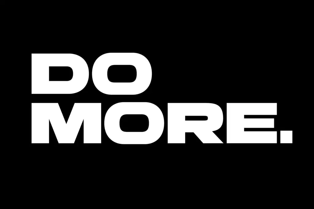
Brigends Expanded is suited to work that needs to shout a little: movie titles, poster headlines, sports and racing branding, book cover titling, and short brand names set large. The width and weight give it presence at billboard or cover scale, and the flat, mechanical terminals suit anything with a technical or competitive edge — automotive, esports, fitness, that general territory.
It’s less useful for anything that needs a body copy partner from the same family, since there’s no lowercase and no lighter weight to fall back on for supporting text. Pair it with a plain sans or serif for the small print and let Brigends carry the headline alone. At smaller sizes the expanded proportions start to feel wasteful of space, so it’s best reserved for the few words that actually need the attention — a title, a logotype, a single line of display type — rather than anything approaching a paragraph.
If you need bold all-caps lettering on a zero budget, the Lemon Milk font is an official donationware option with four weights.
If you want wide letters with a squarer, more technical feel, compare it with Eurostile Bold Extended.
Another wide, technical classic to compare is Microgramma, best known in its Bold Extended style.
We included Brigends Expanded in our roundup of the best space fonts, alongside other picks in the same style.
What we liked, and what we didn’t
Strengths
- Wide, even strokes give it strong presence at large sizes
- Flat terminals and squared forms suit sport, racing and tech-adjacent branding
- Works straight away across standard design apps without extra setup
Trade-offs
- Uppercase-only with no lowercase, so it can't function as a full text family
- Single weight and width limit how far it stretches beyond headline use
Brigends Expanded does one job well: loud, wide, mechanical-feeling headlines. It's not a flexible family and won't carry body text, but for posters, titling and branding that need a bit of muscle, it earns its keep.

Tantype writes independent reviews of typefaces: what each font does well, where it falls short, what it suits, and where it is sold.