
Geom Graphic: a squared-off geometric sans built for retro-futurism
Design style
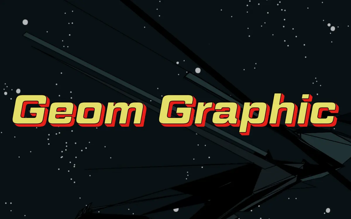
Geom Graphic works the same territory as the square-geometric sans faces that came out of the Eurostile lineage, but it pushes the squaring further and softens the corners just enough to keep it from feeling cold. The brief cites 1980s Japanese robot animation as a reference point, and that lineage is legible in the letterforms: the O is closer to a rounded square than a circle, stroke widths stay even across the skeleton, and the counters are kept open rather than tight. Where Eurostile reads industrial and slightly severe, Geom Graphic has a rounding in the corners that gives it a warmer, more approachable temperament without losing the geometric backbone.
This is a display-leaning construction. The squared terminals and consistent stroke weight are decisions made for impact at scale, not for comfortable reading in a paragraph. The italics are cut to match rather than sloped afterthoughts, which matters if you’re building a system that needs both uprights and italics doing distinct jobs — headline versus caption, for instance.
Character set and features
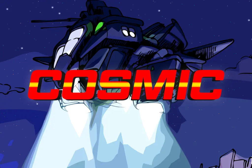
The family ships in four weights with matching italics, which is a reasonable range for a display face: enough to build a hierarchy across a poster or a title sequence without needing to borrow a different sans for body text. Extensive language support is claimed, which widens its usefulness for international branding and packaging work where a single geometric sans needs to carry across markets.
Don’t expect this to behave like a text face. The squared bowls and even weight distribution that make it distinctive at large sizes will start to clot at small ones — counters close up, and the personality that reads as confident in a logotype reads as noisy in a paragraph of ten-point body copy. Treat it as a display and headline tool, not a workhorse for long-form setting.
Use cases
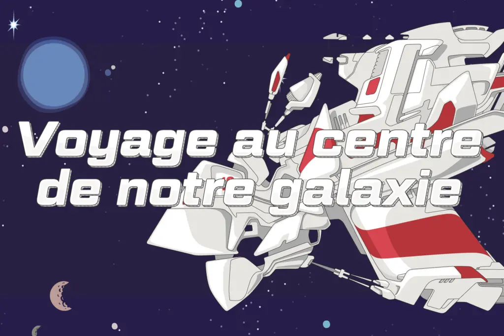
Geom Graphic is well suited to anything that wants a futuristic or retro-tech mood without going full sci-fi cliché: game titles, film and video credit sequences, tech-adjacent branding, packaging for products that want to signal precision or speed. The Gundam-era reference is a useful shorthand — think logotypes and wordmarks for anything mechanical, synthetic, or vaguely robotic, where the squared geometry does the work that a more humanist sans couldn’t.
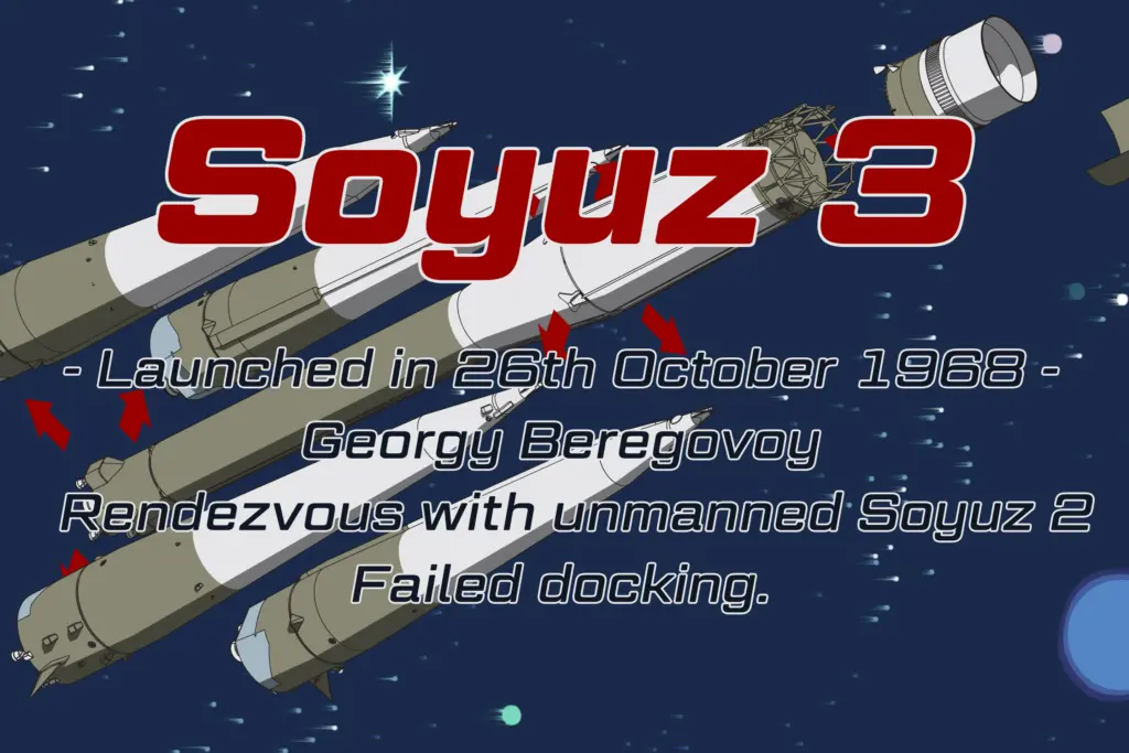
It also has legitimate use outside genre work. A geometric sans with this much personality can anchor a brand identity that wants to feel structured and a little retro at once — a product line, a masthead, a badge or crest treatment. The matching italics give some flexibility for secondary text or accent lines within the same system. Where it will strain is anywhere the brief calls for warmth-first or classic elegance; this face announces itself, and it doesn’t do quiet.
What we liked, and what we didn’t
Strengths
- Squared, rounded geometry gives it a distinct retro-tech character beyond generic Eurostile clones
- Four weights with matching italics cover a workable display hierarchy
- Extensive language support broadens its use in international branding
Trade-offs
- Even stroke weight and closed counters make it unsuitable for body text or small captions
- Its strong genre association (robot anime, sci-fi) limits fit for softer or classic brand briefs
Geom Graphic is a confident geometric display sans with a specific retro-tech personality drawn from 1980s Japanese animation. It earns its keep in logos, titles and packaging that want structure and speed, but it's not built for reading at small sizes.
Verdict

Tantype reviews typefaces in depth — every font is tested in real branding, editorial and screen layouts before a word gets written. 555+ fonts reviewed and counting.