
Sports Fonts: 11 Best Athletic, Varsity and Jersey Fonts
Sports fonts are typefaces that look like they belong on a jersey, a scoreboard or a team poster: collegiate block capitals, heavy numerals, team scripts and forward-leaning athletic italics. Our top three picks are Kensmark, a 45-font athletic family in five widths; Darksport, a six-font sports family with a variable font and Cyrillic; and National Champion Line Series, a collegiate slab with inline and triple-line styles.
All eleven fonts below are commercial Creative Market fonts, with the desktop price we saw on October 16, 2026. Three free Google Fonts options are further down.
Browse sports fonts on Creative Market Commercial fonts: check each listing for current pricing
What is a sports font?
“Sports font” and “athletic font” are shop labels, not formal type classifications. They cover four styles that grew out of uniforms, awards and stadium signs, and most team identities mix two or three.
Varsity and collegiate block lettering
Heavy capitals with square or slab serifs and even strokes, tied to the varsity letter. Wikipedia’s varsity letter article says Harvard’s baseball team added an Old English “H” to its shirts in 1865, the football team adopted it in 1875, and the 1891 baseball nine were the first to wear letter sweaters regularly. Letters moved onto leather-sleeved wool jackets in the 1930s. The patches are felt and chenille with a stitched outline, and many collegiate fonts copy that look with outline and shadow layers. The heavy, bracketed serifs echo older 19th-century slab serifs such as Clarendon.
Team scripts
Bold, slanted, connected scripts for team names across the chest. Pro team scripts are custom lettering, so retail fonts give you the style, not a club’s mark. Tailed scripts are most common in baseball, and our baseball fonts roundup covers them, so this list includes only a few all-sport scripts.
Number fonts
Numbers came late. Wikipedia’s sports number article credits a rugby union match in Christchurch, New Zealand, on 8 September 1894 as the first use of numbered jerseys. The National Hockey Association required numbered armbands from the 1911–12 season, and Arsenal first wore numbered shirts in 1928. A jersey number has to read from across a field, so number fonts are heavy and wide, with open counters.
Athletic sans and italics
Condensed or extended sans serifs, often slanted, for kit names, broadcast graphics and gym brands. The link between sport and gothic sans is old. Hoefler&Co.’s Knockout, built on American wood-type gothics, names its widths after boxing weight classes, from Flyweight up to Heavyweight, plus an even wider Sumo. The italic does a different job: when Pentagram rebranded the car retailer Vroom, Michael Bierut told Dezeen that “the italic balances that weight by evoking speed.”
The best sports fonts at a glance
- Kensmark: 45 fonts in five widths, with slanted and soft-cornered versions.
- Darksport: six-font sports family with a variable font and Cyrillic.
- National Champion Line Series: collegiate slab with Cutline, Inline and Triline styles.
- Bucktooth: all-caps collegiate block lettering in the 1960s style.
- Sportfield Varsity: eight styles, including three outlines and a shadow for layered numbers.
- TT Polls: a professional slab and script system from TypeType, with 160 languages.
- Insporta Signature: a varsity serif and signature script sold as a duo.
- Madison: athletic sans, italic and a swash script in one package.
- Hudson NY Pro: condensed sans, serif and slab, six weights each with italics.
- Hockeynight Sans: rounded-corner college sans in Bold and Bold Italic.
- Pace: all-caps racing sans with a matching italic.
Best sports fonts on Creative Market
Prices are for a one-seat desktop licence as listed on Creative Market on October 16, 2026. Sales and price changes are common, so check the listing.
1. Kensmark
BoxTube Labs pitches Kensmark at sports branding, posters and apparel, and it’s the deepest family here. Five sub-families, Kensmark 01 to 05, cover different widths, each in Regular, Bold and Black, and every style has a Slant and a Soft (rounded) version: 45 fonts in OTF and TTF. One family can cover a wide crest wordmark, condensed player names and a slanted promo headline. It supports most Western European languages. The listing notes that Kensmark 03 Bold and Bold Slanted are free through Pixel Surplus, a handy way to test it. Desktop licence: $18.
See Kensmark on Creative Market
2. Darksport
Sentavio calls Darksport “an authentic sports branding Font Family”: a condensed, angular sans with chamfered corners, closer to cut jersey lettering than a neutral grotesque. Caps and lowercase have different characters, so the capitals can carry a badge while the lowercase handles a tagline. You get six fonts plus a variable font for in-between weights, as OTF, TTF and webfonts. It’s the only pick here with Cyrillic, covering Russian, Ukrainian, Belarusian and Bulgarian alongside Central European Latin. Desktop licence: $19.
See Darksport on Creative Market · Read our Darksport review
3. National Champion Line Series
Kyle Benson of Very Cool Studio describes National Champion as an “overly confident geometric slab” in the college genre. This Line Series adds 12 styles to the original four-weight family: Cutline, Inline and Triline, each in four weights. The lines run through the letters like stripes on a pennant, giving a layered look from one font. It has a three-quarter-height lowercase, OpenType fractions and web hinting. Use the solid weights for numbers and the Triline styles for headers and merch. Desktop licence: $32.
See National Champion Line Series on Creative Market
4. Bucktooth
Deadbolt Design Lab’s Bucktooth is “a classic throwback to collegiate block lettering”, drawn from the lettering of a late-1960s college football team. It’s all caps: the lowercase keys give a second, differently styled set of capitals, which helps when a name repeats a letter. Numbers and symbols match. Creative Market’s own roundup calls it rugged lettering inspired by vintage sweatshirts, so expect a worn feel rather than a crisp outline. It’s a single style, so pair it with a clean sans for small text. Desktop licence: $20.
See Bucktooth on Creative Market
5. Sportfield Varsity
Randi Irvan’s Sportfield Varsity is built for layering. The eight fonts are Regular, Italic, three Outline styles, Shadow, Scribble and Grunge, all in OTF, TTF and WOFF. Stack an outline behind the Regular in another colour and you get the multi-colour border of jersey numbers and letterman patches without offsetting paths by hand. The letters are strong and angular, the Italic covers promo graphics, and Grunge suits worn-look tees. The listing doesn’t state language support. Desktop licence: $20.
See Sportfield Varsity on Creative Market
6. TT Polls
TT Polls, from the TypeType foundry, is a modular slab serif inspired by American sports graphics. The designers suggest jersey lettering and race car numbers. TT Polls has five weights with italics and more than 525 glyphs, including tabular figures for scores and stats. TT Polls Script adds five weights of connected script with geometric swash letters and more than 1,010 glyphs. Both support 160 languages, Cyrillic included. It suits a league or club that needs one system across print, web and broadcast. Desktop licence: $229.
See TT Polls on Creative Market
7. Insporta Signature
Eric Kurniawan (Burntilldead) sells Insporta Signature as a sport font duo. Insporta is a bold, all-caps varsity serif. Signature is a handwritten script, like an autograph across a team photo. Set a player or team name in the script with block “EST” and city lines around it. Both fonts include numbers, punctuation, alternates and ligatures, with multilingual support and OTF, TTF and WOFF files. A character map shows where the alternates sit. Desktop licence: $20.
See Insporta Signature on Creative Market
8. Madison
Fateh.Lab’s Madison is a “bold, powerful and sporty font” that bundles the three main sports styles. You get Light, Regular and Bold uprights, an Italic, a Script and a Script Swash version, each in OTF and TTF, with multilingual support. That covers the block name, the slanted tagline and the cursive team mark in one design. The extras lean toward racing: 35 vector illustrations of dog, horse and car racing in AI, CDR, EPS and PDF. Desktop licence: $20.
See Madison on Creative Market
9. Hudson NY Pro
Andrew Footit (Arkitype) rebuilt his Hudson NY as “the perfect Display family for sports, beverage and entertainment.” It is a condensed, dense display design with square-cut terminals and tight curves, drawn in three styles on one skeleton: Regular (sans), Serif and Slab. Each has six weights with italics, plus small caps, stylistic sets and alternate glyphs. Because the styles share proportions, a slab headline, a sans subhead and an italic stat line sit well together. At this price it suits a club or brand rather than a one-off tee. Desktop licence: $100.
See Hudson NY Pro on Creative Market · Read our Hudson NY Pro review
10. Hockeynight Sans
Christoph Zeugswetter (xtoph) describes Hockeynight as “the helvetica under the college-fonts”. It’s a collegiate sans with rounded corners, friendlier than the sharp-cornered block fonts above, with alternate glyphs. The Creative Market pack has Bold and Bold Italic; the full family has seven weights with italics, and the listing points to the designer’s website for the rest. Use it for rink and court graphics, team apps and schedules. Desktop licence: $25.
See Hockeynight Sans on Creative Market
11. Pace
Pace, by Mariela Dwi Damayanti of Hamz Studio, is an all-caps racing sans for sport, motorsport and fight-night graphics. It comes in Regular and Italic. The Italic gives you the forward lean of motorsport liveries and broadcast graphics without faking a slant in software. Files come as OTF, TTF, WOFF and WOFF2 (web use needs a Webfont licence). With no lowercase, keep it to headlines, numbers and short names. Desktop licence: $29.
See Pace on Creative Market · Read our Pace review
How to choose a sports font
- Start with the sport and the era. Collegiate slabs and block letters read as American school sports. Rounded sans like Hockeynight suit ice and court sports, slanted caps like Pace suit motorsport, and condensed angular sans like Darksport work across most sports.
- Read it from a distance. Print your team name and a two-digit number at real size, step back and check that the 6, 8 and 9 don’t fill in.
- Check the numerals before you buy. Look for numerals as heavy as the capitals, and tabular figures (TT Polls) for scores and stats.
- Use outline and shadow styles instead of strokes. Sportfield Varsity’s outline layers and National Champion’s line styles give you clean borders for heat transfer, screen print and tackle twill. Thick strokes added in software often distort corners.
- Think about production. Thin lines and tight script loops fill in when embroidered or cut from vinyl; solid block weights cut and stitch cleanly. Distressed styles like Sportfield’s Grunge suit screen printing, not cut vinyl.
- Cricut and Canva. Both take uploaded OTF or TTF files but don’t reach OpenType alternates easily, so check for PUA encoding or a character map if you need swashes.
- Don’t copy pro marks. Team wordmarks are custom lettering and registered trademarks. MLB’s legal notices, for example, list club “names, nicknames, logos, uniform designs, color combinations, and slogans” as marks that need permission. Use these fonts to build your own team’s look.
Free sports fonts
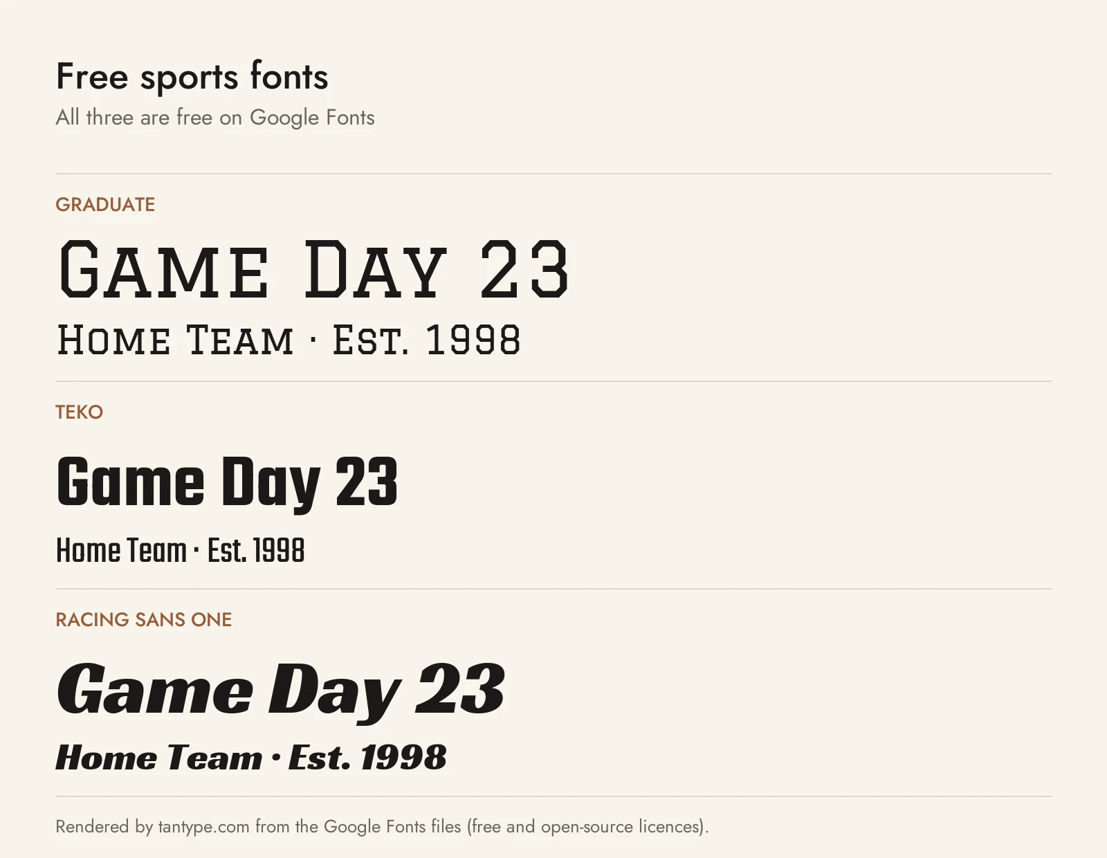
All three are on Google Fonts under the SIL Open Font License, which allows commercial use, including logos and merch.
- Graduate (Eduardo Tunni): a rendition of the classic American college block style. It’s the closest free match to Bucktooth or National Champion, but it comes in one fairly light weight with no outline or shadow layers, and its lowercase are small capitals.
- Teko (Manushi Parikh for Indian Type Foundry): a squared, low-contrast condensed sans with a variable weight axis from Light to Bold. The Bold is a good free stand-in for Darksport or Kensmark’s narrow widths on player names and numbers, though it has no italic.
- Racing Sans One (Impallari Type): a heavy, high-contrast slanted sans modelled on old gothic italics such as American Type Founders’ Doric Italic (1897). It’s the free athletic italic, with lowercase, but a single style with more thick-thin contrast than Pace.
Licensing: personal vs commercial use
Creative Market sells fonts under four licence types: Desktop, Webfont, E-pub and App. Its font licence page says a Desktop licence allows use in “unlimited commercial and personal projects”, including physical products, packaging, online content and ads, as long as the font appears in rasterized form on the web or in apps. That covers jerseys, tees and banners you design. You buy one seat per user; websites need a Webfont licence and apps or games an App licence.
Two rules matter for team work. Print-on-demand is only allowed when the licensee makes the finished product, so a custom-jersey tool where customers type their own names isn’t covered. For logos, Creative Market says the font must be modified and not the dominant element, you must disclaim the font if you register the logo as a trademark, and you can’t claim rights in the font itself. Read each listing for extra terms. This is a summary, not legal advice.
Sports font FAQ
What is the best sports font?
For a full athletic family, Kensmark or Darksport. For collegiate lettering, National Champion Line Series or Bucktooth. For layered jersey numbers, Sportfield Varsity. For speed and motorsport, Pace.
What is an athletic font?
Another name for a sports font: heavy block, slab or condensed sans lettering, often with italics, outlines and strong numerals, drawn to read from a distance.
What font is used on sports jerseys?
Pro teams use custom lettering, usually heavy outlined block or slab numbers. For your own team, try National Champion, Sportfield Varsity or Bucktooth.
What’s the difference between varsity and collegiate fonts?
Shops use them almost interchangeably for the slab or block capitals of American school athletics. “Varsity” leans toward outlined letterman patches, “collegiate” also covers cleaner modern block letters.
Are there free sports fonts for commercial use?
Yes: Graduate, Teko and Racing Sans One on Google Fonts. Fonts labelled “free for personal use” elsewhere usually don’t cover team merch you sell.
Can I use a sports font to recreate a pro team’s logo?
No. Leagues and clubs register names, logos and uniform designs as trademarks, and buying a font doesn’t let you copy them. Use these fonts for your own team, club or brand.
