
Hot Rush Font Duo: an 80s-flavoured sans and script pairing for retro logos
Design style
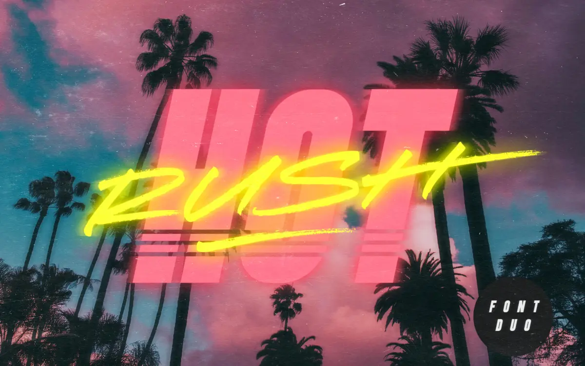
Hot Rush leans hard into 1980s retro signage and VHS-era branding, and it doesn’t apologise for it. The duo pairs a condensed, uppercase-only sans with a fast, textured script drawn with a marker pen. The sans has the clipped, slightly aggressive proportions you’d expect from that era’s motorsport decals and video packaging: tight counters, square-ish terminals, a rhythm built for short punchy words rather than paragraphs. The script sits on top of it as the looser, more energetic half of the pair — long diagonal strokes, a visible marker texture, and a sense of speed baked into the letter connections.
The striped variant of the sans is the more overtly novelty piece. Vertical stripes running through each letterform push it firmly into decorative territory, useful as an accent but not something you’d want carrying body copy or even a full headline on its own. Used sparingly against the plain sans, it gives a poster or badge design a bit of dimension without much extra effort.
Character set and features
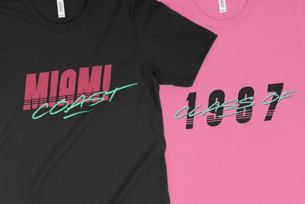
Both the sans and the script are uppercase-only, which is worth planning around before you commit a layout to them. The script compensates with a genuine alternate set — switching to lowercase on the keyboard swaps in a second uppercase alphabet, so you can vary letterforms within a single word rather than repeating identical shapes. That’s a small but practical trick for scripts, where repeated glyphs tend to flatten out the handmade illusion.
The script also includes dedicated end forms for ten letters — A, C, E, F, G, H, K, L, R and T — with elongated horizontal strokes designed to close out a word. These are a nice detail for logotypes and short lockups, giving the script a tapered exit instead of an abrupt stop. Both sans styles ship with italic companions, and the full family supports numerals and standard punctuation, so functional signage or pricing details won’t be a dead end.
Use cases
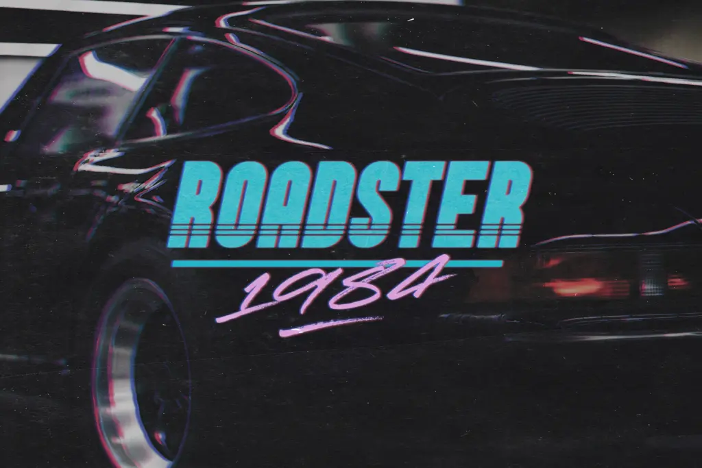
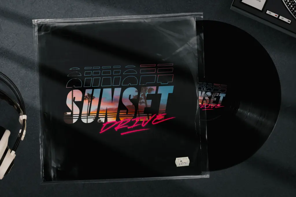
This is a pairing built for display work, not reading. The sans is well suited to short headlines, badges, and merchandise lockups where a condensed, retro voice is the point — think event branding, apparel graphics, or packaging that wants to nod at 80s and 90s design without going full pastiche. The script works best as a secondary flourish: a product name, a signature line, or a tagline layered over or alongside the sans, using the end forms to finish it cleanly.
Because everything is uppercase, it’s not a candidate for anything requiring sentence case or long-form text — instruction manuals, body copy, editorial layouts. It’s also a font with a strong, specific mood, which means it won’t quietly disappear into a brand system the way a neutral grotesk would. If retrowave, synthwave, or 80s nostalgia is genuinely the brief, Hot Rush delivers that register efficiently. If the brief drifts away from that aesthetic even slightly, this pairing will fight you.
What we liked, and what we didn’t
Strengths
- Alternate uppercase set in the script avoids repetitive letterforms within a word
- Dedicated end forms on ten letters give the script a proper finished exit stroke
- Striped sans variant adds a decorative option without needing a separate build
Trade-offs
- Uppercase-only across both fonts rules out any layout needing sentence case
- The strong 80s retro identity means it won't adapt well outside that specific mood
Hot Rush is a well-executed novelty pairing with a strong, specific retro voice. The alternate letterforms and end forms show real attention to detail, but the uppercase-only limitation and narrow aesthetic mean it's a tool for one particular job rather than a flexible workhorse.
Verdict

Tantype reviews typefaces in depth — every font is tested in real branding, editorial and screen layouts before a word gets written. 555+ fonts reviewed and counting.