
Olive Village: a 70s-groovy serif for headlines with a retro wink
Design style
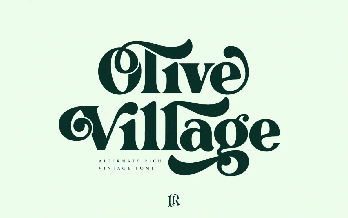
Olive Village leans into a very specific decade. The curves are rounded and slightly bulbous, the contrast is moderate rather than high, and the serifs have a soft, almost bracketed quality that recalls the lettering on record sleeves and grocery packaging from the early 1970s. It doesn’t try to be a faithful revival of any one historical model — it borrows the mood of that era’s hand-lettering and regularises it into a working font. The italic leans harder into that groovy character, with looser joins and more visible flourish, while the regular stays closer to something you could actually set a paragraph in.
What keeps it from tipping into pure novelty is restraint in the counters and x-height. The letters are round but not cartoonish, and the stroke weight stays even enough that the face reads as a serif with personality rather than a costume font. It’s a design built for a mood board more than a manifesto, and it delivers that mood competently.
Character set and features
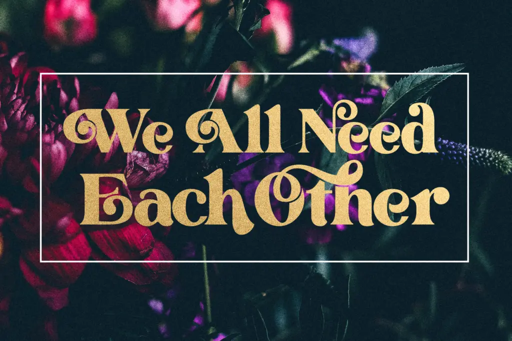
Olive Village ships as two styles, Regular and Italic, which covers the basics of headline and accent work without offering a full weight range. The OpenType feature set is the more interesting part of the package: stylistic alternates and ligatures are included, giving letters like the lowercase g, y, and various pair combinations a chance to loosen up and feel less mechanical when repeated across a heading. Ligatures apply automatically in any app that respects OpenType, but the alternates need a glyphs panel — Illustrator or Photoshop, for instance — since there’s no automatic substitution rule triggering them.
That two-tier access is worth knowing before you commit to a workflow. If your pipeline is mostly web or app-based text without glyph-level control, you’ll get the ligatures but miss the full range of character variation the font is capable of. Designers working in layout software will get the more complete picture.
Use cases
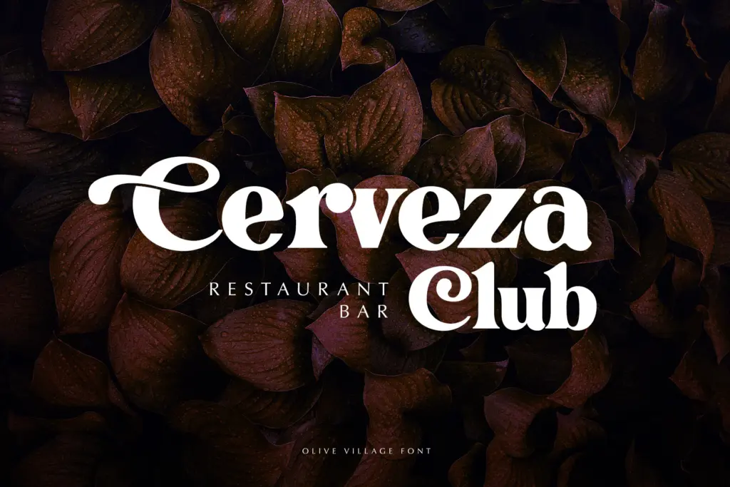
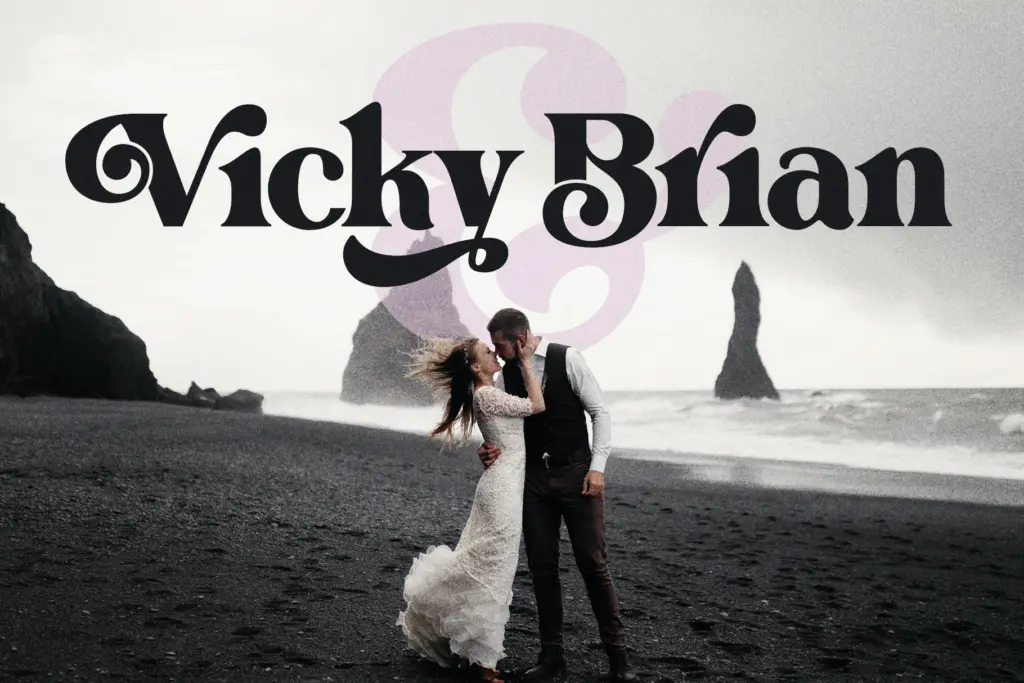
This is a display font in the literal sense: it’s built for headlines, logotypes, packaging lockups, and short editorial titles, not paragraphs of running copy. At large sizes the rounded terminals and moderate contrast give it warmth without looking dated in a bad way — it reads as retro-informed rather than retro-costumed, which is a useful distinction for branding work that wants a nostalgic note without going full pastiche. Packaging for food, drink, and lifestyle products where a 70s-adjacent feel is on brief is an obvious fit, as is any logotype that wants some personality in the letterforms themselves rather than relying on colour or layout to do the work.
It’s less suited to anything that needs to hold up at small sizes or in dense text — the character of the letterforms is exactly what would get lost or turn muddy in a caption or body paragraph. Two styles also means it can’t carry a whole identity system on its own; it wants a plainer sans or serif alongside it for supporting text. Used within its intended scope — headlines, short editorial pieces, logotypes, packaging — it does a clear job with a distinct point of view.
What we liked, and what we didn’t
Strengths
- Rounded, moderate-contrast letterforms that read as retro without looking like a novelty font
- Ligatures and stylistic alternates add real variation to repeated letters in headlines
- Italic has enough extra flourish to work as a genuine secondary style, not just a slant
Trade-offs
- Only two styles, so it can't anchor a full branding system alone
- Alternates require glyph-panel software, limiting access in simpler workflows
Olive Village does a specific job well: it brings genuine 70s warmth to headlines and packaging without tipping into costume-font territory. It's not built for body text or full identity systems on its own, but for short display work with a retro mood, it earns its keep.
Verdict

Tantype reviews typefaces in depth — every font is tested in real branding, editorial and screen layouts before a word gets written. 555+ fonts reviewed and counting.