
The Picnic Club: a groovy 80s-inspired serif for retro branding
Design style
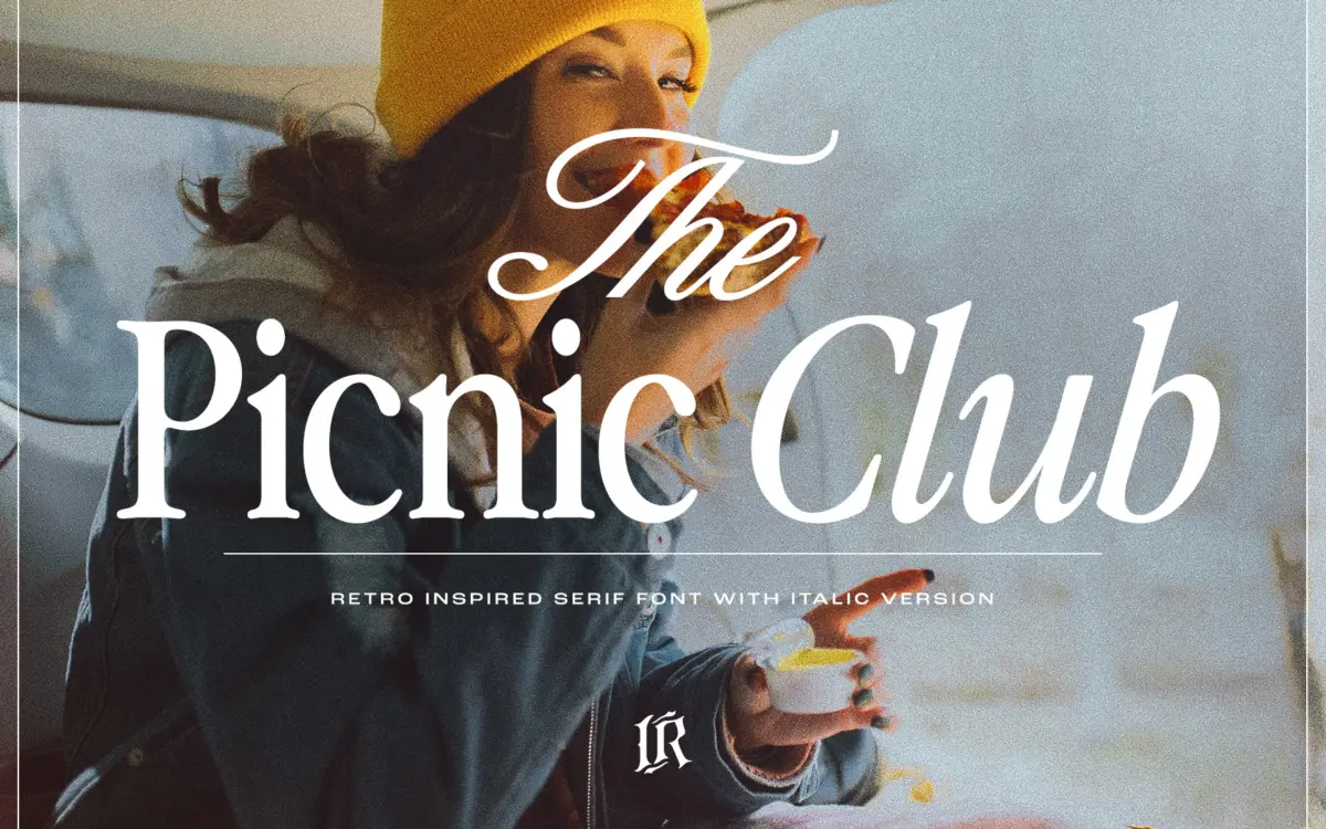
The Picnic Club leans on a specific decade rather than a vague idea of “vintage.” The letterforms carry that early-80s groove: slightly bounced baselines, warm curves, and serifs that flare rather than taper to a point. It reads more like a hand-cut display face from a retro magazine spread than a workhorse text serif, and that’s clearly the intent. Contrast is moderate — enough to give the strokes some personality without collapsing at small sizes.
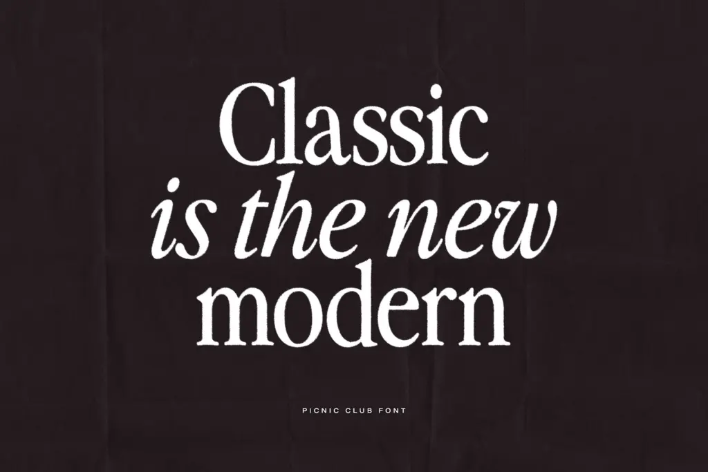
The italic is where the character really shows up. It swings further into script territory, with connections and slants that push the design away from anything neutral. Paired with the upright, the two give you a way to build a little rhythm on a page — regular for structure, italic for accent — without reaching for a second family.
It’s not a subtle typeface. The curves are rounded in a way that reads as friendly rather than formal, and the overall texture sits closer to a poster or a record sleeve than to a book page. If you’re after quiet elegance, this isn’t it. If you want something that announces a decade, it does that job directly.
Character set and features
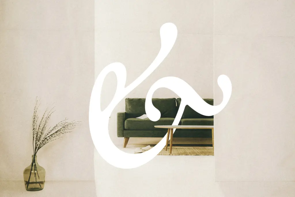
Alongside the regular weight, the italic gives the family a second register without introducing a whole new voice — useful for the kind of layouts where you want variation but not contrast. Stylistic alternates are included for readers with access to a glyphs panel in something like Photoshop or Illustrator, which opens up swapping in looser, more script-like versions of certain letters where the base glyph feels too tidy. Ligatures are also built in and work without extra software, smoothing over some of the more awkward letter pairs that come with a font this decorative.
Because the alternates require manual access through a glyphs panel, casual users working in template-based tools may never see the full range of what’s on offer. That’s worth knowing before you buy: the font looks fine out of the box, but a chunk of its personality is locked behind software most Canva-level users won’t open.
Use cases
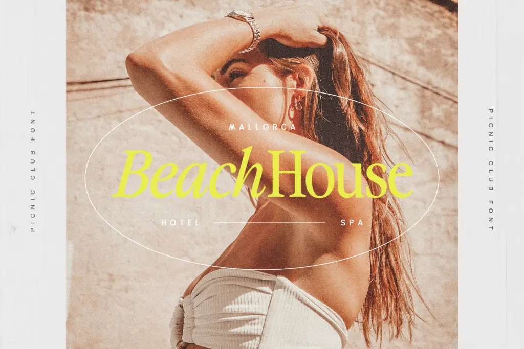
This is a display font, and it should be treated as one. It’s built for headlines, logotypes, packaging fronts, and short editorial titles — not paragraphs. At body-copy sizes the rounded terminals and bounce start to blur the reading rhythm, so keep it to a few words or a line, not a paragraph.
Where it earns its keep is in branding work that wants a specific retro mood: café signage, vintage-themed packaging, festival or event titles, social graphics aimed at a nostalgic audience. The italic works well as a secondary flourish — a tagline under a bolder headline set in the upright. It’s less suited to anything that needs to read as serious, corporate, or timeless; the 80s reference is baked in and won’t fade into the background the way a more neutral serif would.
What we liked, and what we didn’t
Strengths
- Italic swings convincingly into script territory, giving the family real range without adding a second font
- Ligatures work automatically, smoothing awkward letter combinations without extra setup
- Clear decade-specific personality that reads instantly in branding and packaging contexts
Trade-offs
- Stylistic alternates require glyphs-panel access, so users in template tools miss much of the design's depth
- Rounded, bouncy terminals lose clarity at body text sizes, limiting it strictly to display use
The Picnic Club nails a specific retro mood with real character in its italic and alternates, but it's a display font through and through — don't ask it to set body copy. Best suited to branding, packaging, and headline work that wants an unmistakably 80s flavour.
Verdict

Tantype reviews typefaces in depth — every font is tested in real branding, editorial and screen layouts before a word gets written. 555+ fonts reviewed and counting.