
TAN-SUNSET: a warm, flourish-heavy serif for summery branding work
Design style
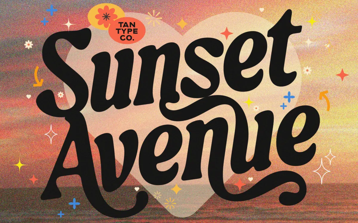
TAN-SUNSET sits in serif territory but leans hard into personality rather than restraint. The strokes carry noticeable contrast, swelling and thinning in a way that reads more hand-cut than mechanical, and the serifs themselves are soft and slightly flared rather than sharp or bracketed in the traditional sense. There’s a looseness to the drawing — terminals curl, some letters lean into a gentle diagonal energy — that gives the face a breezy, unbuttoned feel rather than the formality you’d expect from a text serif.
This is a display-first design. The letterforms are generous with their curves and the rhythm between characters is deliberately uneven in places, which suits a headline or a short phrase far better than a paragraph. It reads as warm and a little nostalgic, the kind of serif that wants to sit next to a photograph of a beach town or a hand-poured candle rather than inside a financial report.
Character set and features
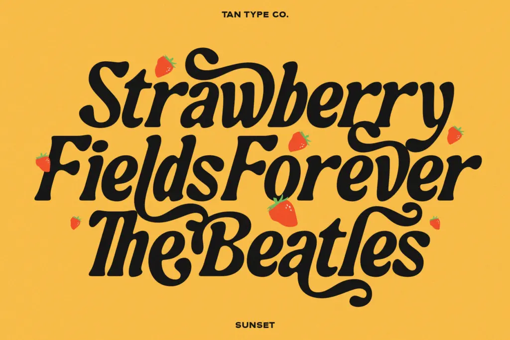
The seller notes multilingual support and OpenType access, which matters here because a face this expressive tends to lean on discretionary ligatures and alternate characters to avoid awkward repetition — think double letters or adjacent curves that could otherwise collide. Software that reads full OpenType features will unlock more of what makes the face feel varied; without that support, expect a flatter, more repetitive version of the same personality. Worth checking before committing a layout to it, particularly if the working file will pass through Canva or similar tools with partial OpenType support.
Weight and language details beyond that aren’t specified, so treat TAN-SUNSET as a single-weight display face until proven otherwise, and test any non-Latin characters you need directly rather than assuming full coverage.
Use cases
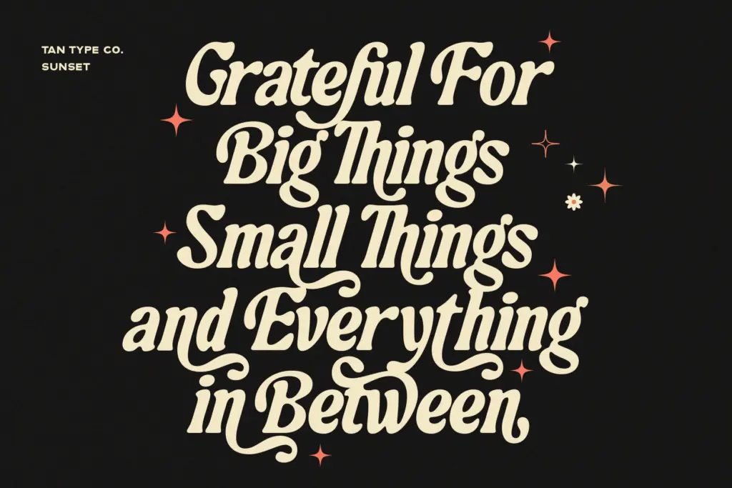
This is a logotype and headline font first. It suits packaging for food, drink, and lifestyle products, especially anything trading on a relaxed or nostalgic mood — think seasonal product lines, small-batch labels, or a boutique’s seasonal collection. It works well for wedding stationery too, particularly for couples who want something looser and more personal than a formal script or engraved serif, and for short editorial headlines where the warmth of the letterforms can do some of the emotional work a photograph would otherwise carry.
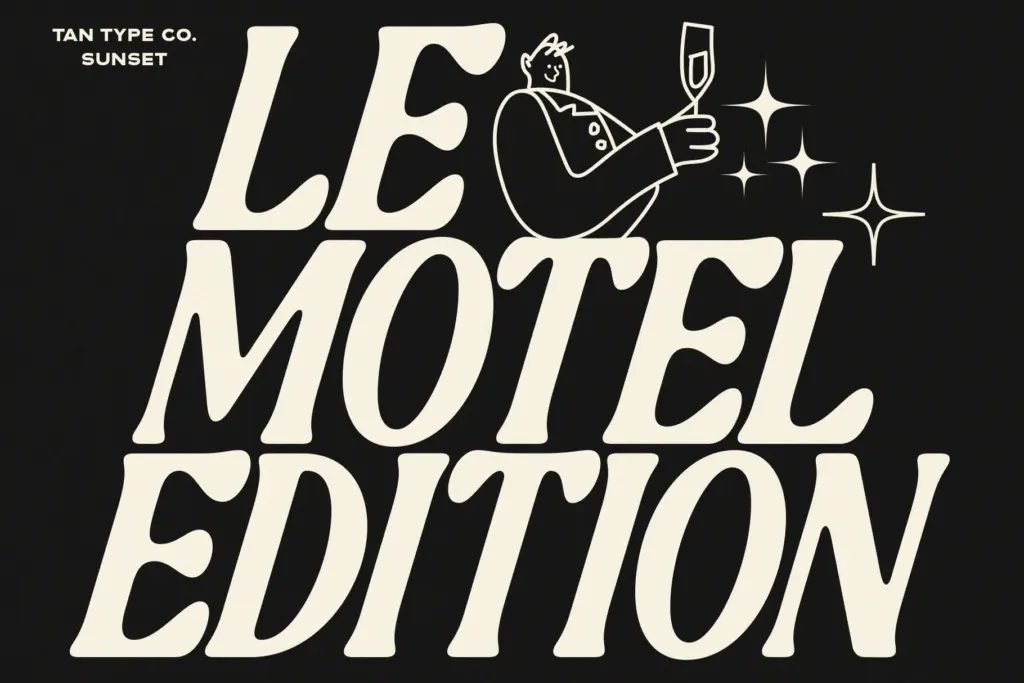
Where it struggles is anywhere that calls for restraint or long-form reading. Set it in a paragraph and the contrast and irregular rhythm start to work against comprehension rather than for it. It also won’t sit quietly as a secondary or supporting typeface — its personality is loud enough that it wants to be the loudest thing on the page, which means pairing it with something plain and letting it do the talking, rather than asking it to share space with another expressive face.
What we liked, and what we didn’t
Strengths
- The soft, flared serifs and shifting stroke contrast give it a distinctly hand-cut, unmechanical feel.
- OpenType alternates and ligatures help avoid the repetition that expressive display faces usually struggle with.
- Strong fit for packaging, seasonal branding, and wedding stationery where mood matters more than density of text.
Trade-offs
- The irregular rhythm and heavy contrast make it unsuitable for anything beyond short headlines or logotypes.
- Full character variety depends on OpenType support, so results will vary noticeably between design tools.
TAN-SUNSET is a characterful display serif that trades legibility for warmth, and it knows exactly what job it's built for. It won't work as body text or a quiet supporting face, but for short-form branding and packaging with a nostalgic, seasonal mood, it delivers real personality.
Verdict

Tantype reviews typefaces in depth — every font is tested in real branding, editorial and screen layouts before a word gets written. 555+ fonts reviewed and counting.