
Jimmy Rough: a distressed sans, serif and script trio for retro branding
Design style
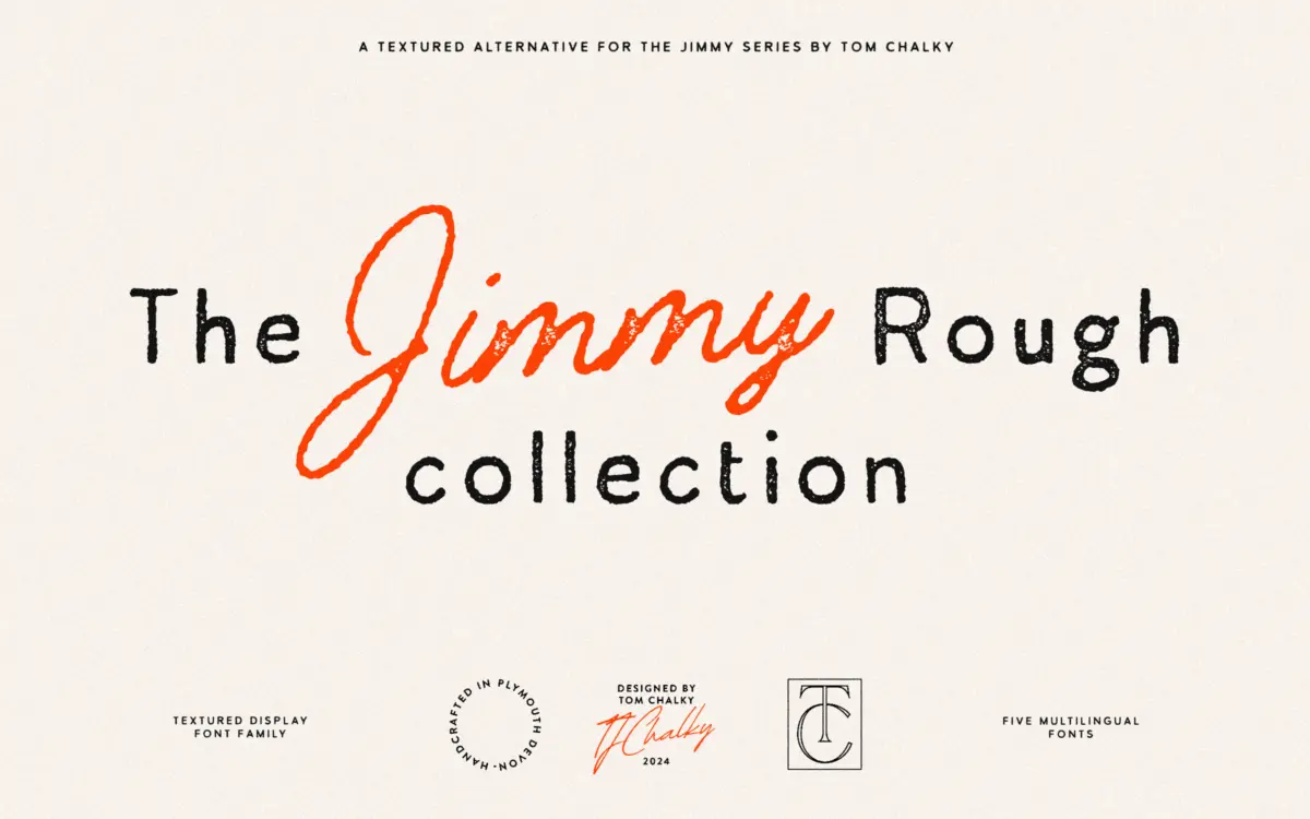
Jimmy Rough is a collection rather than a single face: a sans, a serif and a monoline script, each run through the same distressing treatment. The idea is coherence through texture rather than through construction — the three skeletons are quite different, but the rough edges, ink fill and worn strokes tie them together as a family. It reads as a set built by someone thinking about packaging shelves and apparel prints, not editorial pages.
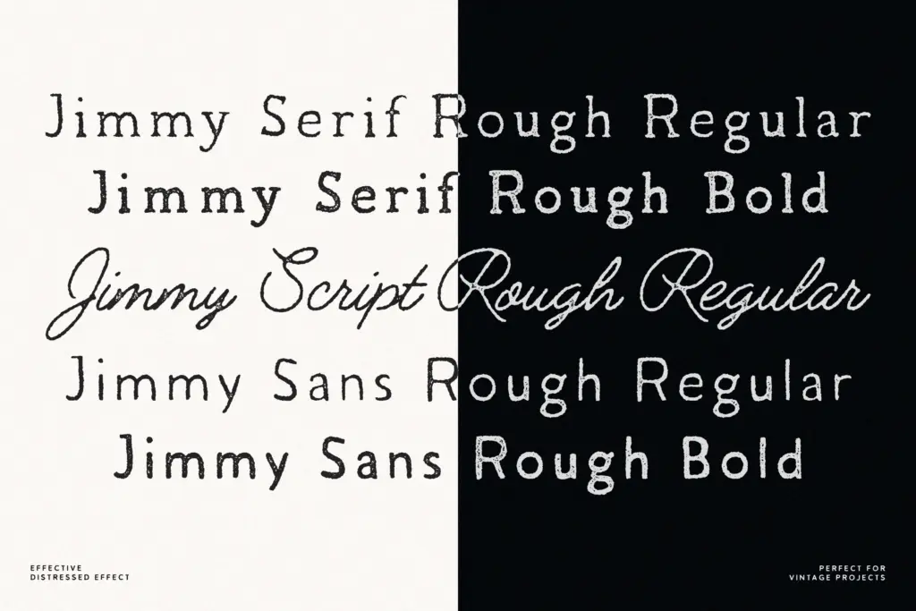
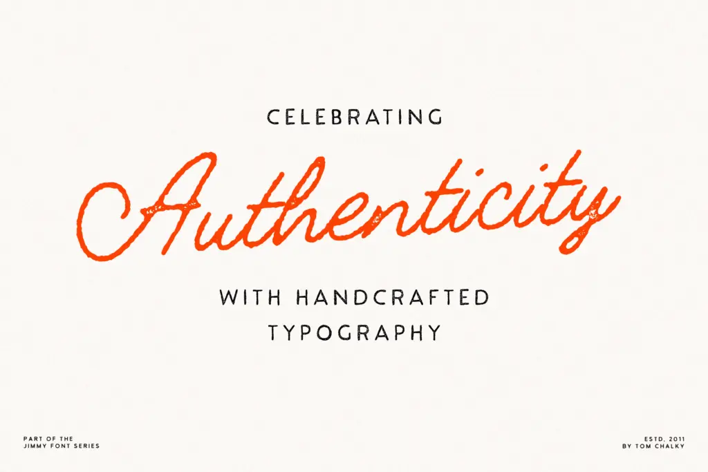
The sans is blunt and workmanlike, with slightly irregular stroke widths that keep it from looking stamped out by a machine. The serif carries a bit more personality, with soft, uneven terminals that suggest a worn printing plate rather than a chisel. The script is the most expressive of the three: a monoline hand with a loose, unfussy connection between letters, closer to a marker than a pen. None of the three pieces is trying to be a display showpiece on its own — the interest is in the texture and in how they sit next to each other.
Character set and features
Each of the five styles — Sans Rough Regular, Sans Rough Bold, Serif Rough Regular, Serif Rough Bold and Script Rough — covers extended Latin glyphs, so accented languages beyond basic English should be supported. The distressing is baked into the letterforms rather than applied as a separate overlay layer, which means the texture is consistent but also fixed: you can’t dial the roughness up or down without redrawing or applying your own effects on top.
Because the three sub-families share a common texture treatment but not a shared structural logic, they work best used deliberately rather than interchangeably. The sans and serif bold weights are sturdy enough to anchor a headline; the script is lighter and needs more room to breathe, especially at small sizes where the monoline strokes and the distress can start to compete with each other.
Use cases
This is a font family for surfaces that want some grain in them: labels, tags, apparel prints, packaging, signage that’s meant to look handled rather than pristine. The rough finish does real work in these contexts — it reads as print imperfection, not as a digital afterthought, which is the whole appeal of a distressed set like this.
It’s less suited to long-form text or anything that needs to stay crisp at small sizes on screen, where the texture can turn to noise. Logo work is a reasonable fit if the brand is leaning into a handmade, nostalgic register — think small-batch food, craft goods, retro revival branding — but it will fight against anything aiming for polish or minimalism. Used as a trio, with the sans for body copy, the serif for secondary emphasis and the script for a signature flourish, it does the job it was built for: giving a design project a sense of worn, handmade authenticity without requiring three separately licensed unrelated fonts to get there.
What we liked, and what we didn’t
Strengths
- Three distinct structures — sans, serif, script — share one coherent worn texture
- Bold weights in the sans and serif are sturdy enough to anchor headline work
- Extended Latin coverage across all five styles supports accented languages
Trade-offs
- The distressing is fixed into the letterforms, so texture intensity can't be adjusted
- Script and lighter weights lose clarity at small sizes where texture competes with the strokes
Jimmy Rough is a competent distressed trio built for shelf and apparel work rather than text. The texture is consistent and well judged for that job, but it's a one-note effect that limits the family's reach beyond retro, handmade-feeling branding.
Verdict

Tantype reviews typefaces in depth — every font is tested in real branding, editorial and screen layouts before a word gets written. 555+ fonts reviewed and counting.