
Fairwren: a hand-inked serif for storybook and cottagecore branding
Design style
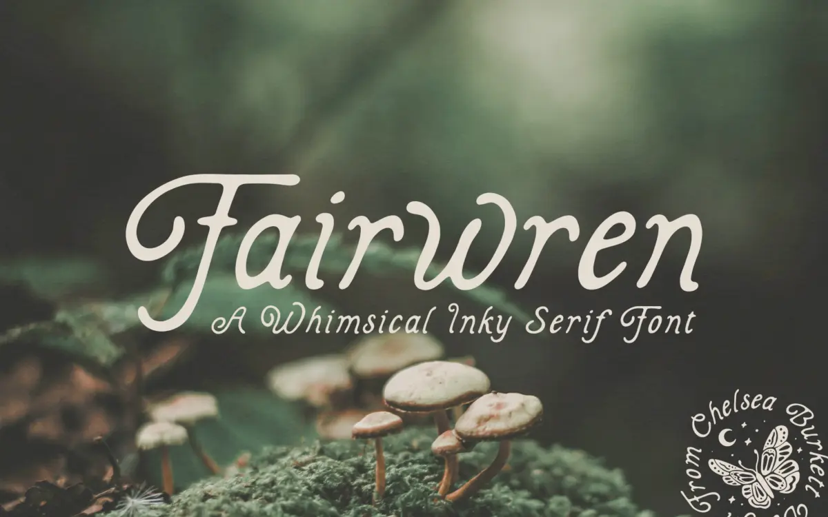
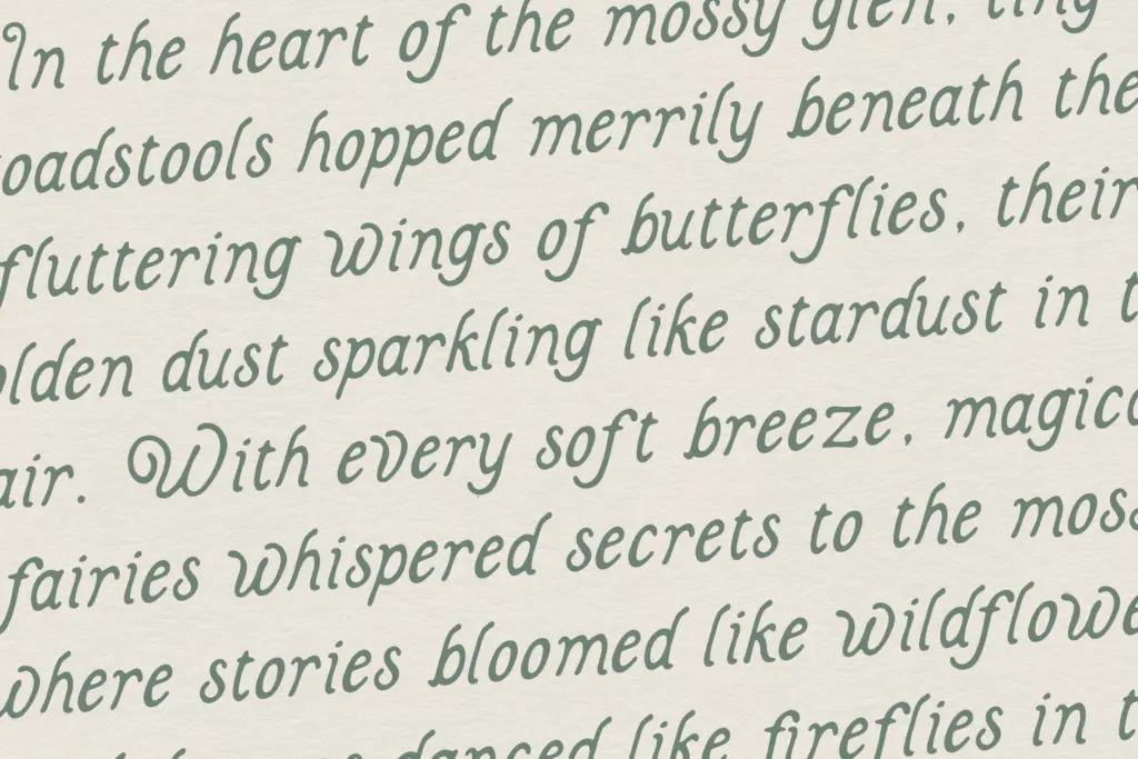
Fairwren is a bold serif built on solid, slightly irregular strokes with inky edges that suggest a nib dragged over rough paper rather than a clean digital outline. The curves have a hand-drawn wobble to them — not shaky, but clearly not ruled with a compass. Terminals curl inward here and there, giving individual letters a small flourish without tipping into full decoration. The overall effect sits somewhere between a woodcut label and a storybook title page: sturdy enough to read as a headline, loose enough to feel handmade.
Where it distinguishes itself from the glut of similar ‘whimsical serif’ releases is in how deliberately uneven the strokes are. Some letters lean heavier than others, and the inking isn’t symmetrical stroke to stroke. That inconsistency is the whole point — it reads as ink on paper, not a filter applied to a geometric serif. Designers who want that fairy-tale, hand-lettered warmth without moving into full script territory will find this does the job cleanly.
Character set and features
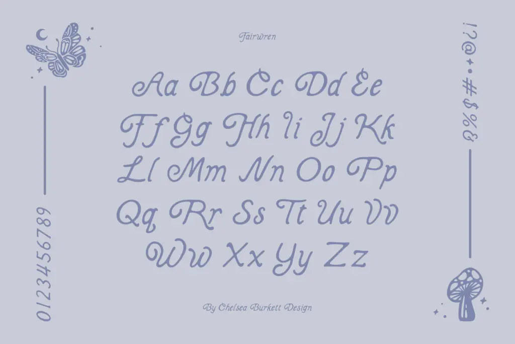
The set covers uppercase and lowercase letterforms, numerals and standard punctuation — a workable base for short-form typesetting rather than a font built for long-form editorial text. There’s no mention of alternates, ligatures or extended language support, so treat this as a single-style display face: what you see in the specimen is what you get, without swapped letterforms to break up repetition.
That’s a fair trade for a font in this category, but it does mean repeated letters in a headline or logotype will look identical each time, which can undercut the hand-drawn illusion if the same word or letter appears twice in close proximity. Worth testing your specific wording before committing to a layout, especially for logotypes where a repeated ‘e’ or ‘o’ might sit awkwardly next to itself.

Use cases
Fairwren is a display face first, and it should stay one. At headline and title sizes — book covers, product packaging, wedding stationery headers, market or farm branding — the inky irregularity reads as intentional charm. Push it down to body copy or dense captions and the irregular strokes start to blur the letterforms; legibility drops fast below a certain point size, so keep it for words and short phrases rather than paragraphs.
It suits nature-adjacent and storybook-flavoured branding especially well: fairy garden or cottage-industry labels, children’s book titles, small-batch packaging, invitation suites that want a handcrafted rather than formal tone. It will feel out of place in anything corporate, technical or minimalist — the whole character of the design fights against restraint. Pair it with a plain sans or a quiet serif for supporting text, since Fairwren does not want to compete with another expressive face in the same layout.
What we liked, and what we didn’t
Strengths
- The uneven, ink-dragged strokes feel genuinely hand-drawn rather than filtered
- Bold enough presence to anchor packaging and headline work on its own
- Fits cottagecore, storybook and nature branding without overreaching into cuteness
Trade-offs
- No alternates or ligatures means repeated letters look identical, which can flatten the handmade effect
- Legibility drops quickly below headline sizes, so it's unsuitable for body text
Fairwren delivers convincing hand-inked charm at display sizes, with genuinely uneven strokes that avoid the flat, templated look common to this style. It's a single-style display face with a basic character set, so it's best kept to headlines, logotypes and short packaging text rather than anything longer.
Verdict

Tantype reviews typefaces in depth — every font is tested in real branding, editorial and screen layouts before a word gets written. 555+ fonts reviewed and counting.