
La Charlune: a copperplate script roughened up with a hand-drawn edge
Design style
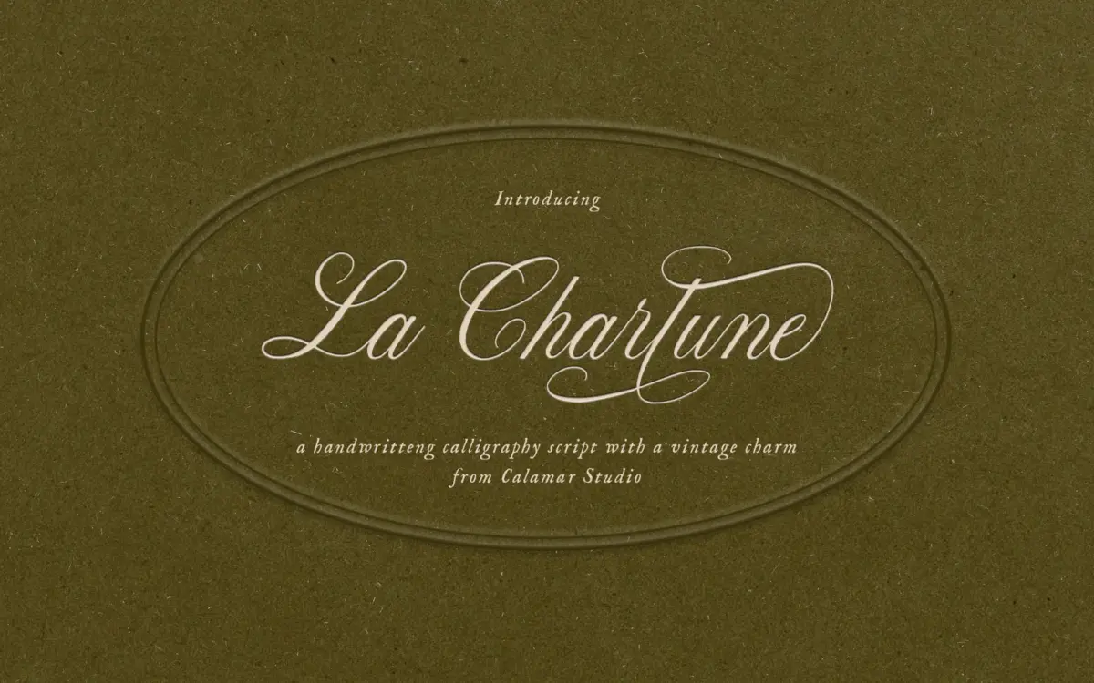
La Charlune takes the bones of copperplate script — the steep slant, the thick-thin contrast built from pressure rather than a flat pen, the looping ascenders — and roughens the edges. Where a strict copperplate face keeps its hairlines perfectly even, this one lets them waver slightly, breaking up here and there as though the nib skipped on textured paper. The result reads as calligraphy remembered rather than calligraphy copied: formal in structure, a little worn in execution.
The contrast between thick downstrokes and thin connectors is pronounced, which is what gives it that copperplate lineage in the first place. But the irregularities are consistent enough that the script doesn’t feel careless. It’s a controlled kind of distress, applied evenly across the alphabet rather than randomly scattered, so the texture reads as a deliberate finish rather than a filter slapped on afterward.
Character set and features
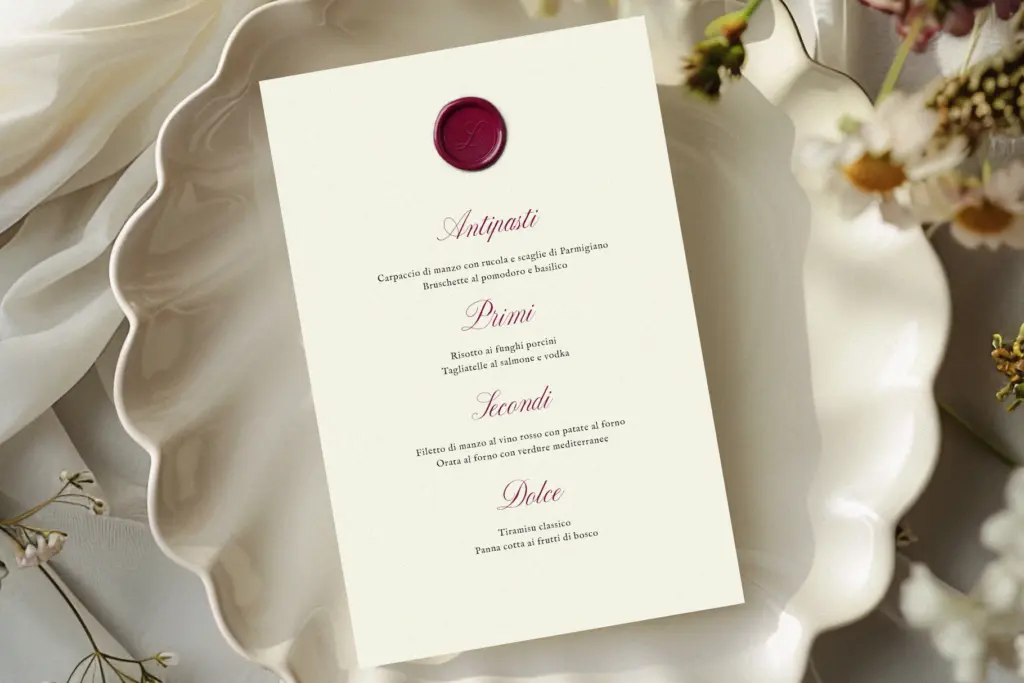
The lowercase carries the most personality — long entry strokes, elegant loops on b, l, and h, and connecting strokes that thin out almost to nothing before the next letter picks up. Capitals lean further into the copperplate tradition, with flourished swashes on letters like C, L, and S that would suit a monogram or a single dropped initial more than a run of text. Numerals and basic punctuation are present, though this isn’t a face built for setting long passages — the connective logic between letters relies on careful spacing, and pushing it into paragraph form quickly turns muddy.
Given its handwritten, textured nature, this is a script best appreciated as individual words or short phrases rather than dense copy. At small sizes the fine hairlines and broken edges start to compete with each other, so it wants room to breathe — generous point size, generous line spacing, and not much else fighting for attention on the page.
Use cases
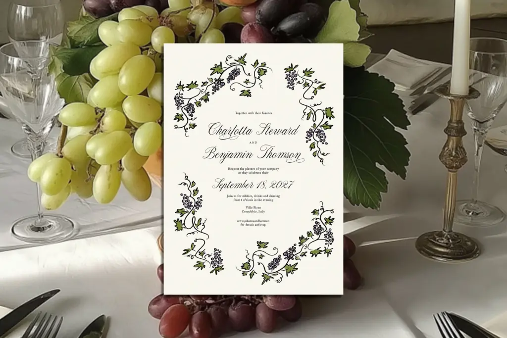
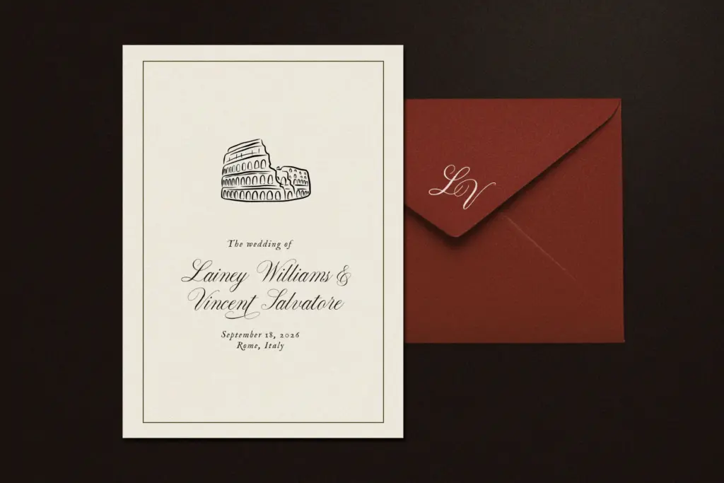
Wedding stationery is the obvious home for this — invitation headers, monogram initials, the bride and groom’s names set large on a save-the-date. The blend of formality and hand-touched texture suits that brief specifically because weddings tend to want both: tradition, but with a sense that a real hand was involved somewhere in the process. It also reads well on packaging for anything positioning itself as artisanal — a label on a bottle, a tag on a gift box, a logotype for a small studio that wants warmth without looking casual.
It’s less suited to interface work, body copy, or anything that needs to hold up at nine or ten points on a screen. The texture and contrast are the whole point of the design, and both get lost below a certain size. Treat it as a display and accent typeface — a word or two doing a lot of visual work — rather than a workhorse for setting text.
What we liked, and what we didn’t
Strengths
- The controlled irregularity gives it warmth without looking sloppy
- Flourished capitals work well as standalone monograms or drop initials
- Strong fit for wedding stationery and artisanal packaging
Trade-offs
- Fine hairlines and texture break down at small sizes
- Not designed for paragraph-length text or dense layouts
La Charlune does one thing well: a copperplate script with a worn, hand-touched finish that suits wedding and luxury branding work. It's not built for long text or small sizes, and the flourished capitals need careful pairing, but as a display script for short phrases it has real character.
Verdict

Tantype reviews typefaces in depth — every font is tested in real branding, editorial and screen layouts before a word gets written. 555+ fonts reviewed and counting.