
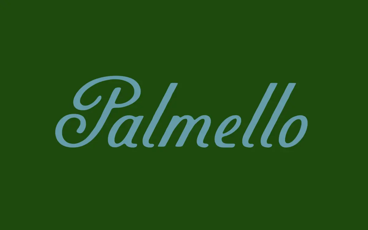
Palmello: a non-connecting script built for retro sign-painted branding
Design style
Palmello belongs to the sign-painter school of script: letters that reference brush and pen work but don’t try to fake continuous cursive joins. Each character stands on its own, with just enough irregularity in stroke weight and baseline to suggest a hand rather than a plotter. The reference point is mid-century European advertising, and it shows in the slightly squared bowls and the way ascenders and descenders flick rather than loop. There’s a lived-in quality to the drawing — nothing here is mechanically repeated, which is both the charm and the risk of this kind of script.
The stroke contrast is moderate. It reads as brushy without tipping into full calligraphic drama, which keeps it readable at a range of sizes. Where it distinguishes itself from the glut of similar market-and-packaging scripts is in restraint: the swashes are kept short, the letters don’t fight each other for space, and the overall texture is closer to hand lettering on a shop window than to wedding calligraphy.
Character set and features
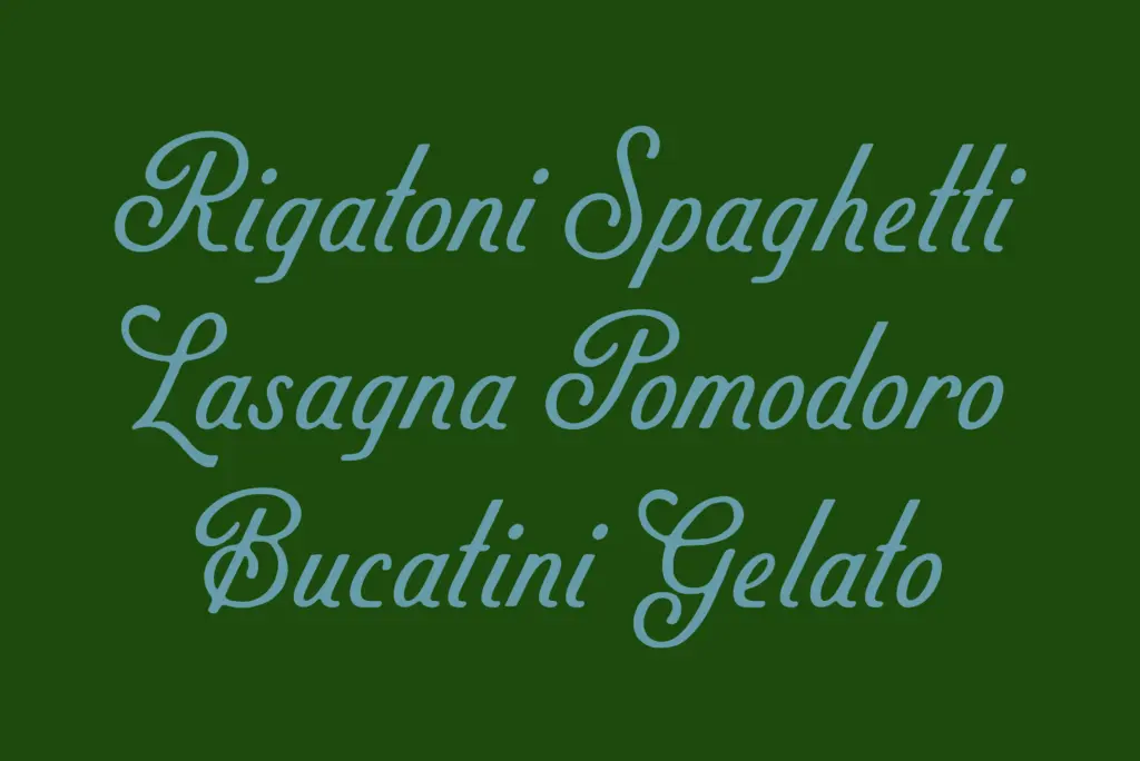
As a non-connecting script, Palmello sidesteps the usual headache of scripts that rely on contextual alternates to fake a continuous line — there’s no need to worry about awkward joins breaking the illusion, because it was never trying to look joined in the first place. That said, the letterforms still carry enough hand-drawn variation between similar letters that setting the same word twice can produce slightly different textures, which is part of the appeal rather than a flaw.
The set covers the standard punctuation and figures you’d expect from a display script, with the lowercase doing most of the personality work. Capitals lean more toward label lettering than script flourish, which makes them useful as initials or short headline treatments rather than as a script capital that needs to loop into the next letter. Spacing has been handled with an eye toward setting short phrases rather than long passages — kerning holds up in product names and headlines, and starts to feel loose in anything longer.
Use cases
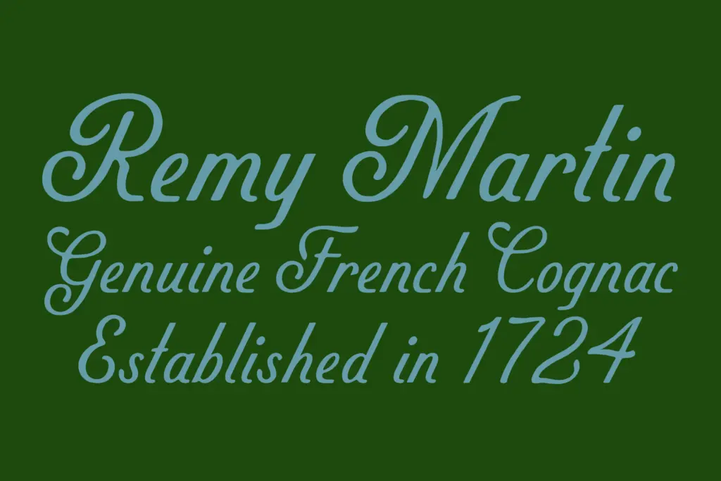
Palmello’s natural home is packaging and label design — the kind of jam jar, bottle, or bakery box lettering that wants warmth without looking twee. It also works well for logotypes and wordmarks where a brand wants to suggest heritage or craft without going full calligraphy. Market signage, café menus, and retro-leaning editorial headlines are all reasonable fits.
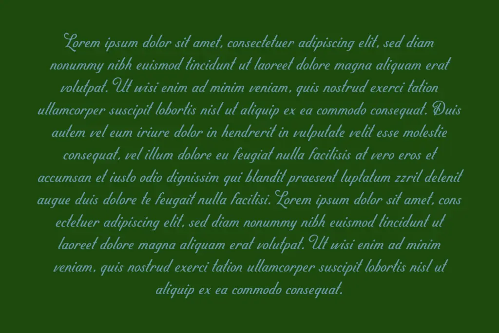
It’s less suited to body copy or anything requiring sustained reading — the seller’s claim that it holds its own in supporting copy is optimistic; at small sizes the hand-drawn irregularity that gives it charm starts to work against clarity. It’s also not the right choice for anything needing a formal or elegant tone, since the sign-painted roughness reads as casual and commercial rather than refined. Best used as a display face doing a handful of words at a time.
What we liked, and what we didn’t
Strengths
- Non-connecting structure avoids awkward join artifacts common in script fonts
- Moderate stroke contrast keeps it legible across a range of display sizes
- Restrained swashes make it easier to use in tight packaging layouts than more ornate scripts
Trade-offs
- Kerning loosens noticeably in longer phrases or full sentences
- Not suited to body copy despite claims of supporting-text versatility
Palmello is a solid, well-observed take on sign-painter script lettering, best used for short bursts of text on packaging and branding rather than continuous reading. It doesn't reinvent the genre but it avoids the usual pitfalls of fake-connected scripts. Buy it for labels and logotypes, not for setting paragraphs.
Verdict

Tantype reviews typefaces in depth — every font is tested in real branding, editorial and screen layouts before a word gets written. 555+ fonts reviewed and counting.