Script
3.9
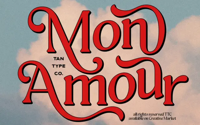
Mon Amour: a groovy retro script for warm, handmade-feeling branding
Design style Mon Amour pulls from 70s lettering — the kind of hand-lettered logotype you’d find on a record sleeve…
 Tantype

Design style Mon Amour pulls from 70s lettering — the kind of hand-lettered logotype you’d find on a record sleeve…
Tantype
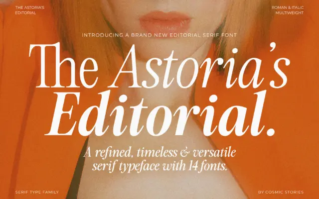
Design style The Astoria’s Editorial Serif sits in a familiar but well-populated lane: the advertising-inspired serif that borrows its bones…
Tantype
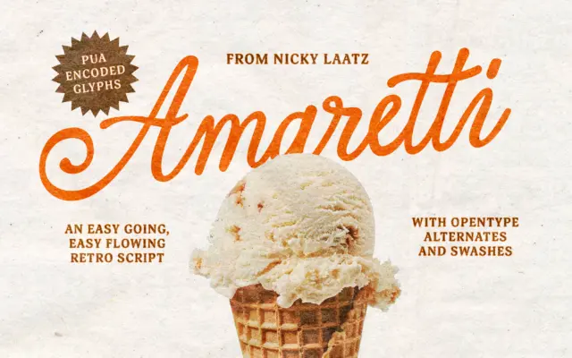
Design style Amaretti belongs to the family of calligraphic scripts built to look hand-lettered rather than machine-drawn, and it pulls…
Tantype
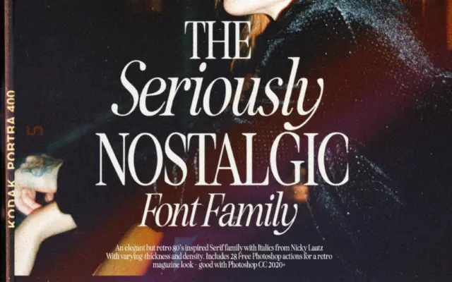
Design style Seriously Nostalgic Serif borrows its attitude from eighties magazine mastheads and fashion spreads rather than from book typography.…
Tantype
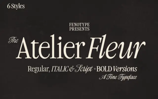
Design style Atelier Fleur takes Garamond’s old-style bones and squeezes them into a condensed frame built for headline duty rather…
Tantype
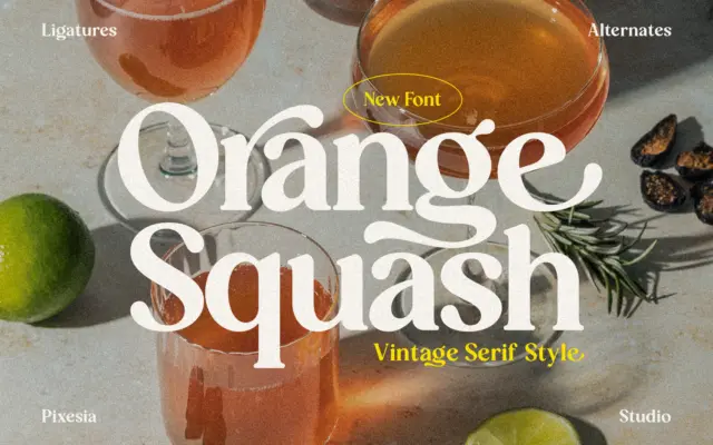
Design style Orange Squash sits in the family of bold vintage serifs that borrow from 1970s packaging and signage rather…
Tantype
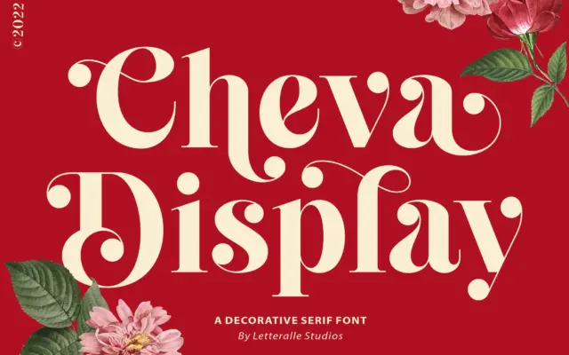
Design style Cheva Display sits somewhere between a slab and a transitional serif, with heavy strokes that carry a soft…
Tantype
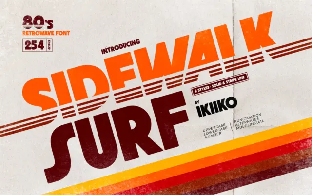
Design style Sidewalk Surf is a heavyweight display letterform built to sit inside the 1980s retrowave revival — the world…
Tantype
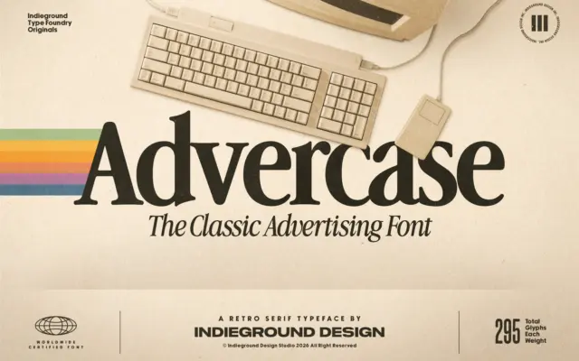
Design style Advercase is a serif built on a specific reference point: the Garamond-derived face Apple used in its print…
Tantype