
Cheva Display: a bold vintage-leaning serif for headlines and branding
Design style
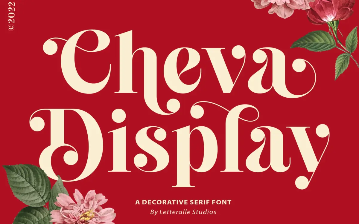
Cheva Display sits somewhere between a slab and a transitional serif, with heavy strokes that carry a soft curve rather than a hard edge. The bowls are rounded, the terminals nudge toward a hand-cut look without tipping into script territory, and the overall weight gives it presence at large sizes. There’s a vintage undertone here — the kind of letterforms you’d expect on an old product label or a hand-painted sign — but the spacing and proportions are tuned enough that it doesn’t read as pastiche. It’s a display face first: the strokes are too heavy and the rhythm too irregular for it to disappear into a paragraph.
The curves Letteralle Studios mention are real but restrained. This isn’t a font built around flourish; it’s built around weight and a bit of warmth in the joins. That restraint is what makes it usable outside of one narrow aesthetic lane — it can lean rustic or it can lean contemporary, depending on what you pair it with and how much space you give the letters to breathe.
Character set and features
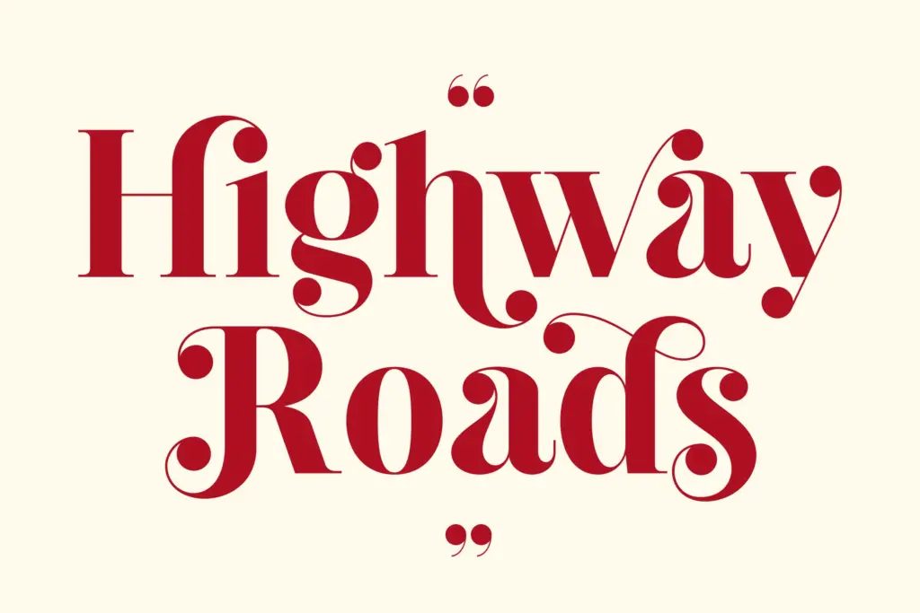
The set covers uppercase and lowercase, numerals, punctuation, and multilingual accents, so European-language projects aren’t an afterthought. Alternates and ligatures are included, and they do meaningful work here — swapping in an alternate lowercase g or a looping ligature changes the tone of a word noticeably, from stern to friendly, without changing the typeface. That’s more useful than a token handful of swashes tacked on for the sake of a feature list.
Where it’s less forgiving is at small sizes. The weight that gives Cheva its presence in a headline starts to clot at body-copy sizes — counters close up, and the rounded terminals lose definition. This is a font for setting words, not paragraphs. Kerning is generally even, though a few of the wider alternate characters need manual nudging when set tight, which is normal for a display face with this much personality in individual letters.
Use cases
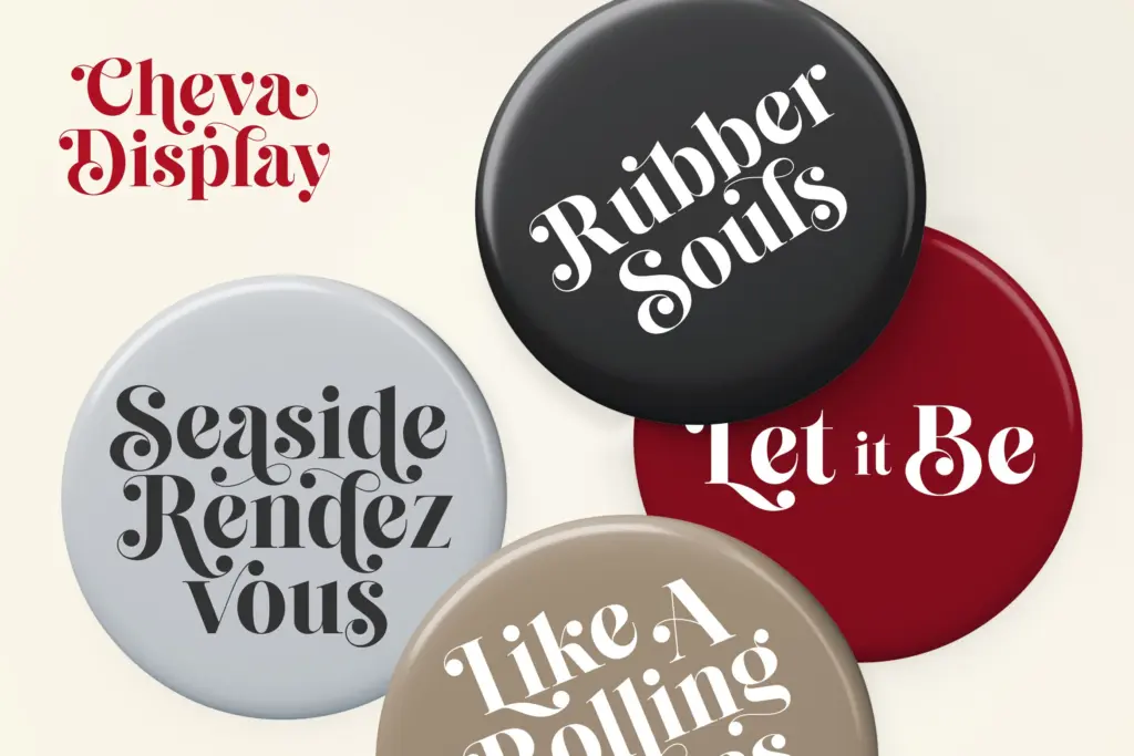
Cheva Display earns its keep on packaging, logo lockups, and merchandise — anywhere a short word or two needs to carry visual weight. It works well on labels, apparel graphics, and magazine headers where the goal is a strong first impression rather than sustained reading. Wedding stationery is a reasonable fit too, particularly for save-the-dates or signage rather than dense invitation copy, since the vintage warmth reads as celebratory without becoming saccharine.
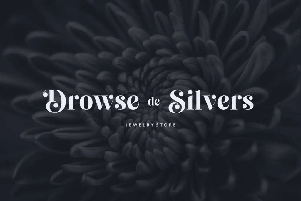
For branding work, it’s strong as a wordmark candidate for businesses wanting a slightly nostalgic, handcrafted signal — bakeries, small-batch goods, apparel lines — but it needs a plainer sans or serif alongside it to carry any supporting text. Don’t reach for it when you need a workhorse across a full editorial layout; it’s not built for that job, and pushing it there will show its limits fast.
What we liked, and what we didn’t
Strengths
- Alternates and ligatures noticeably change tone rather than just decorating letters
- Multilingual accent support makes it usable beyond English-language projects
- Weight and warmth give it strong presence on packaging and product labels
Trade-offs
- Counters close up and legibility drops at smaller sizes, limiting it to display use
- Some wider alternate glyphs need manual kerning adjustment in tight settings
Cheva Display is a confident headline face with real character in its alternates and ligatures, best used sparingly on packaging, logos and short display copy. It loses clarity fast at small sizes, so it needs a plain companion font for anything longer than a few words. A solid choice for branding work with a nostalgic edge, not a general-purpose typeface.
Verdict

Tantype reviews typefaces in depth — every font is tested in real branding, editorial and screen layouts before a word gets written. 555+ fonts reviewed and counting.