
Sidewalk Surf: a bold retrowave display face for 80s-styled titles
Design style
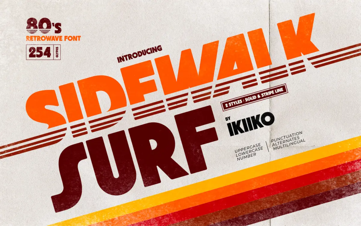
Sidewalk Surf is a heavyweight display letterform built to sit inside the 1980s retrowave revival — the world of chrome logos, sunset gradients and grid horizons. The letters are chunky and rounded, with thick strokes that lean toward the geometric rather than the organic. There’s a skateboard-deck, arcade-cabinet energy to the shapes: wide counters, blunt terminals, and a general refusal to whisper. It’s not trying to be subtle, and it shouldn’t be judged as if it were.
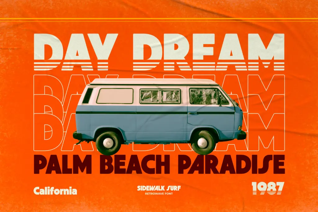
The font ships in two variations, Solid and Stripe Line. Solid is the workhorse version, a single dense fill that reads well from a distance. Stripe Line cuts a horizontal band or motion-line effect through the letterforms, which is the more overtly retrowave of the two — it’s the one that does the visual lifting when you want that sense of speed or neon movement without adding effects in software. Used together, they give you a base layer and an accent layer without needing a second typeface.
Character set and features
The set covers uppercase and lowercase, numerals and punctuation, plus alternate characters for some added variety in repeated letters — useful since a face this bold can start to look monotonous in longer words without some swap options. Multilingual support is included, which extends the font’s reach beyond basic Latin text, though buyers with specific language needs should check character coverage against their actual requirements before committing to it for body-heavy work.
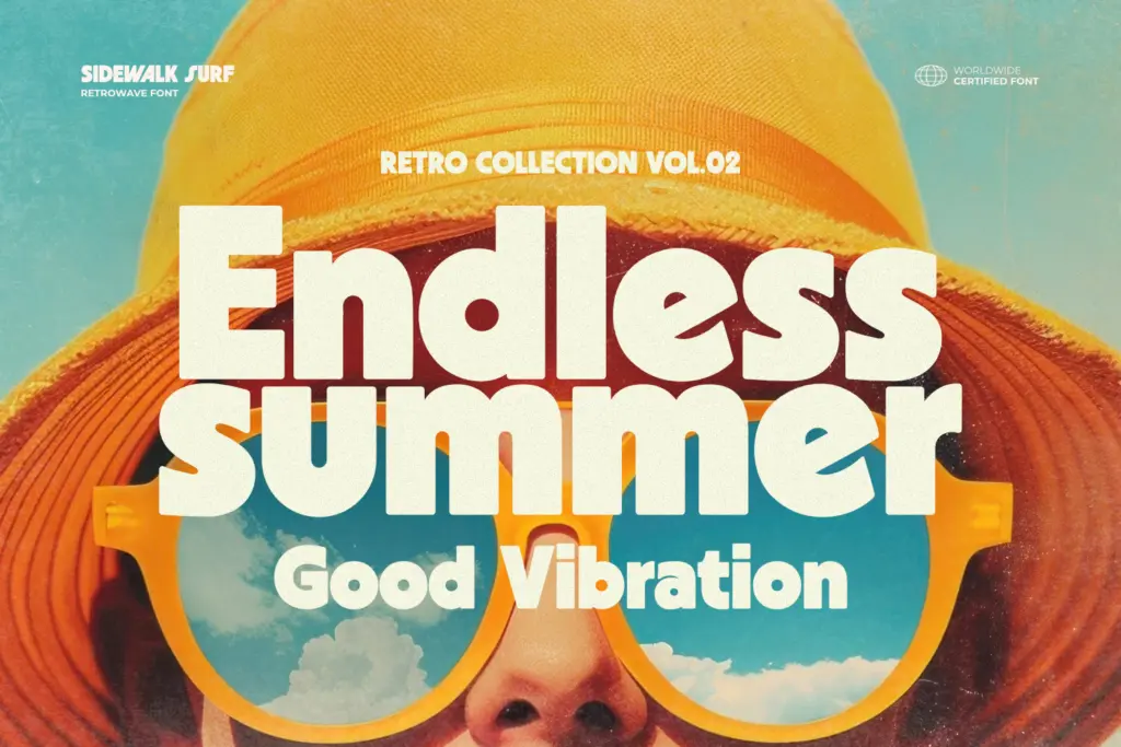
Because the letterforms are so wide and heavy, tracking matters more than usual here. Tight letter-spacing turns words into a solid block, which can work for a badge or logotype but will fight you in anything meant to be read at length. Open the spacing up and the retro poster feel comes through much more clearly. Lowercase exists but functions more as a supporting cast member — the uppercase is clearly where the personality lives, and most of the reference-worthy 80s treatments will lean on caps.
Use cases
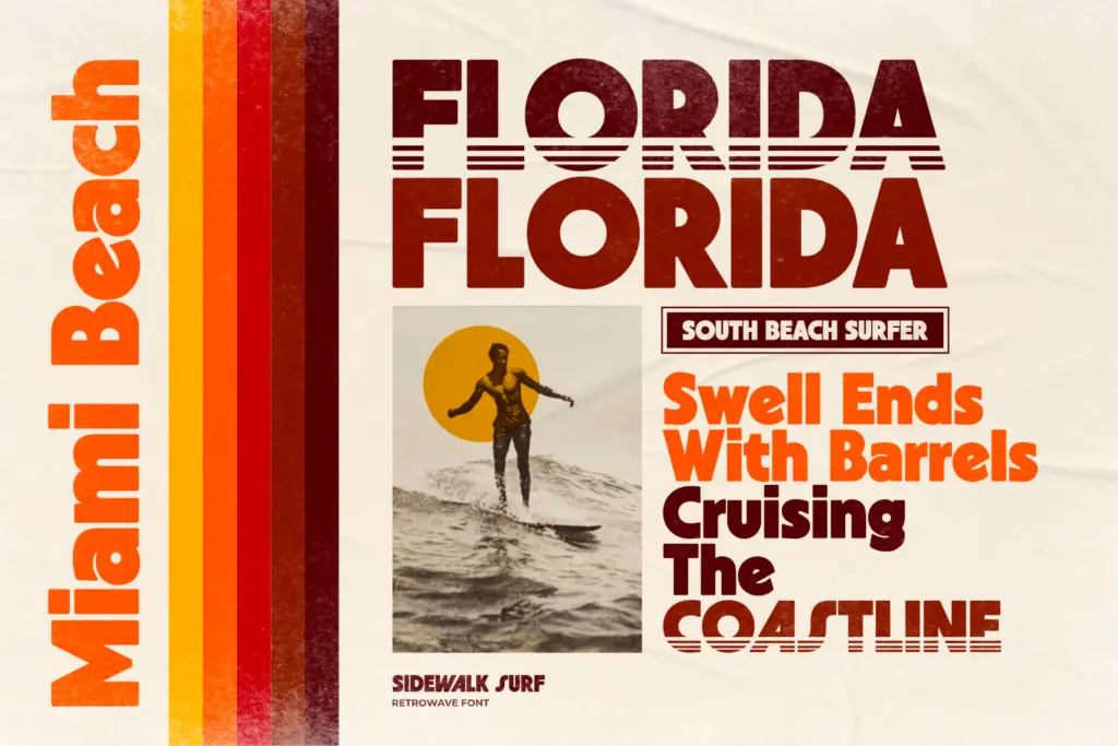
This is a font for headlines, not paragraphs. Posters, album art, apparel graphics, and packaging that wants a loud, nostalgic voice will get the most out of it. The Stripe Line variant in particular suits anything meant to evoke motion — surf and skate branding, VHS-era title cards, synthwave gig posters. Magazine mastheads and cover lines are a reasonable fit too, provided the layout has room for a big, confident wordmark rather than a subtle one.
It’s less suited to interfaces, body copy, or anything requiring restraint — the weight and styling don’t allow for it, and that’s by design rather than a flaw. Pair it with a plain, quiet sans-serif for supporting text and let Sidewalk Surf do the shouting. Used sparingly, at large sizes, with room to breathe, it does its intended job well; used for anything smaller or wordier, it will fight the reader.
What we liked, and what we didn’t
Strengths
- The Solid and Stripe Line pairing gives you a base and accent style without needing a second font.
- Alternate characters help break up repetition in a face this bold and heavy.
- The retro character comes through clearly at large display sizes without extra effects.
Trade-offs
- Legibility drops fast at smaller sizes or in tightly tracked settings.
- Lowercase feels secondary to the uppercase, limiting it mostly to headline-style use.
Sidewalk Surf commits fully to its 80s retrowave brief with confident, chunky letterforms and a useful two-style system. It's a strong pick for posters, logos and short headline work, but it's not built for anything beyond big, loud display type.
Verdict

Tantype reviews typefaces in depth — every font is tested in real branding, editorial and screen layouts before a word gets written. 555+ fonts reviewed and counting.