
Orange Squash: A Chunky Vintage Serif for Bold, Retro Headlines
Design style
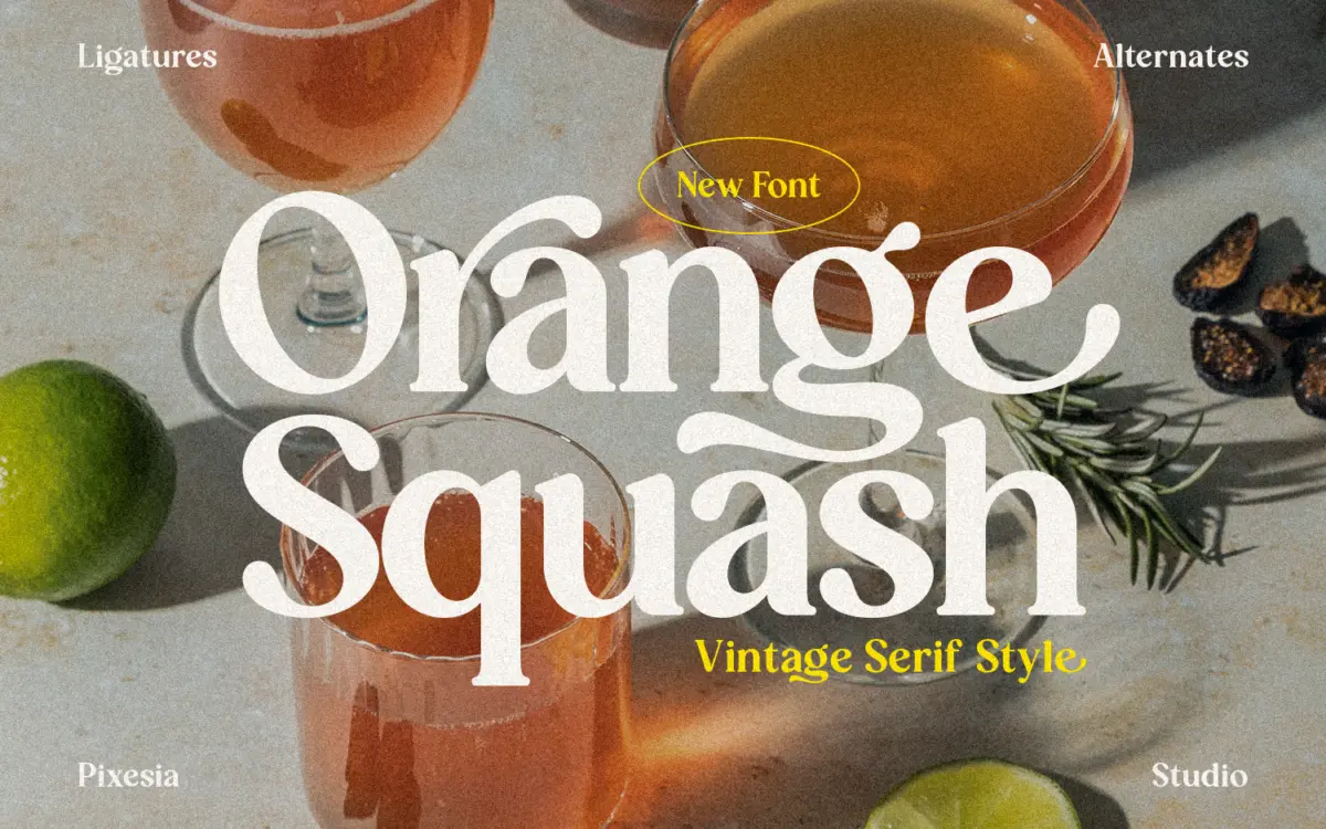
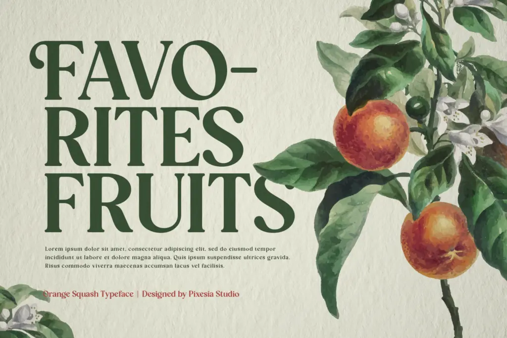
Orange Squash sits in the family of bold vintage serifs that borrow from 1970s packaging and signage rather than from book typography. The strokes are thick and confident, with serifs that read more as blunt wedges than as refined bracketed details. Curves bulge slightly at the shoulders of letters like R and G, giving the face a rounded, almost cartoonish warmth rather than the stiffness you’d expect from a slab.
What makes it feel vintage rather than simply heavy is the way the curves play against the straight stems. There’s a slight looseness to the drawing, a wobble in spirit if not in actual construction, that suggests hand-painted shop signs or citrus crate labels rather than a strict revival of a historical cut. It’s a font with a mood, and the mood is retro-cheerful rather than retro-serious.
Character set and features
The set covers uppercase and lowercase, numerals and standard punctuation, and the seller notes stylistic alternates and ligatures alongside PUA encoding, which is the usual route for accessing those extras without a glyph palette. That matters here because a font this characterful often needs the alternates to avoid repetition — in a headline where the same round letter appears twice, a swapped alternate breaks up the sameness that can otherwise make bold vintage faces feel monotonous.
Multilingual support is mentioned, though the brief doesn’t specify which languages, so treat that as a general claim rather than a guarantee for a particular diacritic set — worth checking against your own language needs before committing a project to it. There’s no indication of multiple weights; this appears to be a single bold cut, which is worth knowing going in if your layout depends on a lighter companion for body text.
Use cases
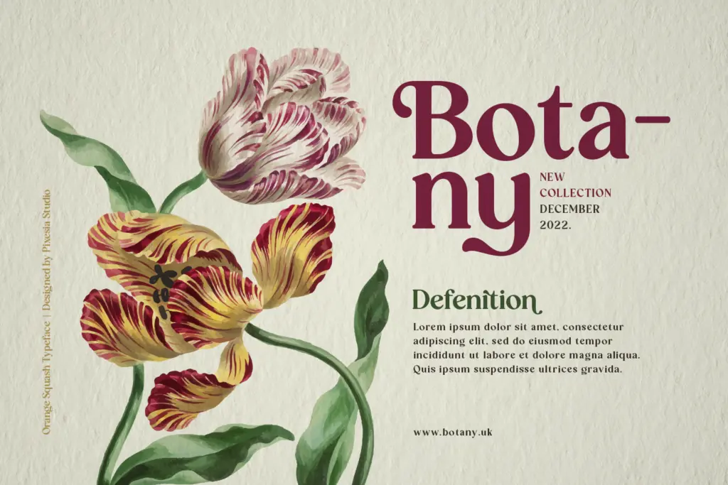
This is a headline font, full stop. The chunkiness that makes it pop on a poster or a jar label will fight you at paragraph sizes — tight counters and heavy strokes are not built for reading in bulk, and nobody should try. Where it does work: short packaging copy, logotypes for food and beverage brands leaning into a retro identity, festival or event titling, and editorial headers where you want a blast of personality above a much quieter body copy.
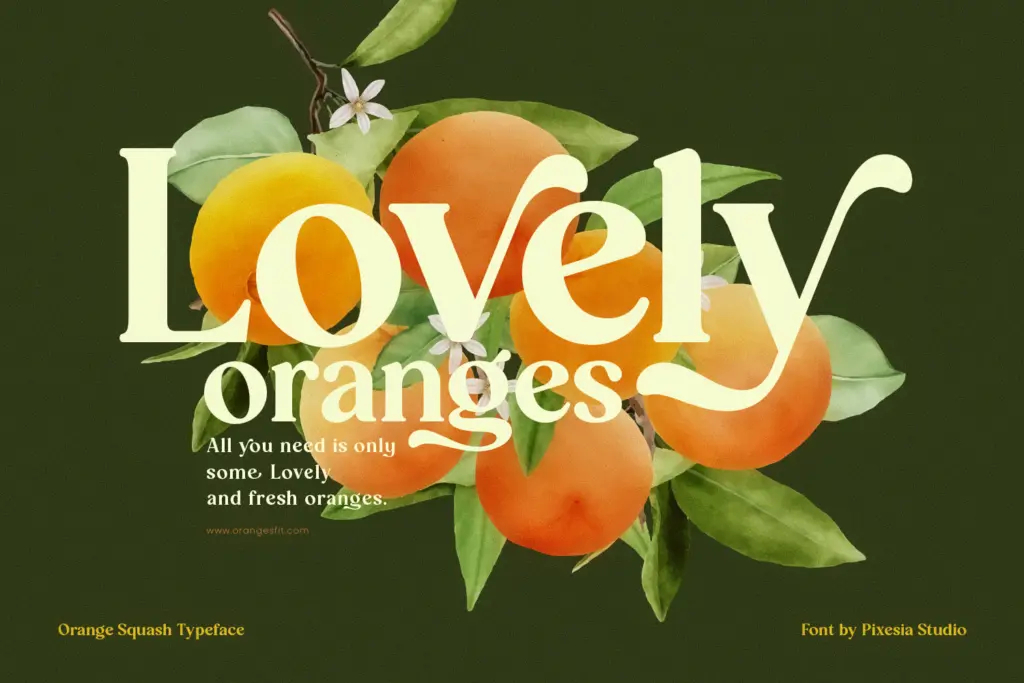
Given the citrus-adjacent name and the tone of the drawing, it slots naturally into food, drink, and lifestyle branding that wants to nod at mid-century Americana without going full pastiche. It also has a place in fashion and cosmetics headers where the brief calls for something loud and a little cheeky rather than polished and minimal — though
What we liked, and what we didn’t
Strengths
- a
- b
- c
Trade-offs
- a
- b
placeholder
Verdict

Tantype reviews typefaces in depth — every font is tested in real branding, editorial and screen layouts before a word gets written. 555+ fonts reviewed and counting.