Script
3.7
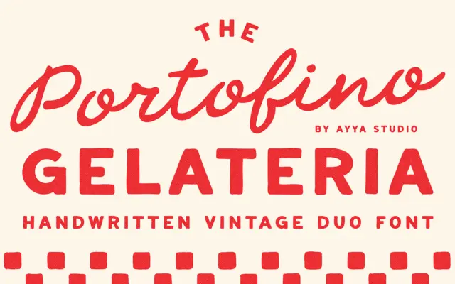
Portofino Gelateria: a hand-drawn duo for Italian-summer branding
Design style Portofino Gelateria pairs a loose, handwritten script with a companion sans that reads like it was lettered with…
 Tantype

Design style Portofino Gelateria pairs a loose, handwritten script with a companion sans that reads like it was lettered with…
Tantype
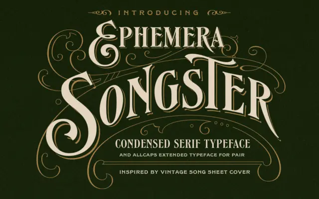
Design style Songster pulls from the lettering found on 19th-century song sheet covers, and it shows in the details rather…
Tantype
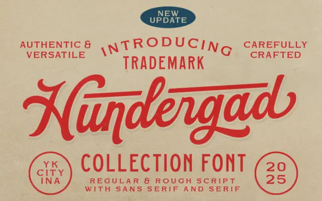
Design style Hundergad started life as a single bold script and has been expanded into a small family: the original…
Tantype
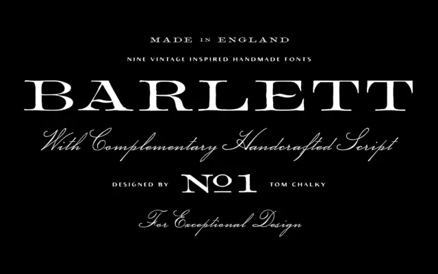
Design style Barlett No.1 leans hard on the look of 19th-century English typefounding — the kind of serif you’d expect…
Tantype
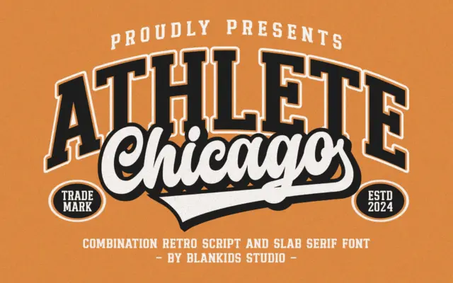
Design style Chicago Athlete pulls from the collegiate athletics playbook: thick slab serifs, squared bowls, and a deliberate wobble in…
Tantype
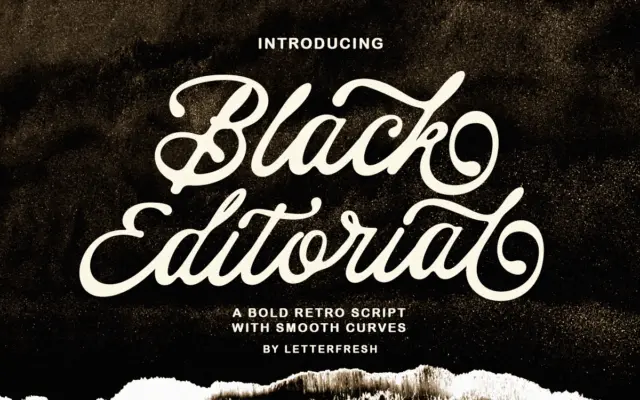
Design style Black Editorial Script sits in the well-populated field of casual, brush-influenced scripts that borrow a bit of vintage…
Tantype
Design style Heartbreak Eighties Retro Serif sits at the thicker end of the slab-serif family, with the rounded, slightly inflated…
Tantype
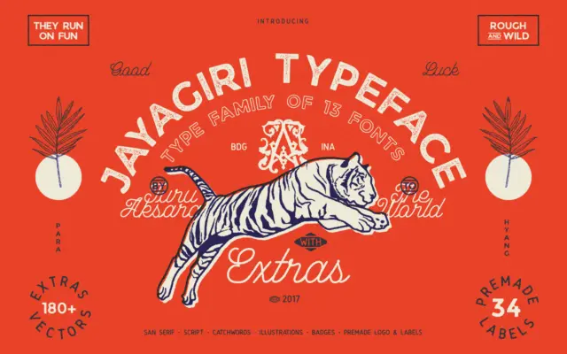
Design style JA Jayagiri is a brush-inflected display face built on a rough, hand-drawn skeleton. The strokes carry uneven edges…
Tantype
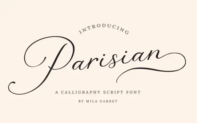
Design style Parisian Vintage Calligraphy Script sits in the well-worn tradition of brush-pointed calligraphy scripts built for invitation suites: connected…
Tantype