
Advercase Font: an Apple-Garamond homage for retro tech branding
Design style
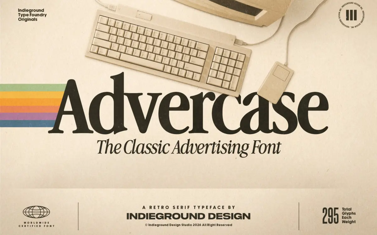
Advercase is a serif built on a specific reference point: the Garamond-derived face Apple used in its print advertising through the 80s and early 90s. That lineage shows in the proportions. The x-height sits comfortably mid-range, the contrast between thick and thin strokes is moderate rather than dramatic, and the serifs are bracketed and slightly blunt rather than needle-fine. It reads as a working serif rather than a decorative one, which fits the source material: this was a face meant to sit next to product shots and price lists, not to carry poetry.
Where it departs from a straight Garamond revival is in a faint mechanical stiffness. Curves are a touch more even, terminals a touch more squared-off, as if the drawing has been filtered through the limitations of an old dot-matrix or early digital output. That’s the retro effect the designers are after, and it’s the font’s most useful trait: it doesn’t just look old, it looks like a specific kind of old — consumer electronics packaging, floppy disk labels, mail-order catalogues.
Character set and features
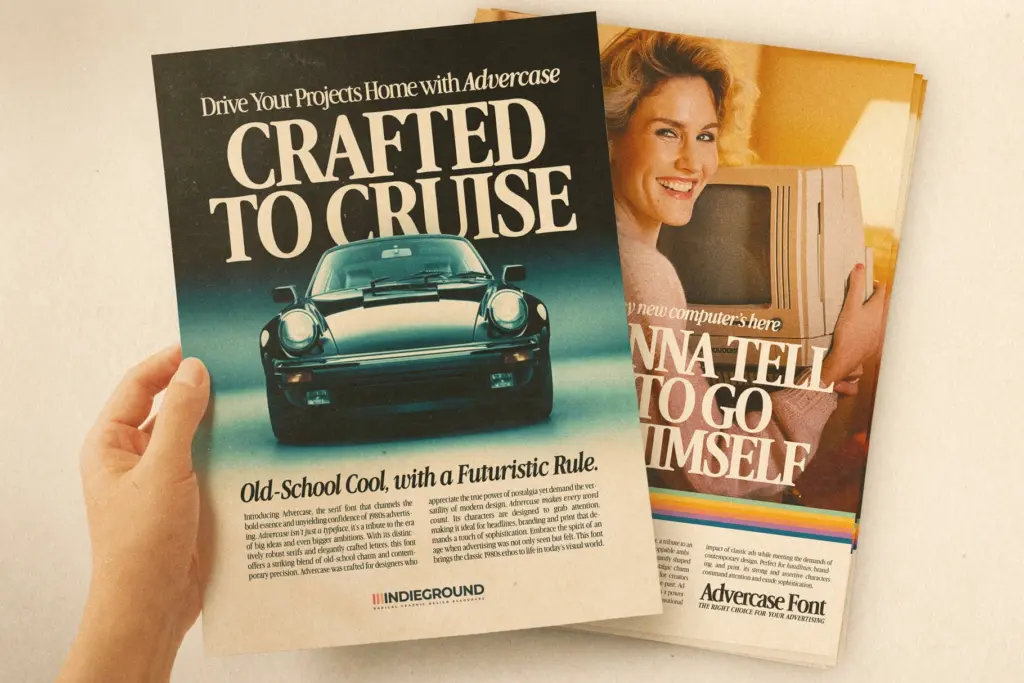
The family now runs to four styles — Regular, Bold, Italic and Bold Italic — with a stated set of 295 glyphs covering uppercase, lowercase, numerals and a range of special characters. That’s a reasonable spread for a display-leaning serif, enough for punctuation-heavy headline work and short blocks of copy without hunting for missing marks.
The italic is a genuine slanted companion rather than an afterthought, with enough personality to work as an accent style against the upright regular. The bold holds its serif structure at heavier weights without the strokes clogging together, which matters if you’re setting anything below display size. There’s no light or thin weight, so anyone expecting a full weight ladder for editorial flexibility will need to look elsewhere.
Use cases
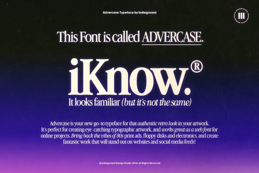
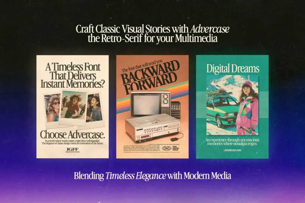
This is a font for a look, not a system. It’s well suited to logotypes and lockups that want to nod at 80s tech and print advertising — think product branding for gadgets, throwback packaging, poster headlines, social posts chasing a nostalgic aesthetic. The moderate contrast and even rhythm mean it holds up reasonably at smaller sizes for short lines, so pull quotes, labels and captions are workable, though it’s not built for long-form body text.
Where it strains is anywhere the retro signal isn’t wanted. Push it into a neutral editorial layout or a contemporary tech brand and the Apple-Garamond references start to feel like a costume rather than a voice. It’s also a single stylistic idea executed well rather than a broad toolkit — four styles cover headline and short-copy needs, but there’s no expanded family to lean on for complex hierarchy. Used where the brief calls for genuine vintage warmth, though, it does the job convincingly.
What we liked, and what we didn’t
Strengths
- Convincingly captures a specific 80s Apple-advertising serif look rather than generic vintage styling
- Bold weight stays legible without clogging at heavier sizes
- Genuine italic and bold italic give it real range for headline and accent use
Trade-offs
- No light or thin weight limits its use in varied hierarchy systems
- The retro signal is strong enough that it reads oddly outside nostalgic or tech-throwback contexts
Advercase Font is a well-observed nod to Apple's 80s Garamond-based advertising type, with enough mechanical stiffness in the drawing to sell a specific retro-tech mood. It's narrow in purpose — great for headlines and branding that want that vibe, less useful once you step outside it.
Verdict

Tantype reviews typefaces in depth — every font is tested in real branding, editorial and screen layouts before a word gets written. 555+ fonts reviewed and counting.