
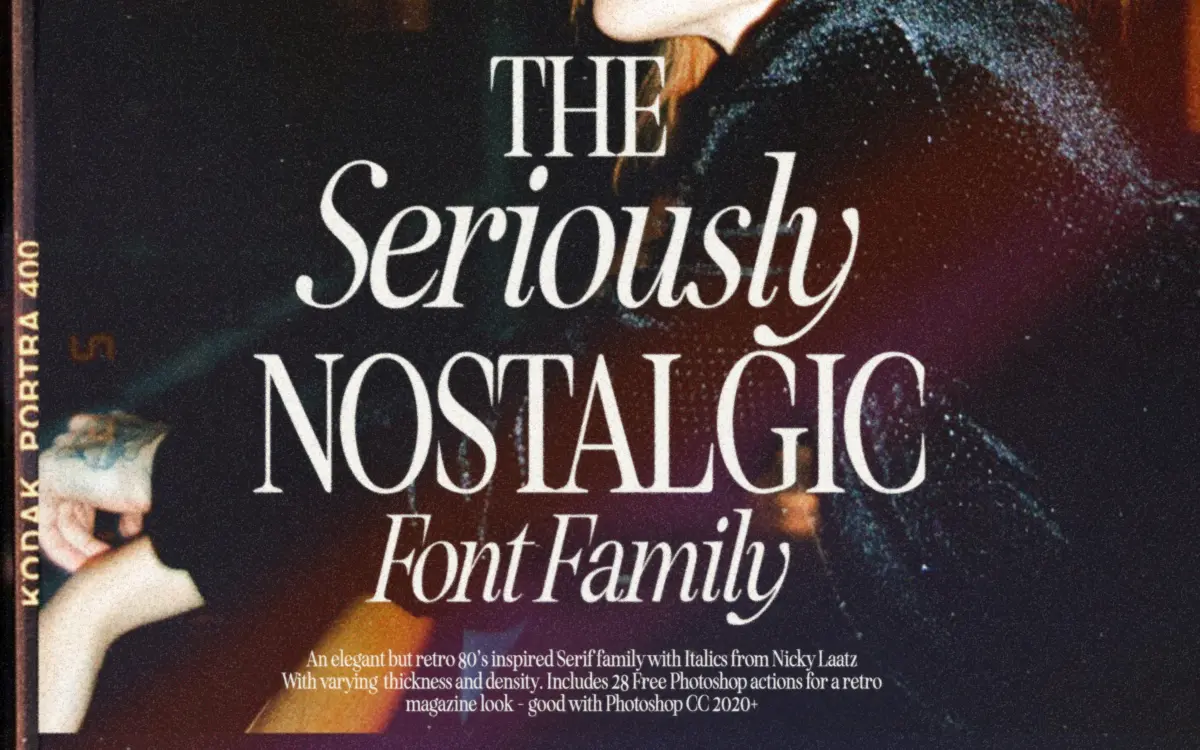
Seriously Nostalgic Serif: an eighties magazine serif with condensed variants for headline work
Design style
Seriously Nostalgic Serif borrows its attitude from eighties magazine mastheads and fashion spreads rather than from book typography. It has the high-contrast stroke weight and slightly theatrical proportions of that era’s display serifs — tall x-height relative to the cap height, sharpened terminals, and a general sense of confidence rather than restraint. This is a font built to be looked at, not read in long paragraphs.
The seller offers two contrast levels: a softer, lower-contrast cut and a crisper, higher-contrast one. That’s a genuinely useful decision to have made for the buyer, because contrast level changes the mood more than almost any other variable in a serif. The crisper version leans glamorous and a little cold; the softer one reads warmer and more approachable, closer to a vintage editorial voice than a fashion-plate one. Neither is neutral — both carry period flavour, which is the point, but it does mean this isn’t a face you reach for when you want a serif to disappear.
Character set and features
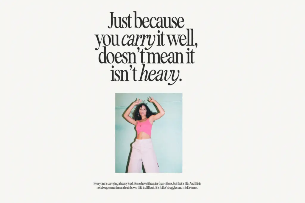
The family includes an italic companion, and Nicky Laatz has drawn it with enough of its own character that it doesn’t feel like a mechanically slanted version of the roman — the italic has its own swing to entering strokes and a slightly narrower rhythm, which is what you want from a serif italic used for pull quotes or emphasis rather than as a default text style.
What sets this apart from a typical serif release is the range of condensed cuts sitting alongside the two contrast levels. Being able to mix a condensed weight with a standard-width one within the same headline is a real eighties-magazine trick — think stacked headline treatments where the second line is squeezed to fit — and having those widths built rather than faked with horizontal scaling matters. Scaled type distorts stroke contrast unevenly; a genuinely condensed cut keeps the thicks and thins proportional, which is why the condensed variants here hold their shape at small display sizes better than a stretched version would.
There’s no indication this family extends into a full text-weight range or handles extended language support beyond the basics, so treat it as a headline specialist rather than a workhorse.
Use cases
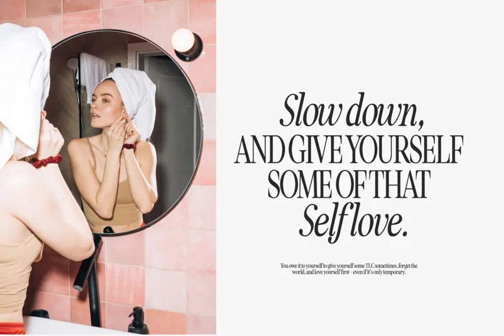
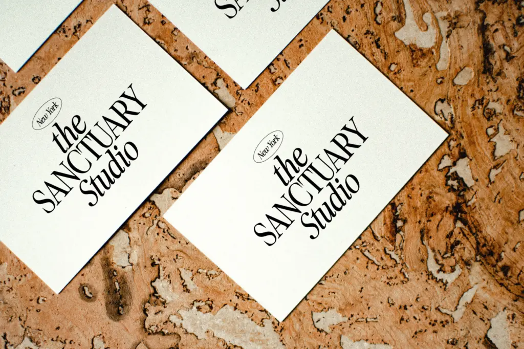
This is a font for mastheads, magazine-style headlines, editorial pull quotes, and branding work that wants a period wink without going full pastiche. The high contrast and condensed options make it good for packaging and cover lines where space is tight but a serif’s authority is still wanted. It also suits invitation work — the softer contrast cut in particular has enough warmth for wedding stationery or announcement pieces that want
What we liked, and what we didn’t
Strengths
- Two contrast levels give real tonal range from warm-vintage to glamorous-crisp
- Condensed cuts are genuinely drawn rather than horizontally scaled, keeping stroke contrast intact at small sizes
- Italic has independent character rather than a mechanical slant
Trade-offs
- High contrast and condensed forms limit it to display sizes, not body copy
- Strong period personality makes it a poor fit for brands needing a neutral or evolving serif
Seriously Nostalgic Serif is a confident, period-flavoured display serif that does one job — eighties magazine glamour — very well, with genuinely useful contrast and width variants to back it up. It's not built for body text or brands that need to shift tone later. Buyers wanting a headline face with retro attitude get real value; buyers wanting a flexible all-rounder should look elsewhere.
Verdict

Tantype reviews typefaces in depth — every font is tested in real branding, editorial and screen layouts before a word gets written. 555+ fonts reviewed and counting.