
Heartbreak Eighties Retro Serif: a bold slab-serif throwback for 80s branding
Design style
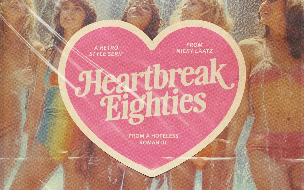
Heartbreak Eighties Retro Serif sits at the thicker end of the slab-serif family, with the rounded, slightly inflated look that got attached to a lot of 1980s packaging and signage. The strokes are heavy and consistent, but the corners are softened rather than sharp, which keeps the letterforms from feeling mechanical. There’s a warmth to it that reads more hand-finished than drafted with a ruler.
The serifs themselves are stubby, almost bracketed into the stroke rather than sitting apart from it, which is part of what gives the face its retro-advert feel rather than a classical one. Nicky Laatz has clearly built this for headlines and short bursts of text, not for reading in bulk — the letters are wide, generous with their spacing, and designed to hold a page at large sizes rather than disappear into a paragraph.
Character set and features
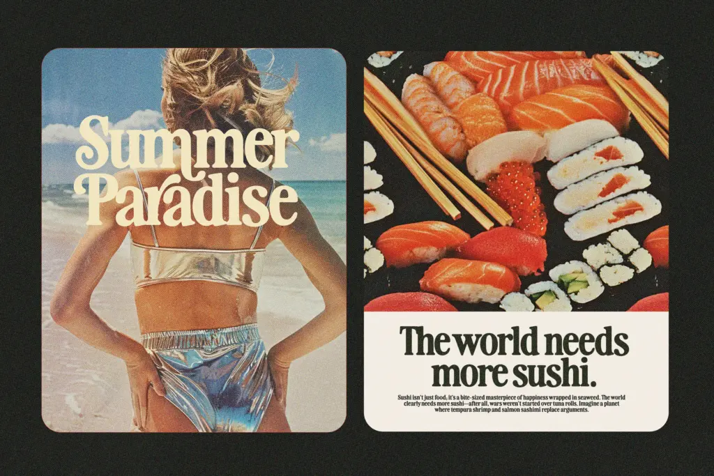
The seller’s description mentions alternate faces, and the font does appear to include swash variants and alternate characters that shift its personality — some of these lean more feminine and script-adjacent, others sit heavier and more masculine. That range is the font’s main selling point: it isn’t one fixed voice, it’s a small family of moods built on the same skeleton, so you can pick a version depending on whether you want a logo to feel tender or brash.
This flexibility comes with the usual caveat for display faces with swash sets: you need to actually go into the character map or a glyphs panel to find the alternates, since they won’t appear by simply typing. Anyone expecting automatic OpenType substitution should check before committing a layout to it. The letterforms are also, by design, not built for small point sizes — the soft slab serifs and open counters that look inviting at 60pt will clot at 9pt.
Use cases
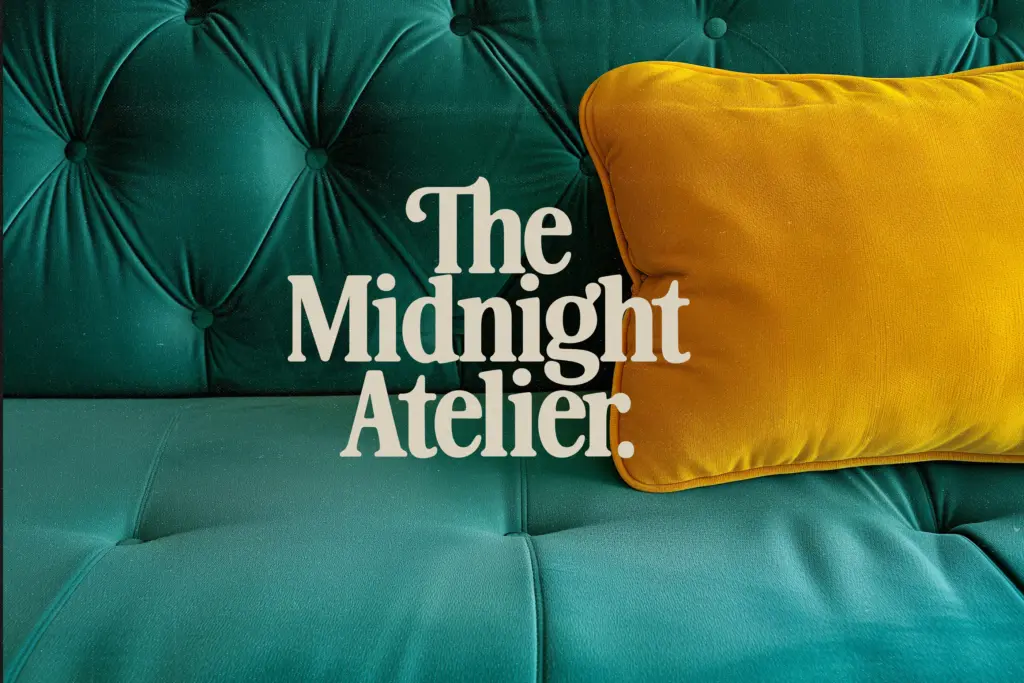
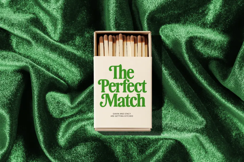
This is a font for surface, not substance: logotypes, packaging headers, greeting cards, poster type, the kind of retro-themed editorial spread that wants to evoke roller rinks and neon signage without tipping into pastiche. It would suit a wedding invitation that’s leaning into a playful, nostalgic theme rather than a formal one — the softness in the strokes keeps it from feeling too shouty for that context, provided it’s given room to breathe.
Branding work aimed at a specific decade — 80s or 90s nostalgia campaigns, throwback product lines, magazine mastheads — is the obvious home for it. Pair it with a plain, quiet sans for any supporting text; this typeface has no interest in being a workhorse, and pushing it into body copy or dense signage will fight against everything it’s built for. Used as a headline or wordmark, though, it does exactly what it promises: it looks like it walked out of a decade with big hair and bigger optimism.
What we liked, and what we didn’t
Strengths
- Swash and alternate glyph sets genuinely shift the tone from feminine to masculine
- Soft, rounded slab serifs give it a warmer feel than typical retro display faces
- Strong presence at large sizes for logos, packaging headers and posters
Trade-offs
- Legibility drops fast at small sizes due to heavy, open forms
- Alternate characters require manual access via glyph panel, not automatic
Heartbreak Eighties Retro Serif nails a specific decade-flavoured mood with real character in its swash alternates. It's a display font through and through, so don't ask it to carry body text or small print — keep it big, keep it short, and it earns its keep.
Verdict

Tantype reviews typefaces in depth — every font is tested in real branding, editorial and screen layouts before a word gets written. 555+ fonts reviewed and counting.