
Barlett No.1: A Vintage Serif and Script Duo for Heritage Branding
Design style
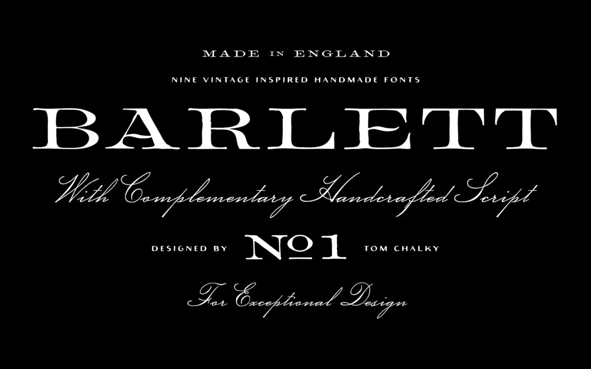
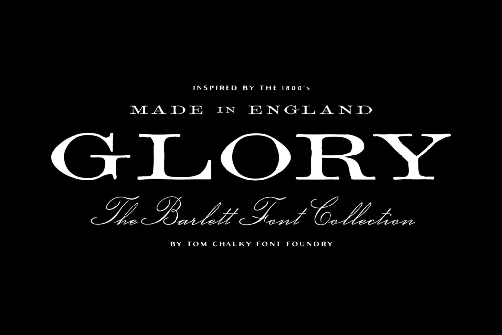
Barlett No.1 leans hard on the look of 19th-century English typefounding — the kind of serif you’d expect on an old apothecary bottle or a printer’s specimen sheet. The serifs carry weight, the contrast between thick and thin strokes is pronounced, and there’s a deliberate roughness to the edges that keeps it from reading as a clean revival. It’s not trying to be historically accurate so much as historically flavoured, and it succeeds at that more modest goal.
The accompanying script is where the personality shows most. It’s a flowing hand with a fair bit of slant and looping connections, pitched as a companion rather than a lead face. It doesn’t try to match the serif’s structure stroke for stroke — it’s softer, more casual — which is the right call for a pairing meant to sit side by side on a label rather than compete for attention.
The imperfections built into the drawing — slightly uneven baselines, worn-looking terminals — are the whole point of the design. They read as intentional rather than sloppy, though anyone wanting a crisp, geometric serif should look elsewhere entirely.
Character set and features
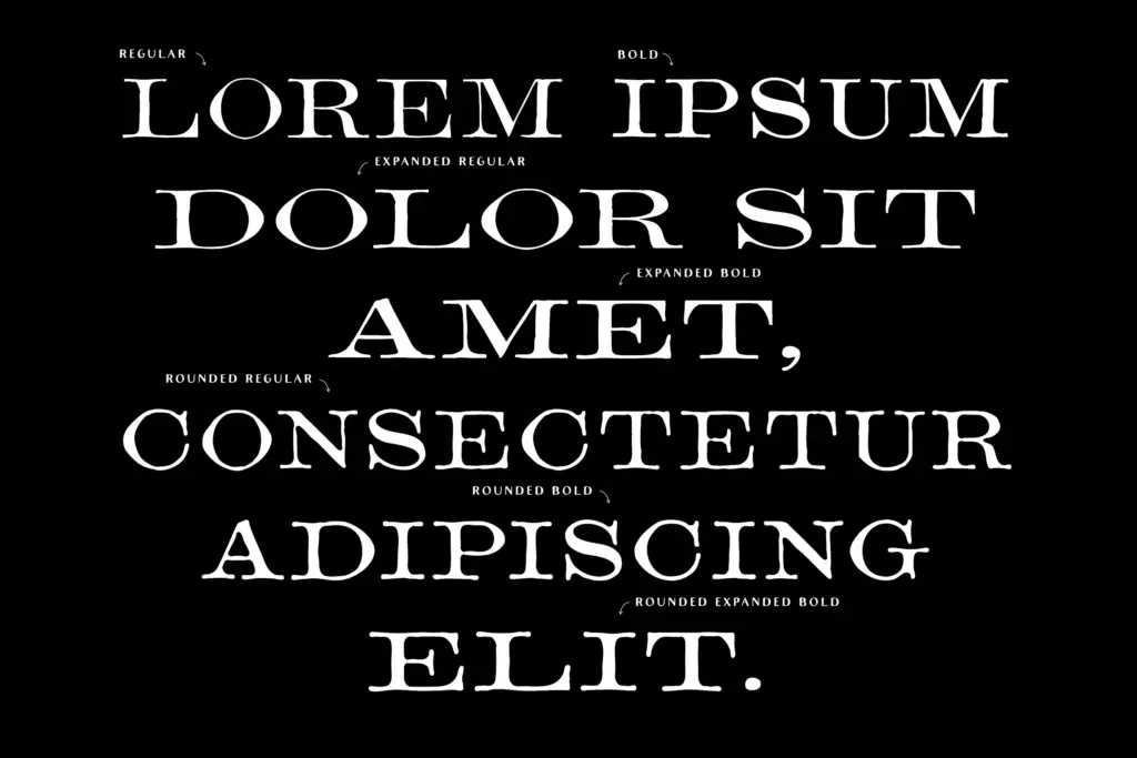
Nine styles come packed into the family: regular, bold, expanded, and rounded serif variants alongside the script. That’s a reasonable spread for a display-oriented family, though it’s worth noting these are built for headline and label use rather than long-form text — the texture that makes them charming at large sizes will work against them in a paragraph.
Stylistic alternates and custom ligatures are included, which matters more here than in a plainer serif. Swapping in an alternate cap or letting a script ligature take over a word ending is often what separates a label that looks hand-set from one that looks like it came out of a template. The rounded serif variant is a nice inclusion — it softens the historical edge without losing the texture, useful when the brand needs warmth rather than austerity.
No specific language support or character coverage is detailed in the brief, so anyone working outside basic Latin punctuation should test the glyph set before committing a layout to it.
Use cases
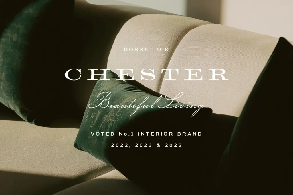
This is a font family built for surfaces, not sentences. Whisky and spirits labels are the obvious fit — the seller isn’t wrong to lead with that — but the same qualities work for boutique packaging, cheese and preserve labels, cafe signage, and any branding project trying to signal heritage without going full antique-shop pastiche.
Editorial headlines can work too, provided the surrounding layout gives the serif room to breathe; it’s not a face for dense magazine grids. Wedding stationery is plausible territory as well, particularly where the couple wants something warmer than a formal script but more textured than a standard serif. Where it won’t help: anything digital-first and small — app interfaces, body copy, dense set text — where the deliberate roughness just reads as noise.
What we liked, and what we didn’t
Strengths
- The serif's uneven, worn-looking details feel intentional rather than sloppy
- Stylistic alternates and ligatures give the script real variety on short lines
- Rounded serif variant offers a softer option within the same family
Trade-offs
- Texture that reads as charming at display size will hurt legibility in body copy
- Glyph and language coverage aren't specified, so multilingual projects need testing first
Barlett No.1 does one job well: giving packaging and branding work a handcrafted, old-world texture without tipping into pastiche. It's not built for text-heavy layouts, and buyers should test the alternates before assuming full language coverage, but as a label and headline pairing it's convincing.
Verdict

Tantype reviews typefaces in depth — every font is tested in real branding, editorial and screen layouts before a word gets written. 555+ fonts reviewed and counting.