
Parisian Vintage Calligraphy Script: a swash-heavy script for wedding stationery
Design style
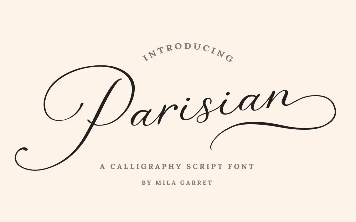
Parisian Vintage Calligraphy Script sits in the well-worn tradition of brush-pointed calligraphy scripts built for invitation suites: connected lowercase, a steep slant, and thick-to-thin strokes that mimic a flexible nib. The letters lean toward the ornamental end of the genre rather than the restrained end. Entry and exit strokes are pronounced, joins are looped rather than clipped, and the overall rhythm favours flourish over economy of line.
What separates it from a plainer wedding script is the swash apparatus built around the base alphabet. Capitals come with an alternate set of beginning swashes that sweep well above and below the x-height, and lowercase letters get matching ending swashes for word-final positions. Used with restraint, on a single word or a short line, these give the face a hand-lettered, custom-monogram quality that a default script often lacks. Used across a full paragraph, they compete with each other for space and the page starts to feel busy — this is a display script, not a text face, and it doesn’t pretend otherwise.
Character set and features
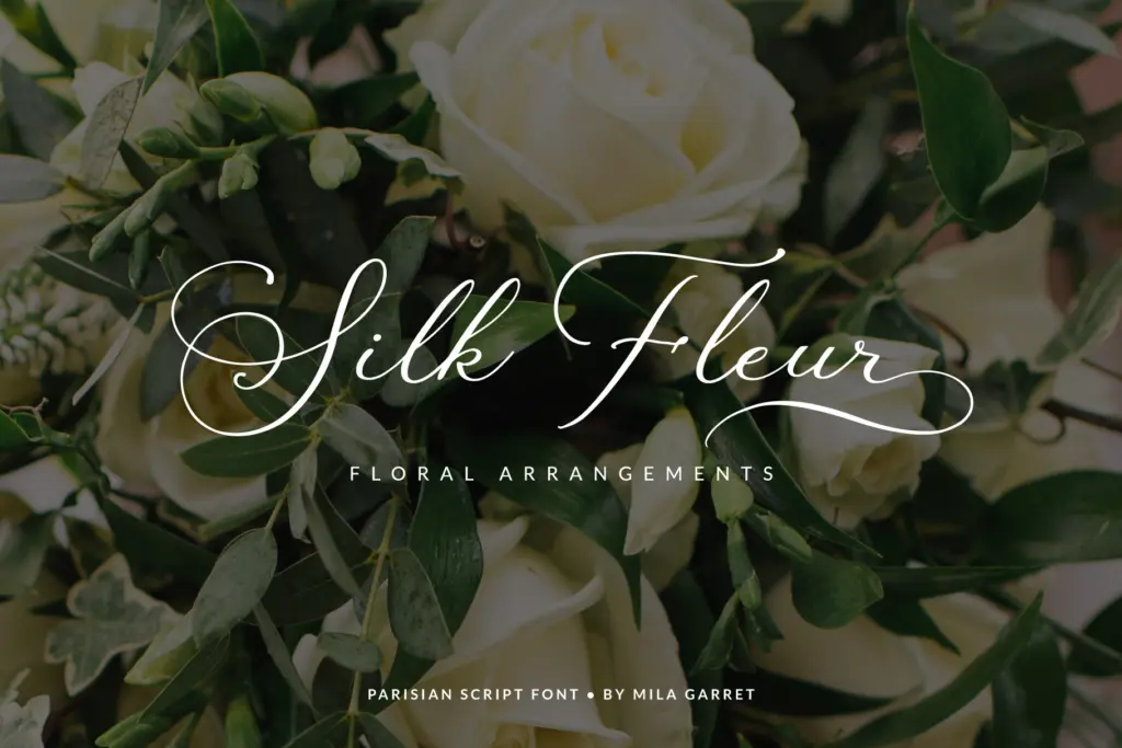
The character set is built for the job it’s aimed at: full standard alphabet and punctuation, a separate set of swashed capitals for word beginnings, ending swashes for lowercase, plus stylistic alternates and ligatures to break up repeated letter shapes. Everything extra is PUA-encoded, so the alternates sit on their own keystrokes and don’t require an OpenType-aware app to reach them — useful if your workflow is Canva or a basic image editor rather than InDesign or Illustrator.
Language support extends beyond basic Latin, with accented characters for several Western and Northern European languages, plus currency symbols and ordinal markers. That’s a reasonable spread for a script sold primarily on stationery and branding marketplaces, though anyone setting body copy in a less common Latin-based orthography should check specific characters before committing.
The swash system is generous rather than exhaustive — there’s enough variation to avoid obvious repetition across a short phrase like a couple’s names, but not so much that every letter has three or four alternates to audition. That’s a fair trade-off for a font aimed at people who won’t necessarily go alternate-hunting in a glyphs panel.
Use cases
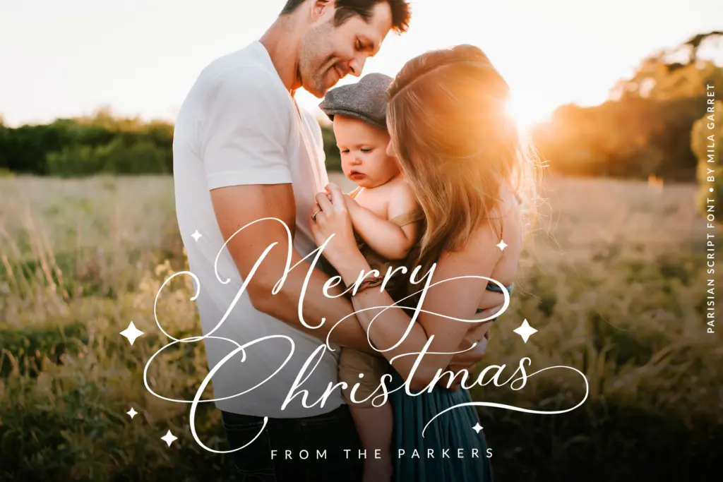
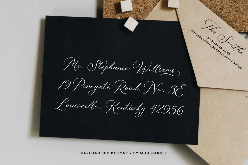
This is squarely an invitation-and-branding script: wedding suites, save-the-dates, monogram-style logotypes, greeting cards, and short lines of packaging copy where an ornamental, old-world feel is wanted. It works best set large, on its own line or paired with a plain sans or serif for supporting text, since the swashes need room to breathe and a body-copy setting will only muddy them.
It’s less suited to anything that needs to run long — a website’s navigation, a paragraph of marketing copy, or dense signage — where the slant and looping joins slow reading down. Treat it as a headline or feature element, not a workhorse text face, and it does the job it was drawn for.
What we liked, and what we didn’t
Strengths
- Separate beginning-capital and ending-lowercase swash sets give real customisation for names and monograms
- PUA encoding means the extra characters are reachable without OpenType-aware software
- Reasonable multilingual accent coverage for a script sold on Latin-alphabet stationery
Trade-offs
- Heavy flourishes and steep slant make it unreadable at body-copy length or small sizes
- The ornamental style is close to many other vintage wedding scripts on the market, offering little that feels distinct
Parisian Vintage Calligraphy Script is a competent, ornamental wedding-style script with a well-built swash system for capitals and word endings. It's clearly a display face meant for short lines, not paragraphs, and it does that one job convincingly.
Verdict

Tantype reviews typefaces in depth — every font is tested in real branding, editorial and screen layouts before a word gets written. 555+ fonts reviewed and counting.