
Portofino Gelateria: a hand-drawn duo for Italian-summer branding
Design style
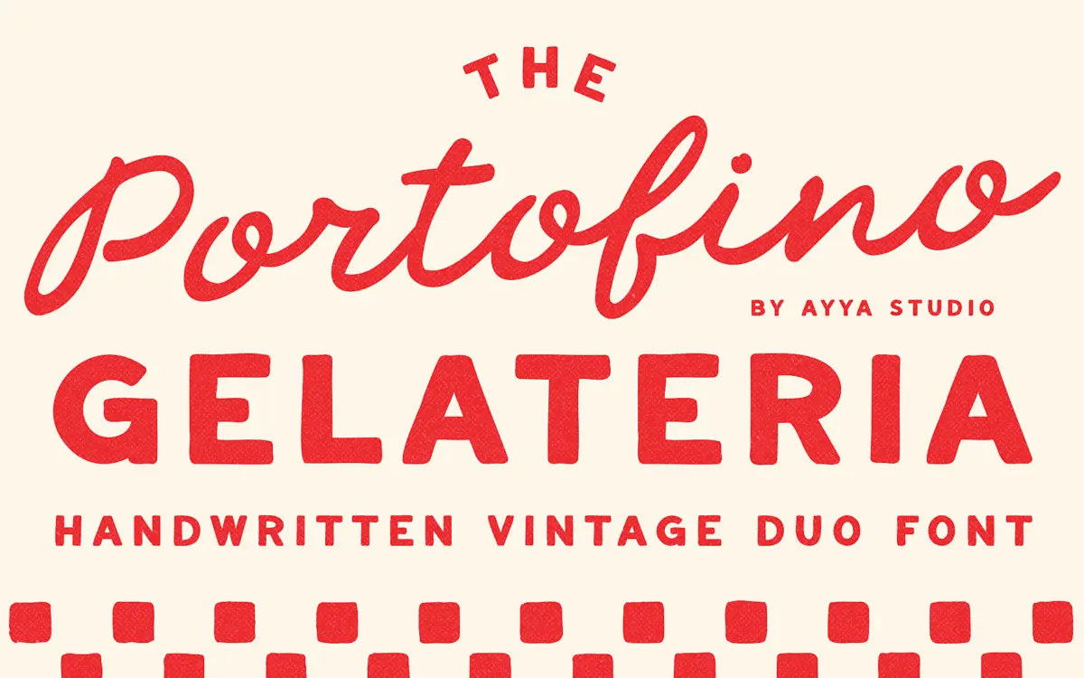
Portofino Gelateria pairs a loose, handwritten script with a companion sans that reads like it was lettered with a felt-tip on the back of a menu. Both are drawn, not just decorated with a jitter effect afterward — strokes vary in pressure, baselines wander slightly, and curves don’t quite close the same way twice. That’s the point. It’s aiming for the feel of a hand-painted gelateria sign that’s been touched up a few times over the decades, and it gets there.
The script leans casual rather than formal. Letters connect but not rigidly, terminals often stop short or flick out, and the overall rhythm has more in common with quick brush lettering than with polished copperplate. The sans companion is the quieter half: rounded, a little naive, clearly built to sit underneath the script as a support face rather than to carry a headline on its own.
Character set and features
As a duo, the pairing does the job most script-plus-sans combinations are built for: one face for the flourish, one for the fine print. The script carries the personality — the imperfections are visible even at moderate sizes, which is either charming or distracting depending on how much noise you want in your layout. The sans is plainer by comparison, which is useful; it means body copy, addresses, dates or ingredient lists don’t have to fight the script for attention.
Because the whole thing is hand-drawn, don’t expect the kind of even, engineered spacing you’d get from a grid-built typeface. Kerning discipline in scripts like this is always the weak point, and this one is no exception — long words and mixed-case settings need a manual eye before they go to print. There’s no mention of extended language support, so treat it as a Latin-alphabet, English-and-a-few-Romance-languages tool rather than something for multilingual body text.
Use cases
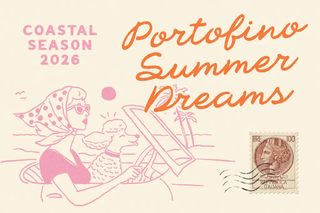
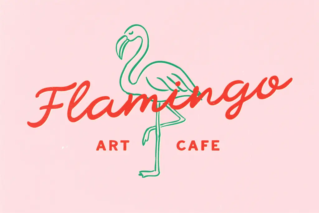
This is a branding and packaging font first. It suits gelaterias, cafés, wine labels, market stalls, small hospitality brands — anything trying to look like it’s been around since the 1960s even if it opened last spring. It works well on postcards, retro posters, and wedding stationery that wants a Mediterranean, sun-bleached tone rather than a formal, engraved one.
It’s less suited to anything that needs to look precise or corporate — dense body text, UI copy, or brands that want crispness over character will find the imperfections work against them. At small sizes the script’s looseness can blur letterforms together, so reserve it for headlines, logotypes, and short set phrases, and let the sans handle anything that actually needs to be read quickly. Used that way — script for the name, sans for the details — the duo does exactly what it promises: it looks handmade because it is.
What we liked, and what we didn’t
Strengths
- The hand-drawn imperfections feel genuine rather than filtered on afterward
- The plainer sans companion gives the script somewhere to rest without competing for attention
- Strong fit for a specific niche: gelaterias, cafés, and Mediterranean-themed branding
Trade-offs
- Loose spacing and connecting strokes mean manual kerning is needed for clean results
- Legibility drops quickly at small sizes, limiting it to headline and short-text use
Portofino Gelateria nails a specific, sun-bleached Italian-signage mood, and the script-plus-sans pairing is practical rather than decorative for its own sake. It's a headline and logotype tool, not a body-text font, and the handwritten looseness means manual kerning is non-negotiable. Best suited to small hospitality brands and retro-themed stationery rather than anything needing precision.
Verdict

Tantype reviews typefaces in depth — every font is tested in real branding, editorial and screen layouts before a word gets written. 555+ fonts reviewed and counting.