
Black Editorial Script: a retro-leaning script for quick, casual branding work
Design style
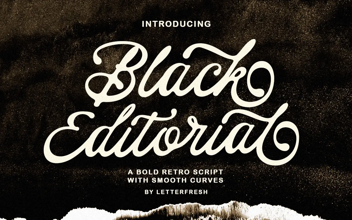
Black Editorial Script sits in the well-populated field of casual, brush-influenced scripts that borrow a bit of vintage American signage and a bit of modern handwritten looseness. The letters lean forward at a moderate angle, with connections that favour speed over precision — you can see where the tool that inspired it would have skipped or thickened on a downstroke. It’s not a calligraphic script built on strict pen-angle logic; it reads more like confident marker lettering cleaned up for print.
The stroke contrast is modest rather than dramatic, which keeps the face from feeling too delicate. That’s a deliberate trade-off: it loses some of the elegance you’d get from a higher-contrast script, but it gains sturdiness at smaller sizes and on textured surfaces like packaging or fabric print, where a hairline script would break up.
Character set and features
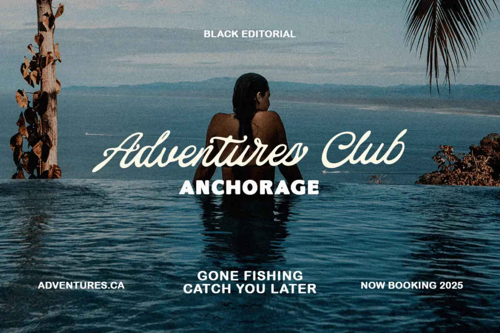
Coverage includes upper and lowercase Latin, numerals, and a set of symbols, alongside a stylistic collection and ligatures accessed through OpenType features or PUA-encoded glyphs. The alternates matter here — the base lowercase alphabet is fairly plain on its own, and it’s the swapped letterforms and ligatures that give words their personality, breaking up repeated letters and adding the occasional flourish to entry and exit strokes.
Multilingual support is mentioned in the file, though the brief doesn’t specify which languages beyond basic Latin extension, so treat that as a bonus rather than a guarantee for anything beyond Western European diacritics. Because the good stuff lives behind OpenType features, you’ll want software that actually exposes them — Illustrator, InDesign, or a glyph browser — otherwise you’re stuck with the default set, which is serviceable but noticeably less interesting than what’s advertised.
Spacing is generously loose in places, which helps the letters breathe but means tight-set headlines can look gappy unless you go in and kern manually, especially around ligature boundaries where the design assumes certain letter pairs and not others.
Use cases
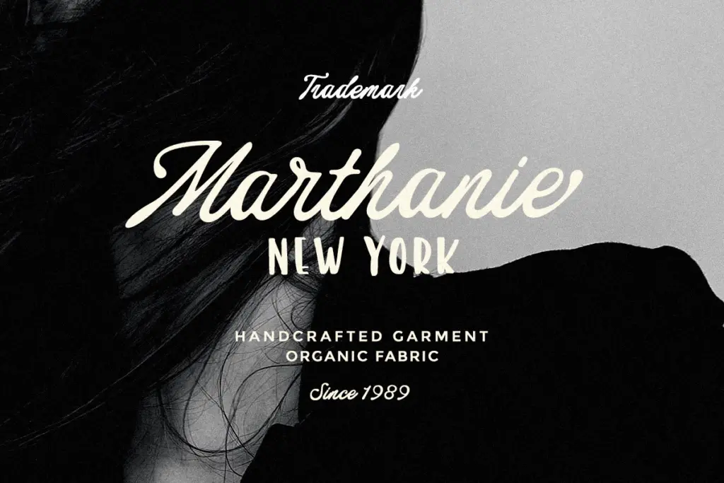
This is a font built for short bursts of text: a logotype, a product name on packaging, a header on a card, a single line on a t-shirt. It’s not intended for anything paragraph-length — the looseness and stroke variation that make it charming at large sizes will just blur into noise if you try to run body copy in it.
Craft and small-batch retail work is a natural fit — Cricut-style cutting projects, sublimation prints, apparel decoration — where a bit of imperfection reads as handmade rather than sloppy. Greeting cards and casual invitations, particularly ones with a retro or Americana mood, suit it better than anything formal or minimal. For a wedding invitation aiming at understated elegance, this probably isn’t the right register — it wants a bit of nostalgia and warmth in the surrounding design rather than a stark, contemporary layout.
Pair it with a plain sans or slab for supporting text; it needs a quiet neighbour to do the heavy lifting of information while it handles the personality.

What we liked, and what we didn’t
Strengths
- Sturdy stroke weight holds up on textured surfaces like fabric and packaging.
- Stylistic alternates and ligatures add real character once accessed via OpenType.
- Retro American lettering mood suits craft, apparel, and casual card work well.
Trade-offs
- Base character set without alternates enabled looks plain and generic.
- Loose default spacing needs manual kerning for tighter headline compositions.
Black Editorial Script is a competent, slightly gruff retro script best kept to short bursts of text — logos, headers, packaging. Its charm depends on the OpenType alternates being switched on; skip that step and it looks flatter than it should.
Verdict

Tantype reviews typefaces in depth — every font is tested in real branding, editorial and screen layouts before a word gets written. 555+ fonts reviewed and counting.