Serif
4.1
Fifty Fifty: a six-weight editorial serif built for headline work
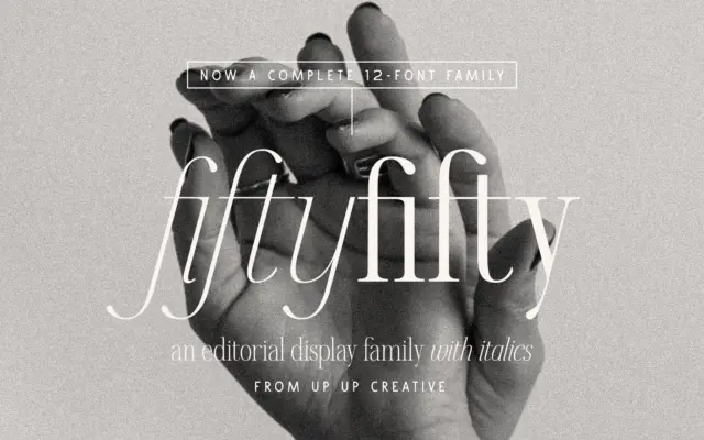
Design style Fifty Fifty sits in the editorial serif category, which usually means one of two things: a workhorse text…
 Tantype

Design style Fifty Fifty sits in the editorial serif category, which usually means one of two things: a workhorse text…
Tantype
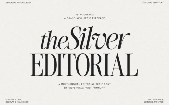
Design style The Silver Editorial is a high-contrast serif built for attention rather than for reading paragraphs. Its debt to…
Tantype
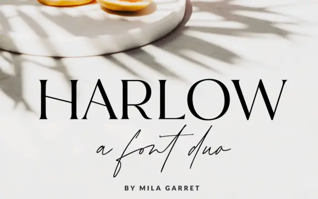
Design style Harlow is a two-part release: a pared-back serif and a casual handwritten script meant to sit alongside it.…
Tantype
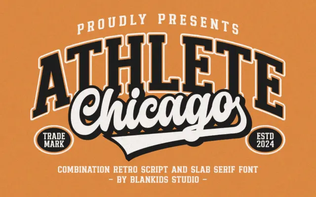
Design style Chicago Athlete pulls from the collegiate athletics playbook: thick slab serifs, squared bowls, and a deliberate wobble in…
Tantype
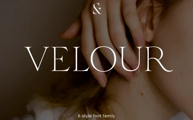
Design style Velour sits in that familiar territory of thin, bracketed serif display faces built for headlines rather than paragraphs.…
Tantype
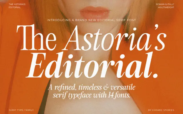
Design style The Astoria’s Editorial Serif sits in a familiar but well-populated lane: the advertising-inspired serif that borrows its bones…
Tantype
Design style Muse belongs to the modern-serif family that fashion branding has leaned on for years: hairline serifs, dramatic thick-thin…
Tantype
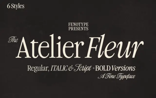
Design style Atelier Fleur takes Garamond’s old-style bones and squeezes them into a condensed frame built for headline duty rather…
Tantype
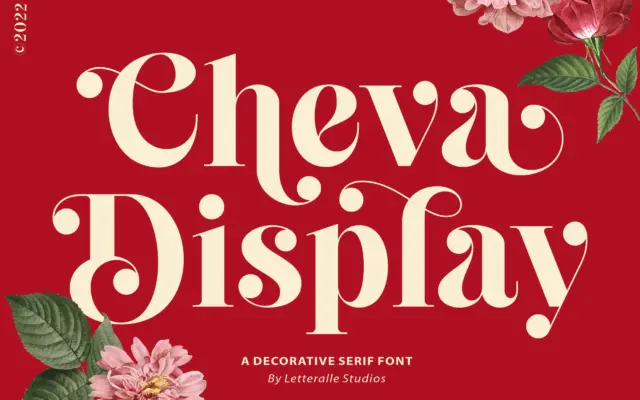
Design style Cheva Display sits somewhere between a slab and a transitional serif, with heavy strokes that carry a soft…
Tantype