Serif
3.9
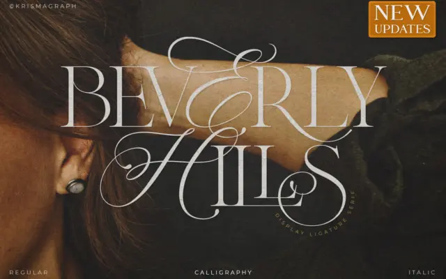
Beverly Hills: a ligature serif for wedding suites and glamour branding
Design style Beverly Hills sits at the intersection of calligraphy and serif construction, and it wears that hybrid identity openly.…
 Tantype

Design style Beverly Hills sits at the intersection of calligraphy and serif construction, and it wears that hybrid identity openly.…
Tantype
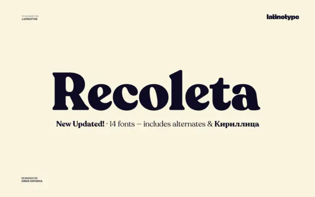
Design style Recoleta belongs to the family of soft slab serifs that took cues from 1970s display faces like Cooper…
Tantype
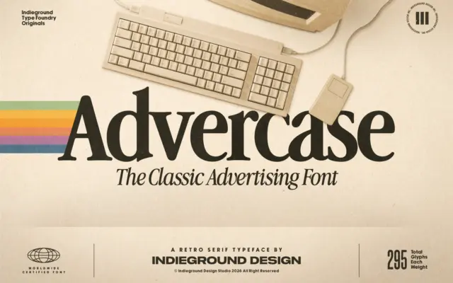
Design style Advercase is a serif built on a specific reference point: the Garamond-derived face Apple used in its print…
Tantype
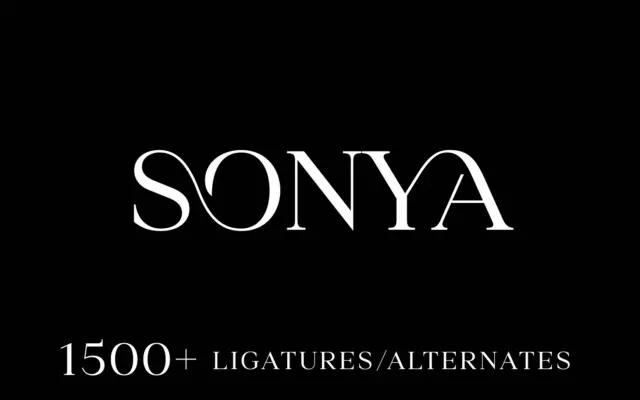
Design style Sonya is a caps-only serif with the kind of formal, slightly theatrical bearing you associate with letterpress invitations…
Tantype
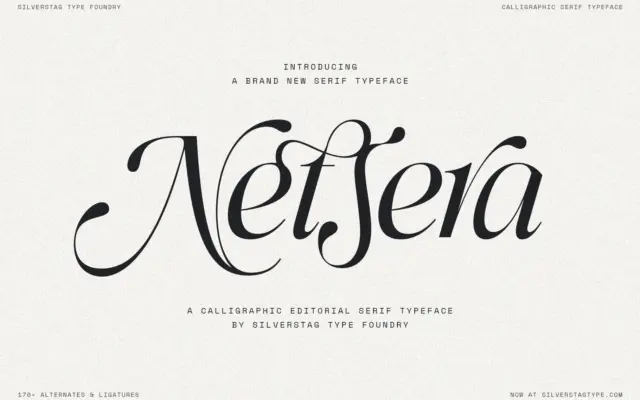
Design style Netsera sits at the point where a serif structure meets a calligraphic hand. The uprights have the weight…
Tantype
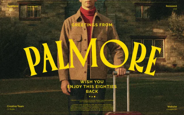
Design style Palmore sits in that well-worn but still useful lane of condensed display serifs built for headlines rather than…
Tantype
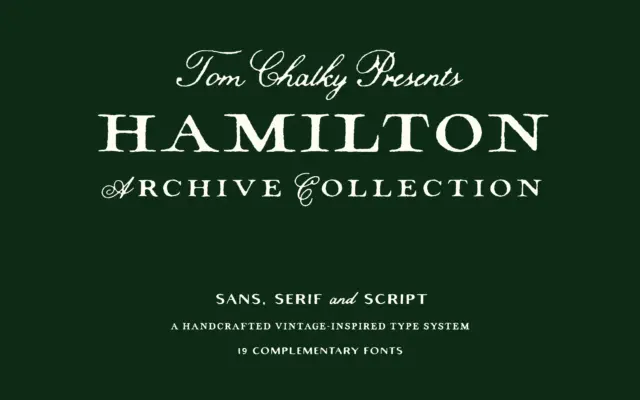
Design style Hamilton Archive is built around a printer’s-drawer idea of early 20th-century type: a serif and a sans that…
Tantype
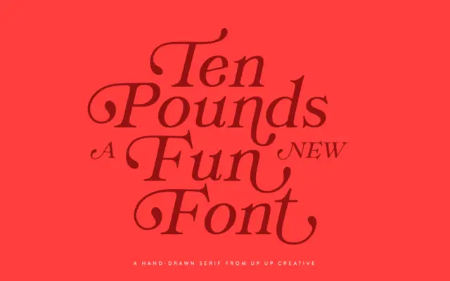
Design style Ten Pounds is a hand-drawn serif with a loose, sketchy construction rather than a polished, formal one. The…
Tantype
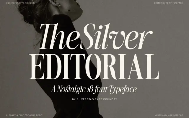
Design style The Silver Editorial sits in the high-contrast editorial serif tradition — thick vertical stems, hairline-thin horizontals, and bracketed…
Tantype