
The Silver Editorial Serif: an 80s-flavoured display serif for headlines
Design style
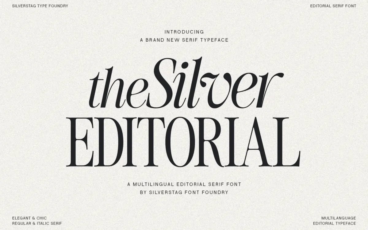
The Silver Editorial is a high-contrast serif built for attention rather than for reading paragraphs. Its debt to 1980s fashion-magazine typography shows up in the way the thick strokes swell and then snap into thin, needle-like hairlines. Terminals are cut cleanly rather than rounded, and the overall rhythm has that confident, slightly theatrical quality you associate with mastheads and cover lines rather than book interiors. There’s a stylised angularity to some of the curves that keeps it from feeling like a straightforward revival — it reads as a contemporary reinterpretation rather than a pastiche.
The contrast is the main design decision here, and it’s a strong one. At large sizes the thin strokes have real presence and the letters feel drawn rather than assembled. That same contrast is also the thing to watch: it’s a font with a clear point of view, not a neutral workhorse, and it wants to be used where its personality is the point.
Character set and features
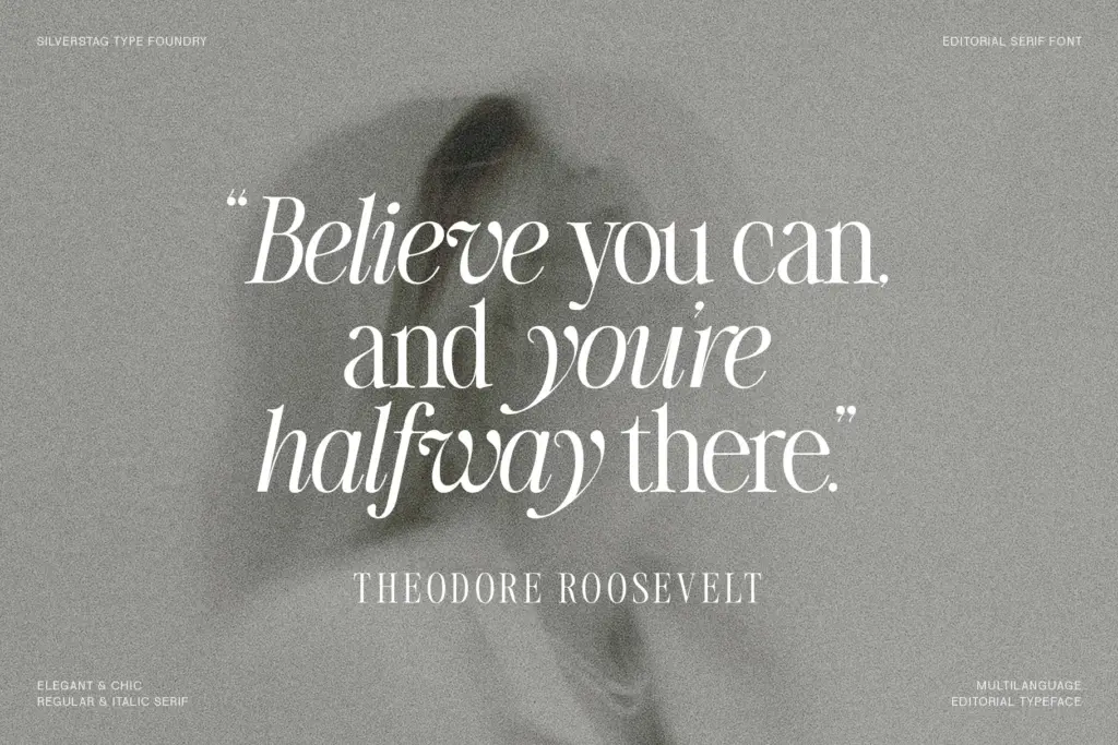
The set includes italics, which lean elegant and a touch more fluid than the uprights, useful for pull quotes or secondary headline treatments. Ligature support is mentioned as part of the package, which suggests the designer has paid attention to the small connections between letters that matter in tight headline tracking — join points like ct, st, or similar pairs tend to be where high-contrast serifs either sing or clash. Multilingual character support is listed too, though exact language coverage isn’t specified, so European-market buyers should check accented characters against their specific needs before committing to a full editorial rollout.
What isn’t clear from the material available is the weight range of this particular version — the seller notes a newer, expanded 18-font edition with nine weights, which implies the version described here is a slimmer offering, likely built around one or two weights plus italics. That matters for anyone hoping to use it across a full hierarchy of headline sizes rather than a single dramatic display line.
Use cases
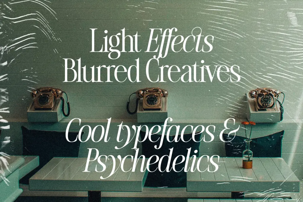
This is a headline font first. The contrast that makes it striking at 60pt starts to blur and lose crispness as size drops — hairlines thin to the point of disappearing on screen, and print reproduction at small sizes will need decent stock and a careful print run to hold the detail. Nobody should be setting body copy in it, and that’s fine; it isn’t trying to.
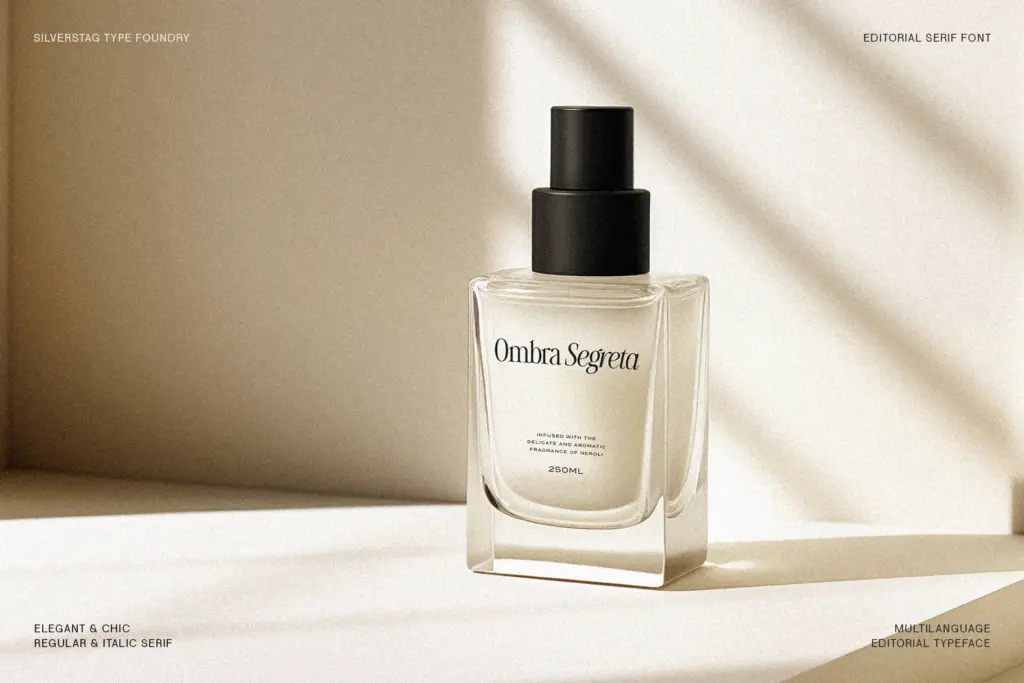
Where it earns its keep is in editorial mastheads, magazine cover lines, fashion and beauty branding, invitation typography, and packaging where a single word or short phrase needs to carry visual weight. Logo work is plausible too, provided the mark stays large enough to preserve the thin strokes. Pair it with a plain, low-contrast sans or a quiet serif for body text — anything with a comparable amount of personality will fight it for attention. Used sparingly, at size, on a few words at a time, it does the job it was drawn for.
What we liked, and what we didn’t
Strengths
- Strong, dramatic contrast that gives headlines genuine presence
- Italics add a more fluid secondary option for pull quotes and accents
- Ligatures suggest attention to how letters join under tight headline tracking
Trade-offs
- High contrast means hairlines lose crispness at small sizes and thin print stock
- Weight range for this version is unclear, limiting use across a full type hierarchy
The Silver Editorial is a confident, high-contrast display serif that does exactly one job well: big, dramatic headline type with an 80s fashion-magazine attitude. It's not built for body copy or small sizes, and buyers should confirm weight range and language coverage before assuming it covers a full hierarchy. For cover lines, invitations and packaging headlines, it delivers real character.
Verdict

Tantype reviews typefaces in depth — every font is tested in real branding, editorial and screen layouts before a word gets written. 555+ fonts reviewed and counting.