
Fifty Fifty: a six-weight editorial serif built for headline work
Design style
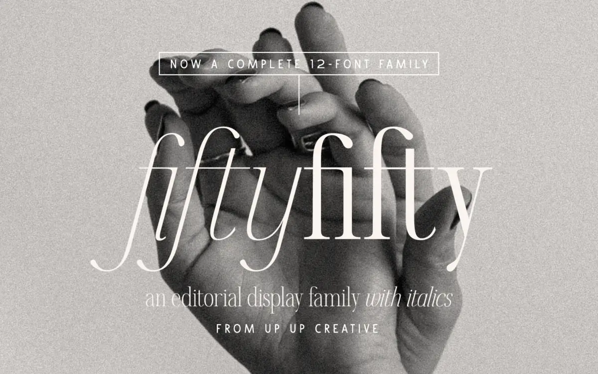
Fifty Fifty sits in the editorial serif category, which usually means one of two things: a workhorse text face dressed up for magazines, or a display face that borrows serif cues but really wants to be read at 60 points and up. This is the second kind. The curves are smooth and a little theatrical, the contrast between thick and thin strokes is pronounced, and the letterforms lean on that contrast to do the expressive work rather than on quirky construction. It reads as confident and current rather than nostalgic, closer to the glossy end of contemporary editorial type than to a revival of an old-style serif.
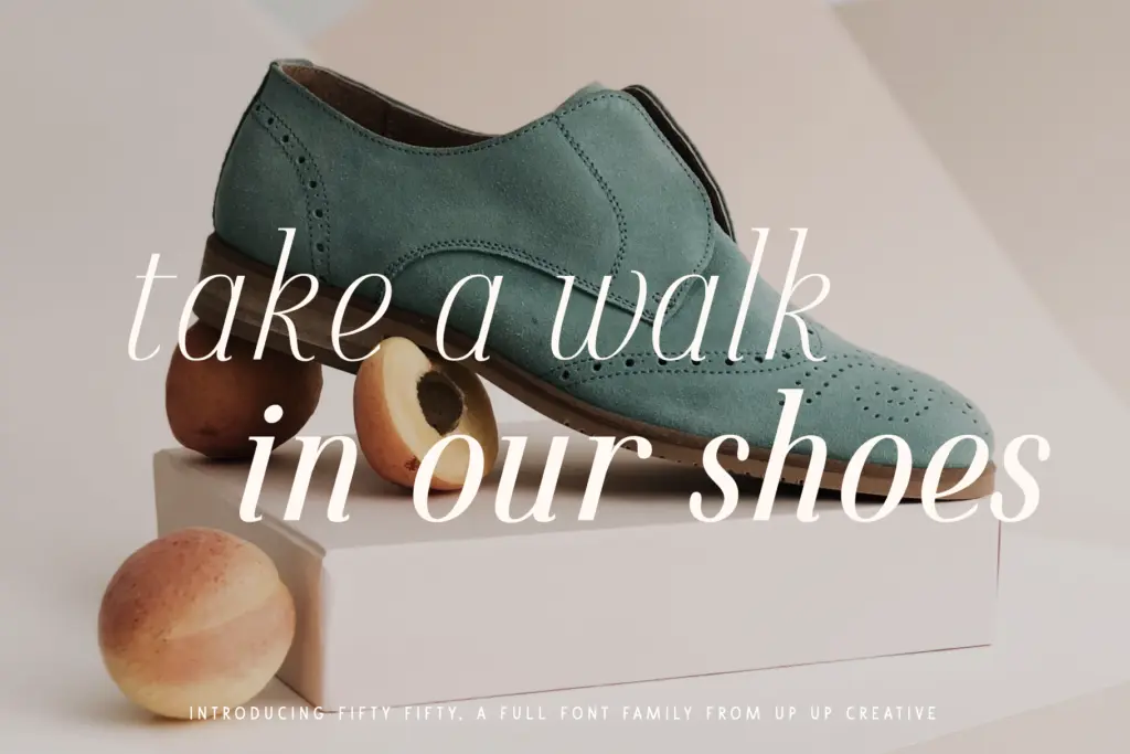
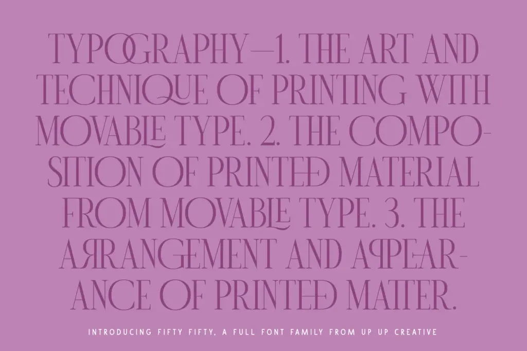
The seller is right that the caps carry the personality. Set a word in all capitals and the rhythm of thick verticals against fine hairlines gives it the polish you want on a masthead or a monogram. The lowercase is calmer, with steadier stroke widths and less flourish, which is sensible — it means the family doesn’t collapse into decoration once you drop below headline size, though it also means the lowercase reads as a slightly different register from the caps, something worth testing before you commit a whole logotype to mixed case.
Character set and features
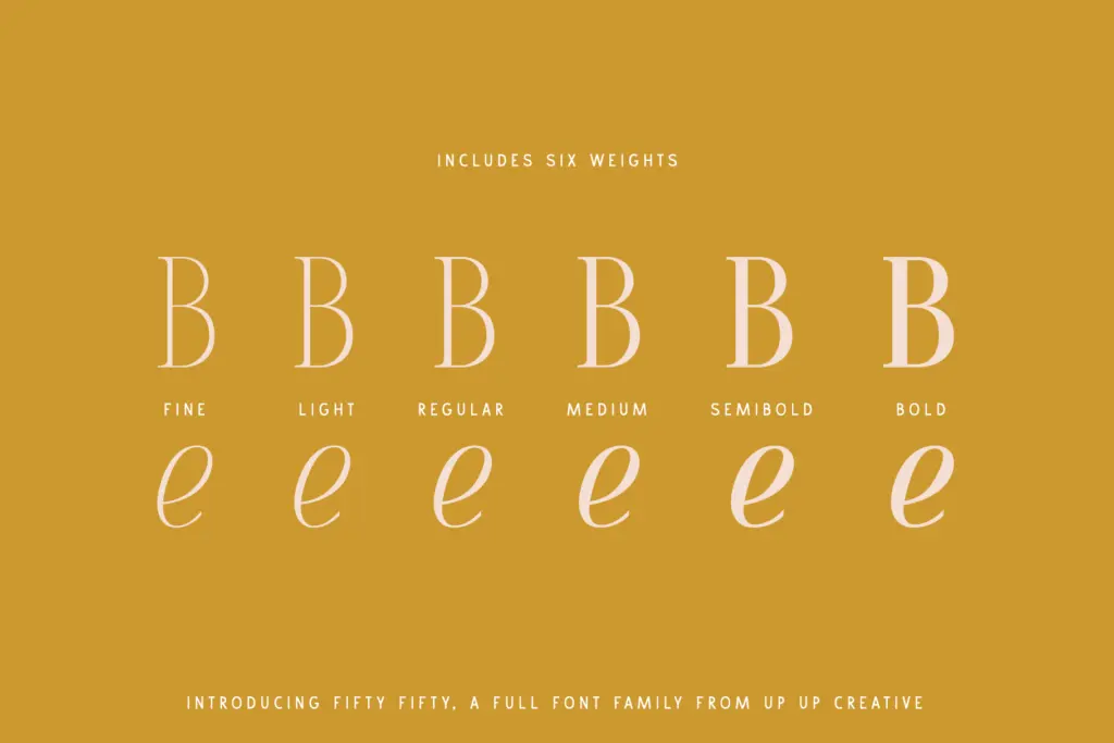
Six weights, each with a companion italic, gives you a genuine range to work a layout with — light for captions and pull quotes, heavier weights for the moments that need to shout. Around 700 glyphs is a healthy count for a display-leaning family, and the multilingual support extends its usefulness beyond English-only branding work.
The standout is the ligature set: 117 standard and discretionary ligatures. That’s an unusual amount of attention for a font in this category, and it shows in practice — pairs and triples of letters that normally look mechanical when kerned tightly instead flow into single, drawn connections. Combined with stylistic sets and character variants, there’s real room to customise a wordmark without leaving the typeface. The catch is that none of this is automatic in every environment. Word users will need to dig into the advanced OpenType tab, and anyone building assets for the web needs to check that whatever platform they’re using actually exposes discretionary ligatures — many don’t by default, so the feature can sit unused unless someone sets it up.
Use cases
This is a headline and branding font first. Logotypes, monograms, poster type, magazine covers, packaging lockups — anywhere a few words need to carry visual weight, Fifty Fifty performs well, and the ligature set gives branding work a bespoke, hand-finished quality without requiring custom lettering. The six weights make it plausible to build a small hierarchy around it, using lighter weights for supporting text.
Push it into long-form body copy, though, and the contrast that makes it striking at large sizes becomes a liability — fine hairlines thin out and lose crispness in small print or low-resolution reproduction. Treat it as a display and identity tool, and pair it with a plainer, higher-contrast-neutral text face for anything that needs to run to paragraph length.
What we liked, and what we didn’t
Strengths
- 117 ligatures give branding work a genuinely custom, hand-finished feel
- Six weights plus italics support real typographic hierarchy in one family
- Caps have real presence for logotypes, monograms, and masthead work
Trade-offs
- High stroke contrast thins out and loses crispness at small or body-text sizes
- Advanced OpenType features require extra setup in non-Adobe software like Word
Fifty Fifty is a confident display serif with an unusually deep ligature set, built for headlines, logotypes, and editorial covers rather than paragraphs. Six weights and italics give it flexibility for hierarchy, but its high contrast means it's best kept out of body text. Strong choice for branding and poster work, less so for anything that needs to run small.
Verdict

Tantype reviews typefaces in depth — every font is tested in real branding, editorial and screen layouts before a word gets written. 555+ fonts reviewed and counting.