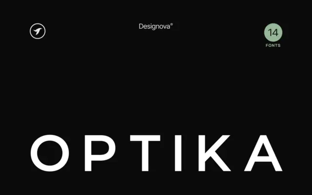
Optika: a Swiss-leaning minimalist sans built for logotypes and headlines
Design style Optika sits squarely in the grotesque-revival lane that has dominated branding work for the past decade: tight apertures,…
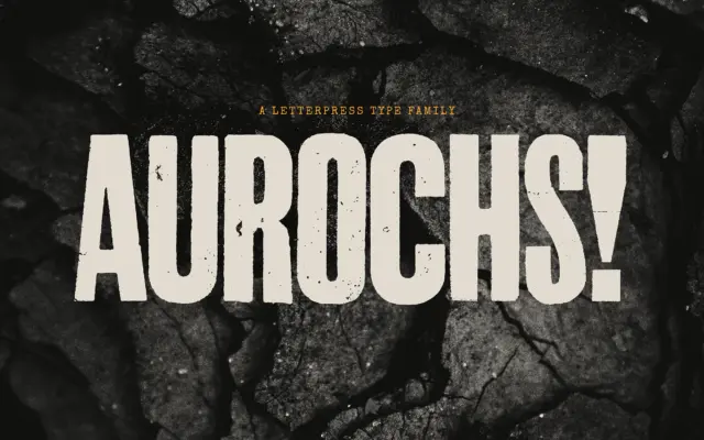
Design style Aurochs is a display sans drawn from scans of old letterpress and woodblock capitals, and it wears that…
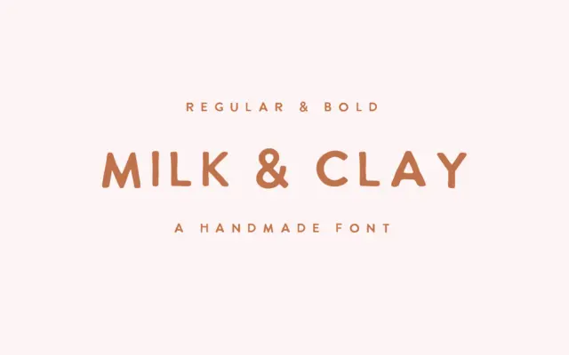
Design style Milk & Clay sits in the loose, hand-drawn sans category that’s become a staple of small-brand branding: unjoined…
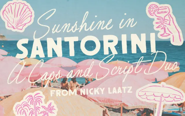
Design style Santorini Sunshine is a two-part family: a loose, imperfect script paired with a rough-edged all-caps sans built to…
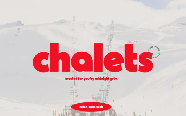
Design style Chalets pulls from mid-century ski resort signage — the kind of lettering you’d find painted on a lodge…
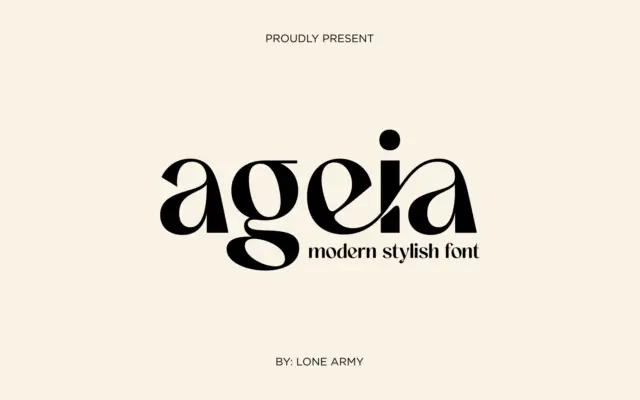
Design style Ageia sits in the geometric-sans family that’s become the default vocabulary for modern branding, but it doesn’t try…
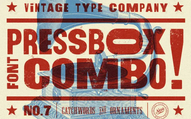
Design style PressBox belongs to the well-worn tradition of American wood-type revival: thick, confident sans-serif letterforms that lean on the…
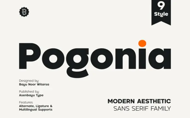
Design style Pogonia sits in the well-populated territory between geometric construction and humanist warmth, a combination that has become the…
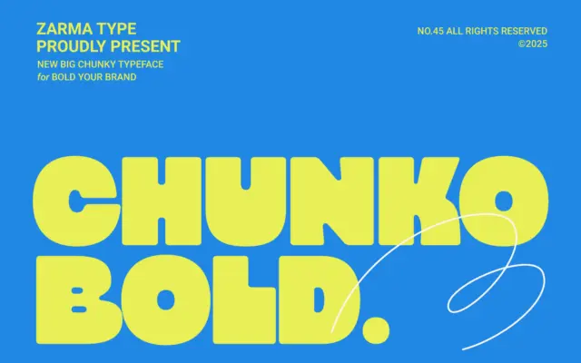
Design style Chunko Bold sits in the current wave of oversized geometric sans faces built for one job: filling space…