
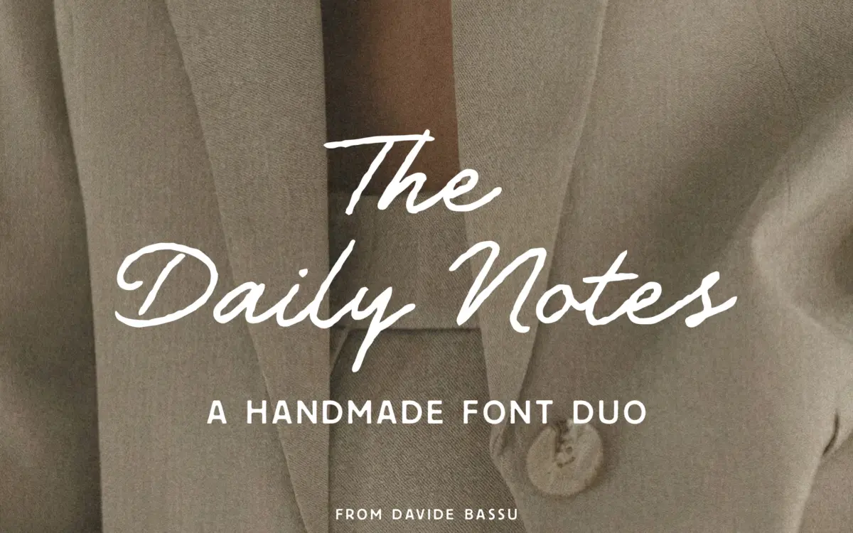
The Daily Notes: a handwritten script and sans duo for boutique branding
Design style
The Daily Notes pairs a loose, handwriting-style script with a geometric sans, the sort of combination that has become the default toolkit for lifestyle branding. The script leans into an unforced, slightly wobbly rhythm rather than tight calligraphic polish. Letters connect casually, with entry and exit strokes that vary just enough to avoid looking stamped. It comes in Regular, Slanted, Bold, and Bold Slanted, which gives you a reasonable spread between a quiet handwritten note and a headline that needs more visual weight.
The sans is the plainer half of the pairing, and deliberately so. It’s geometric and open, with even stroke widths and generous counters, built to sit quietly under or beside the script without competing for attention. Two weights, Regular and Bold, is enough for basic hierarchy but not much more — there’s no light or condensed option to lean on if a layout needs finer gradation.
Character set and features
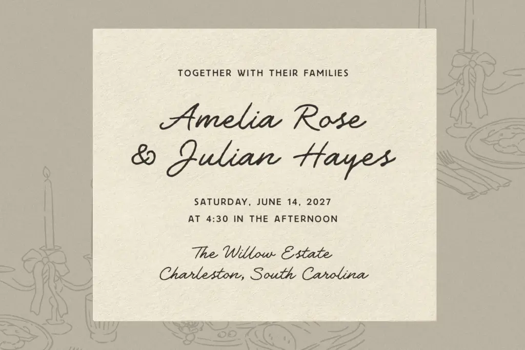
The script’s main selling point is its alternate set: over 50 OpenType alternates and ligatures aimed at breaking up repetition in words with doubled letters or common combinations. Used well through OpenType-aware software, this is what keeps the handwriting illusion from collapsing into a mechanical repeat-pattern, which is the usual failure point of script fonts at this price point. The catch is that it requires a program that actually supports these features — drop this into something that doesn’t, and you’re stuck with the default glyphs, which are fine but noticeably flatter.
The sans is more conventional in its character support, doing the job of a workhorse companion rather than trying to say anything on its own. Neither typeface claims an unusual language range or extended symbol set in the brief, so treat it as a Latin-script tool for now and check coverage before committing to a multilingual project.
Use cases
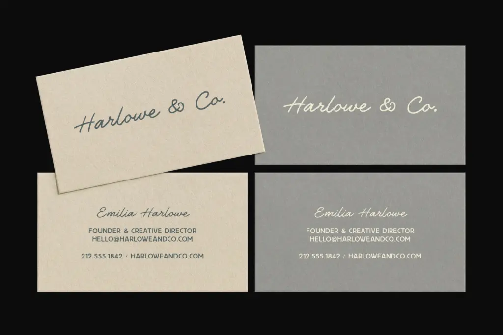
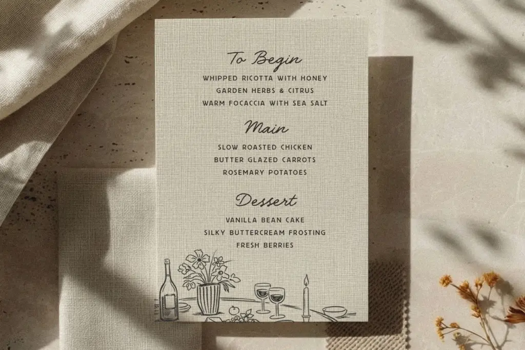
This duo is built for a specific visual world: beauty and wellness branding, boutique packaging, wedding stationery, cafés, and the kind of editorial spread that wants to feel personal rather than corporate. The script does well as a logotype, a pull quote, or a short headline where its imperfections read as warmth rather than noise. Push it into long-form paragraph text and the irregularity that makes it charming at large sizes starts to work against legibility — this is a display script, not a body-copy script, and it should be used as one.
The sans earns its keep in the places the script can’t reach: taglines, addresses, ingredient lists, captions, anywhere small and clear matters more than personality. Together they give a designer a fast way to build a two-tier hierarchy without hunting for a second font that matches the mood. The trade-off is that the pairing looks like a lot of other pairings in this exact niche right now — soft feminine script over airy geometric sans — so it will need genuinely good layout and colour work to avoid blending into the wallpaper of boutique branding built the same way.
What we liked, and what we didn’t
Strengths
- Over 50 alternates and ligatures on the script help break up repetitive letterforms
- Four script styles and two sans weights give a workable hierarchy out of the box
- The sans is genuinely quiet and functional as a supporting text face
Trade-offs
- The script's charm depends on OpenType support; without it the alternates are unavailable
- Only two sans weights limits fine hierarchy control in more complex layouts
The Daily Notes does exactly what a lifestyle-branding script and sans duo is supposed to do, and it does it competently rather than distinctively. The alternate set on the script is a real strength if your software supports OpenType features properly. It's a solid working tool, but it sits within a very crowded visual category and won't stand out on its own.
Verdict

Tantype reviews typefaces in depth — every font is tested in real branding, editorial and screen layouts before a word gets written. 555+ fonts reviewed and counting.