
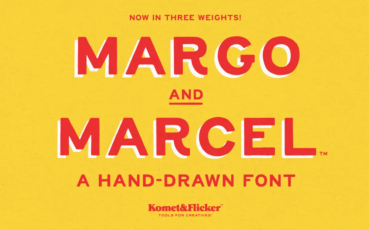
Margo and Marcel: a rough all-caps sans for casual, hand-touched branding
Design style
Margo and Marcel is an all-caps sans built on an uneven, hand-drawn line. Strokes wobble slightly rather than running dead straight, corners round off unevenly, and terminals stop with a bit of overshoot rather than a clean cut. It reads as a marker or brush-pen sketch cleaned up just enough to function as a typeface, without losing the evidence of a hand behind it. There’s no pretence of geometric consistency here — letters lean and swell in small, deliberate ways that keep the word shapes from feeling mechanical.
It sits closer to lettering than to a drafted sans, which means it has a strong point of view but a narrow one. It’s not trying to be neutral, and it shouldn’t be asked to be.
Character set and features
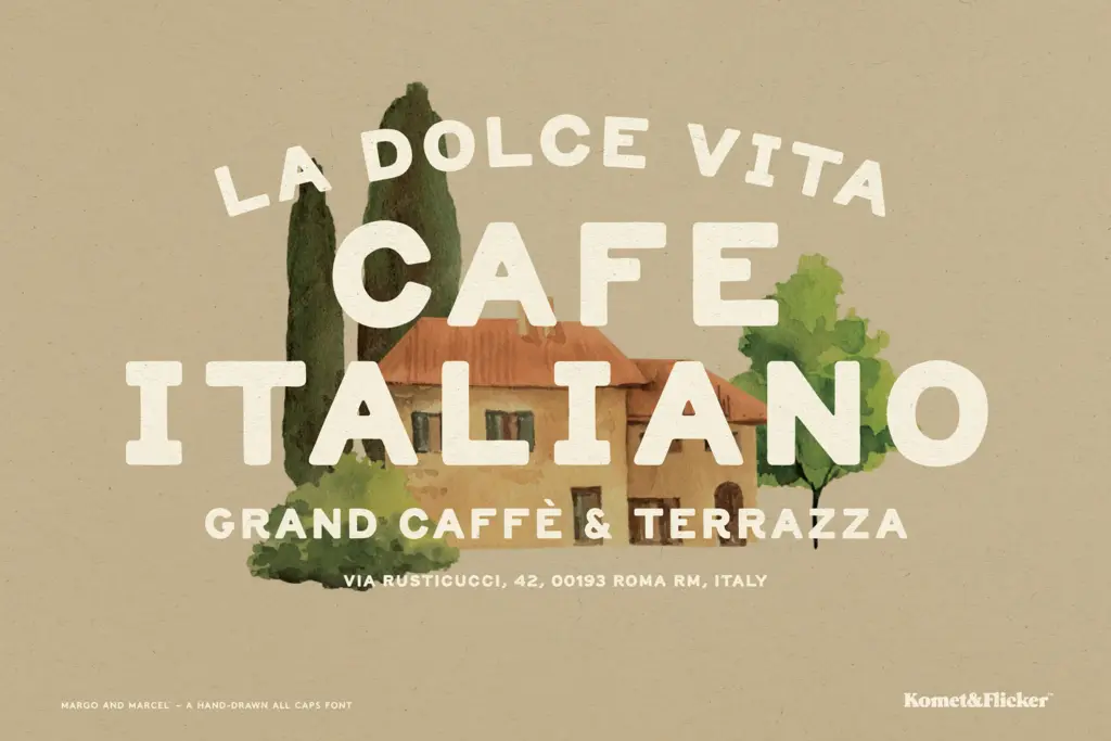
The set covers uppercase A–Z, a selection of European characters, numerals, punctuation, and a handful of symbols, along with two styles of pre-made fractions. Being caps-only is a real constraint worth naming upfront: there’s no lowercase companion here, so anything requiring sentence case or long-form reading is off the table by design.
Alternate glyphs are provided for C, E, G, I, J, K, Q, R, and S, which helps break up repeated letters across a headline or logotype and adds some of the irregularity you’d expect from genuine hand lettering rather than a single repeated stamp. The standout feature is the set of 11 custom connecting-word glyphs — ligature-style treatments for words like AND, THE, and WITH — accessed through the glyphs panel in Illustrator or Photoshop. These are built to sit naturally within a line of text, giving small compositions (a label, a short tagline, a product name) a bit of scripted flair without requiring any kerning gymnastics from the user.
Spacing throughout is loose and a little irregular, consistent with the hand-drawn premise, but worth checking line by line in longer headlines — organic spacing can drift unevenly if you’re not paying attention to word breaks.
Use cases
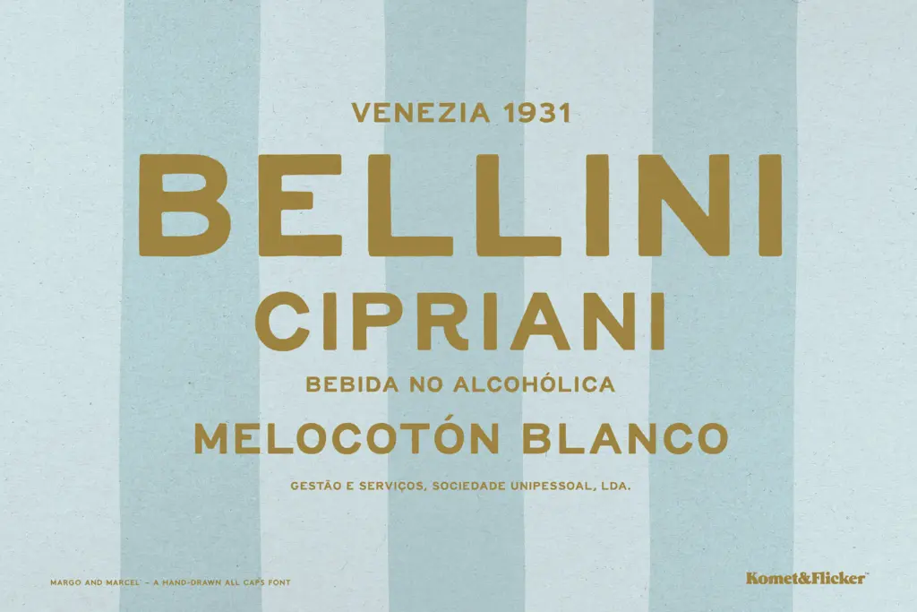
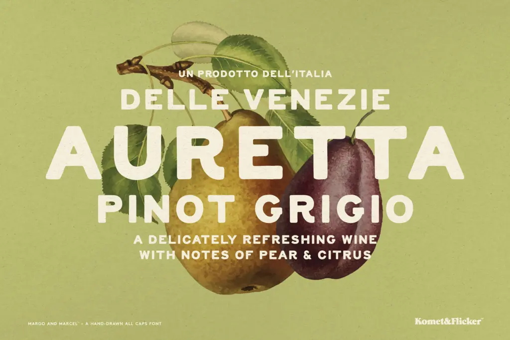
This is a font for short bursts of text: logotypes, packaging call-outs, signage, social graphics, menu headers, market stall signs. The rough edges and alternate letters make it well suited to food and beverage branding, artisanal or handmade product lines, and anything wanting an unpolished, friendly voice rather than a corporate one. The connecting-word glyphs make it particularly useful for small phrases — a jar label reading
What we liked, and what we didn’t
Strengths
- Custom connecting-word glyphs add scripted flair to short phrases without manual kerning
- Alternate letters for nine characters keep repeated letters from feeling stamped
- Loose, organic linework gives it a genuinely handmade feel rather than a filtered effect
Trade-offs
- All-caps only, so there's no lowercase for anything beyond short headlines or labels
- Irregular spacing needs manual checking on longer word combinations to avoid awkward gaps
Margo and Marcel is a caps-only, hand-drawn sans built for short bursts of playful branding rather than sustained reading. The connecting-word glyphs and letter alternates give it real texture for labels and signage, but the format limits it to display duty. It does one job — friendly, unpolished headline type — reasonably well.
Verdict

Tantype reviews typefaces in depth — every font is tested in real branding, editorial and screen layouts before a word gets written. 555+ fonts reviewed and counting.