
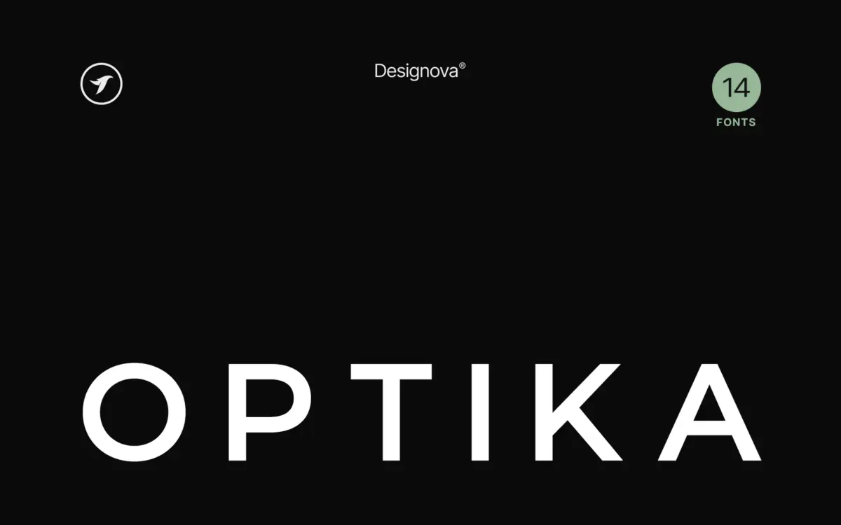
Optika: a Swiss-leaning minimalist sans built for logotypes and headlines
Design style
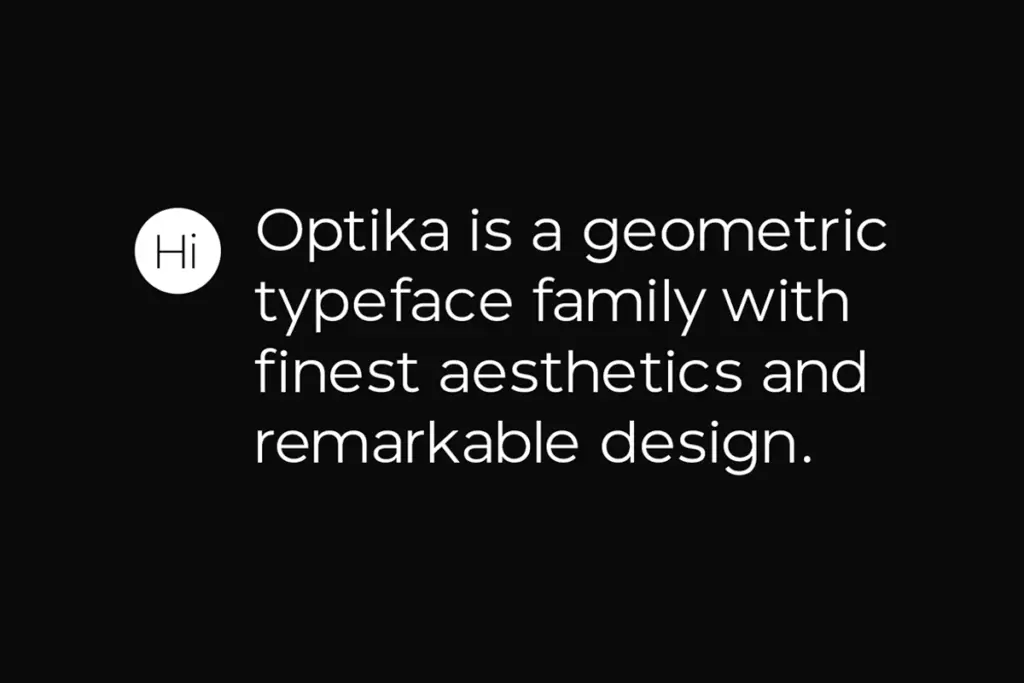
Optika sits squarely in the grotesque-revival lane that has dominated branding work for the past decade: tight apertures, low stroke contrast, and a geometric bones. It reads as descended from the Swiss school without trying to be a strict historical exercise. Circles are true circles rather than superellipses, and the x-height runs generous, which gives the lowercase a confident, almost architectural presence at large sizes.
What Optika does not do is take risks. The terminals are cut straight, the counters are open but not eccentric, and there’s no single letterform — a spurred G, a flared R leg, an unusual t — that gives it a signature you’d recognise blind. That’s not necessarily a flaw for a family pitched at branding work, where a typeface’s job is often to disappear into the logotype rather than announce itself. But designers hoping for a distinctive point of view in the drawing itself will find Optika plays it safe.
Character set and features
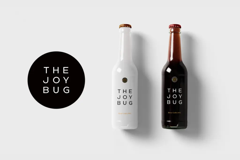
As a family spanning multiple weights, Optika gives you the range to build a full identity system — light weights for body copy and captions, heavier cuts for headlines and wordmarks. The spacing is even and the family holds its rhythm across the weight range, which matters more than any individual glyph when you’re setting a paragraph rather than a logo. Numerals and basic punctuation behave as expected; there’s nothing exotic here in the way of ligatures or alternates, and the seller material doesn’t claim any, so treat this as a working sans rather than a feature-rich display face.
The uppercase is where the family earns its branding credentials — letters like the M and W sit on consistent diagonal angles, and the O family (O, Q, C, G) stays visually uniform, which is the detail that makes or breaks a wordmark set in all caps. Loosen the tracking, as the seller’s own promotional material suggests, and the caps start to feel like a logotype rather than a paragraph of text — which is clearly the intended use.
Use cases
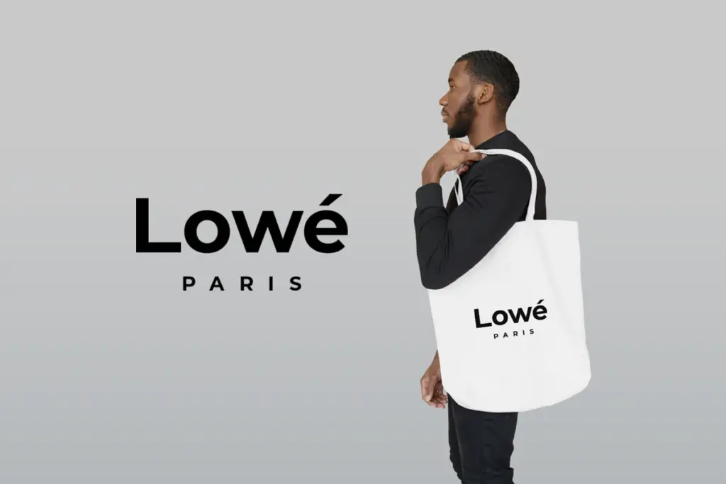
Optika is built for exactly what its name and category suggest: logotypes, headline treatments, corporate identity work, and marketing collateral where a clean, undecorated sans needs to carry a brand mark rather than a novel. Tracked-out caps at a large size are the sweet spot — think signage, posters, packaging headers, or a wordmark set beside a mark. It will also do quiet work as a headline face paired with a more characterful body text elsewhere in a system, since its neutrality makes it a safe anchor rather than a competing voice.
It’s less suited to long-form reading — nothing here suggests it was optimised for small-size body text, and its lack of a distinct personality means it won’t lift a design that needs typographic charisma to do the heavy lifting. If your brief calls for a sans that people should look at twice, Optika isn’t that font. If your brief calls for a dependable, well-spaced grotesque that lets the layout and the mark do the talking, it’s a solid, if unadventurous, choice.
What we liked, and what we didn’t
Strengths
- Even spacing and consistent weight rhythm make it reliable for full identity systems
- Uniform round-letter geometry (O, Q, C, G) makes tracked-out caps read cleanly as a wordmark
- Generous x-height gives headlines a confident, architectural presence at large sizes
Trade-offs
- The drawing lacks a distinctive letterform or quirk that would set it apart from other grotesque-revival sans families
- Not optimised for long-form body text or small-size reading
Optika is a competent, well-spaced minimalist sans that does exactly what its brief promises: clean logotypes, tracked-out headlines, and corporate identity work. It doesn't take drawing risks or offer a distinctive personality, so it works best as a dependable anchor rather than a star.
Verdict

Tantype reviews typefaces in depth — every font is tested in real branding, editorial and screen layouts before a word gets written. 555+ fonts reviewed and counting.