
Milk & Clay: a handwritten sans for handmade brands and quote graphics
Design style
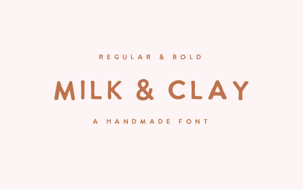
Milk & Clay sits in the loose, hand-drawn sans category that’s become a staple of small-brand branding: unjoined letters built from a single-width marker-like stroke, with none of the calligraphic swing of a script. The construction is casual on purpose. Letters lean slightly off their baseline, x-heights bounce a little, and terminals are blunt rather than tapered, which gives it the feel of something written with a felt-tip rather than drawn with a brush. It comes in two weights, Regular and Bold, so there’s a small amount of range for hierarchy without ever leaving the handmade register.
The personality is warm and unpolished rather than elegant. Where a lot of handwritten sans fonts try to smooth out the wobble to look more “designed,” Milk & Clay leaves the imperfection visible — slightly uneven stroke weight, a few inconsistent joins where letters almost touch. That’s the point of the typeface, and it works as long as you want that effect. It won’t pass for a considered display serif or a refined script; it reads as approachable, a little scrappy, on the feminine-leaning side of the handmade aesthetic.

Character set and features
The set covers standard uppercase and lowercase Latin characters plus numerals and basic punctuation, delivered in the usual web and desktop formats (OTF, TTF, WOFF, WOFF2) across both weights. There’s no mention of extended language support, small caps, ligatures, or alternate characters, so treat this as a single-style pair rather than a font with built-in variation — what you see in the two weights is what you get. That’s fine for its intended use, but designers hoping for swash caps or contextual alternates to break up repetition in longer quote graphics will need to fake that variation with manual kerning or occasional letter substitution.
At small sizes the looseness of the strokes and the slight baseline drift start to work against legibility — this isn’t a font built for body copy or dense paragraphs. It wants space: generous line spacing, short lines, and enough size to let the handwritten character breathe. Push it too small and the wobble reads as noise rather than charm.
Use cases
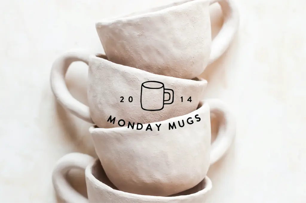
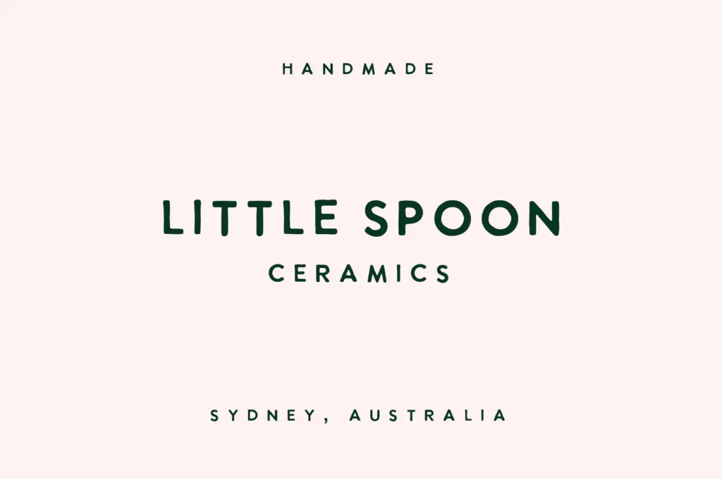
This is a font for surface-level, high-impact use rather than for setting long text. Think product labels on ceramics or packaging, a logotype for a handmade or craft brand, a headline on an Instagram quote tile, or a blog header where a friendly, unfussy voice is more useful than formal polish. It pairs naturally with a plain grotesk or a simple serif for supporting text, since it has no interest in doing that job itself.
It’s not the right choice for anything that needs to read as premium or restrained — luxury packaging, editorial mastheads, anything where precision matters more than warmth. But for the specific niche it’s aimed at — small-batch branding, social quote graphics, handmade-goods packaging — it does a competent, unpretentious job without pretending to be more than it is.
What we liked, and what we didn’t
Strengths
- Genuinely casual, marker-like stroke that avoids the over-smoothed look of many handwritten sans fonts
- Two weights give a small but usable amount of hierarchy for headers versus subheads
- Well suited to packaging and quote-graphic work where a handmade voice matters more than precision
Trade-offs
- Legibility drops off quickly below display sizes, so it's unsuited to any real body copy
- No alternates, ligatures, or extended character features to add variation across repeated words
Milk & Clay does one job well: a friendly, unpolished handwritten sans for handmade branding and short display text. It has no ambitions beyond that, which is honest, but it also means it strains fast outside its lane.
Verdict

Tantype reviews typefaces in depth — every font is tested in real branding, editorial and screen layouts before a word gets written. 555+ fonts reviewed and counting.