
Black Mango: a 9-weight sans built for branding and web work
Design style
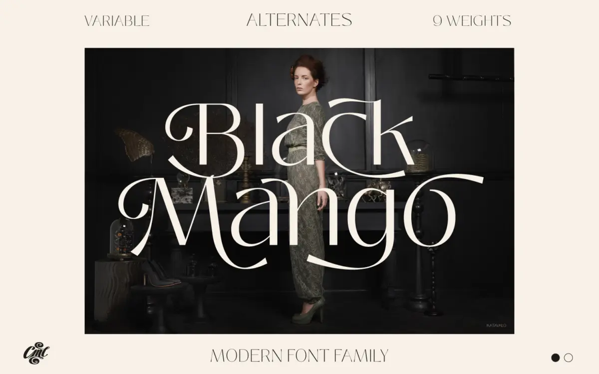
Black Mango is a low-contrast grotesque-leaning sans that plays it straight rather than chasing personality. The letterforms are geometric-adjacent without being rigidly circular — bowls are slightly squared off, terminals are cut cleanly, and there’s none of the quirky detailing that would tie it to a specific era or trend. That restraint is the point. It reads as a workhorse family rather than a display statement, which is a reasonable choice given how many weights it spans.
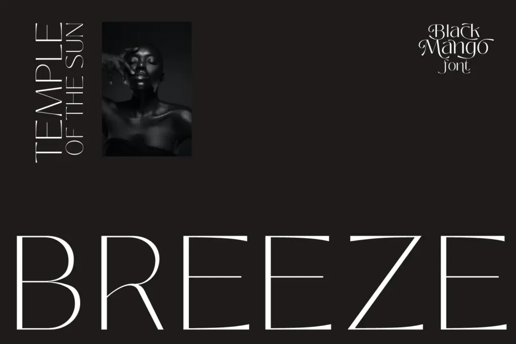
Across the range, the extremes are where it gets interesting. The thinnest weights thin out to hairline strokes that feel closer to a modern serif’s contrast than a typical sans, giving them a fashion-editorial quality when set large. The heaviest weights bulk up into a solid, almost slab-like presence without changing the underlying skeleton much — a sign the family was built systematically rather than interpolated loosely. The alternates add some optional flourish, mostly in characters like the ‘a’, ‘g’, and terminal letterforms, letting you dial in a bit more character in headlines without touching the working weights.
Character set and features
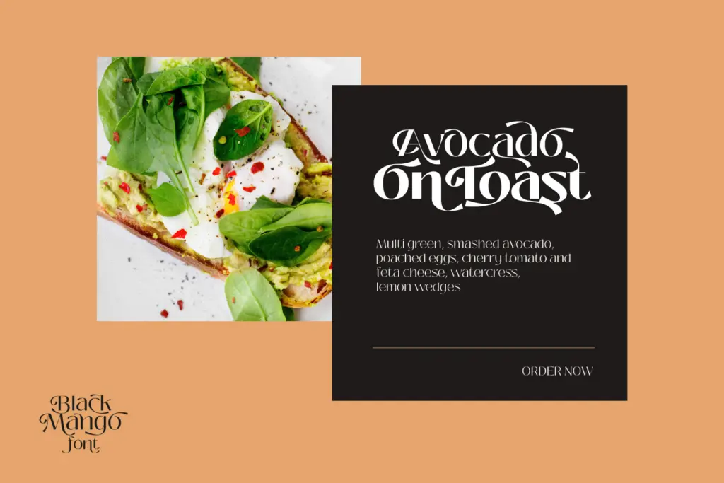
Nine weights is a genuinely useful range, covering hairline through black, and the variable font format means you’re not locked into fixed instances if your workflow supports it. Numbers and currency symbols are included, which matters for anything touching pricing, packaging or financial UI, and multilingual support widens the pool of projects it can serve without a fallback font. The dozens of alternates are a nice inclusion but function more as seasoning than as a second personality — don’t expect a dramatically different look by swapping them in wholesale.
What’s missing from the brief is any mention of italics. If the family doesn’t include an italic axis, that’s a real gap for editorial or long-form use where emphasis matters, and it’s worth checking before committing to it as a primary text face. The lighter weights, while elegant at large sizes, will need testing at small sizes — hairline strokes are the first thing to disappear on lower-resolution screens or cheap print stock.
Use cases
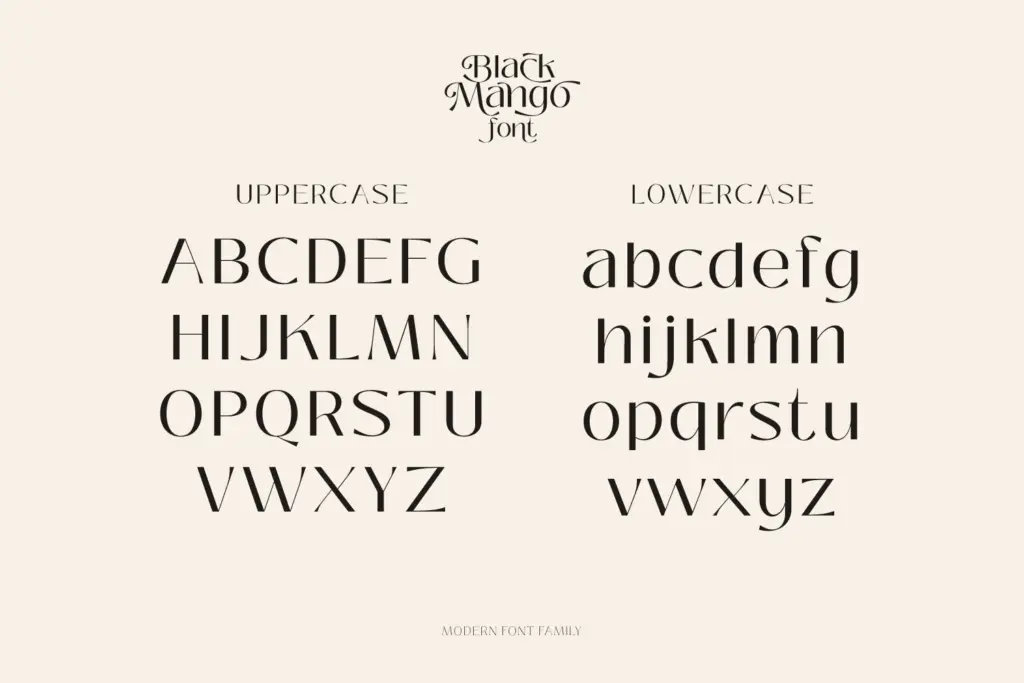
This is a branding and interface family first. The weight range makes it genuinely flexible for building a type system: hairline or thin for oversized fashion headlines, mid weights for body copy and UI labels, black weights for buttons, badges or emphatic callouts. Web designers will appreciate the variable font angle for performance and fine-tuned weight control without loading nine separate files.
It suits fashion and lifestyle branding, editorial mastheads, packaging typography that needs a currency-aware numeral set, and general web UI where a single family needs to do several jobs. It’s less suited to anything asking for warmth or idiosyncrasy — logos wanting a distinctive silhouette will need to lean hard on the alternates, since the base letterforms are deliberately neutral. Treat it as infrastructure rather than a hero font, and it earns its keep.
What we liked, and what we didn’t
Strengths
- Nine weights plus variable format give real flexibility for building a type system
- Currency symbols and multilingual support make it practical for commercial and international work
- Alternates offer a way to add character to headlines without abandoning the base letterforms
Trade-offs
- Hairline weights risk disappearing at small sizes or on lower-quality print stock
- No mention of italics, which limits its use for editorial emphasis or long-form text
Black Mango is a competent, systematically built sans that trades personality for range. It's well suited to branding and web systems that need one family to cover many weights, but it won't carry a project on distinctive character alone.
Verdict

Tantype reviews typefaces in depth — every font is tested in real branding, editorial and screen layouts before a word gets written. 555+ fonts reviewed and counting.