Serif
3.9
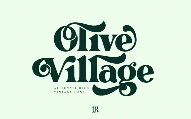
Olive Village: a 70s-groovy serif for headlines with a retro wink
Design style Olive Village leans into a very specific decade. The curves are rounded and slightly bulbous, the contrast is…
 Tantype

Design style Olive Village leans into a very specific decade. The curves are rounded and slightly bulbous, the contrast is…
Tantype
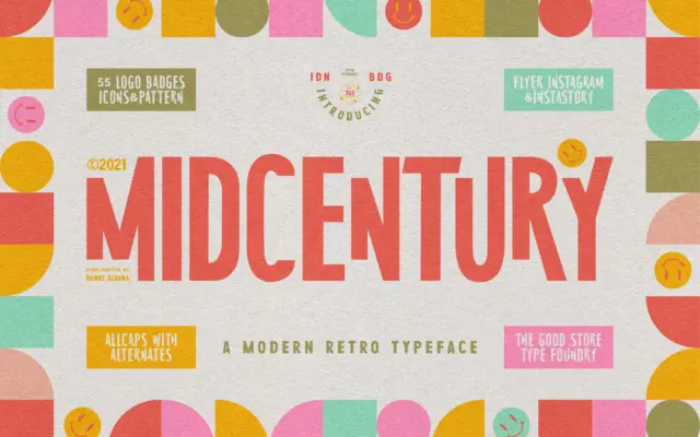
Design style MidCentury Typeface is an uppercase-only display face pitched squarely at the poster-and-book-jacket look of the 1950s. The letters…
Tantype
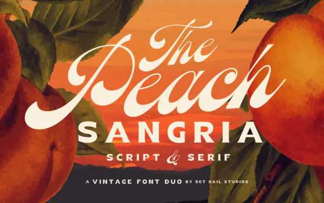
Design style Peach Sangria is a two-font set built around a single idea: a connecting script with weight pooled low…
Tantype
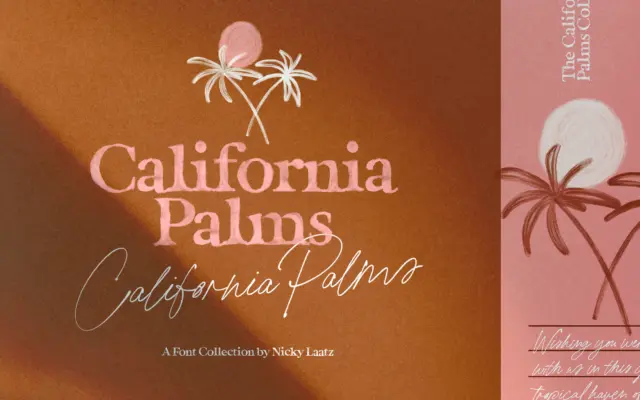
Design style California Palms is less a single typeface than a small collection built around one seasonal mood. There are…
Tantype
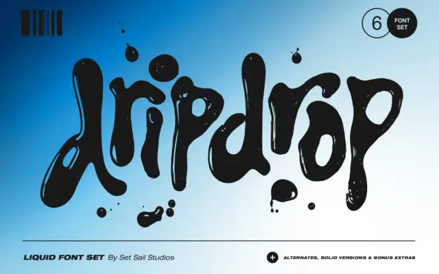
Design style Dripdrop is built from actual ink squeezed onto paper, then digitised letter by letter, and it looks it.…
Tantype
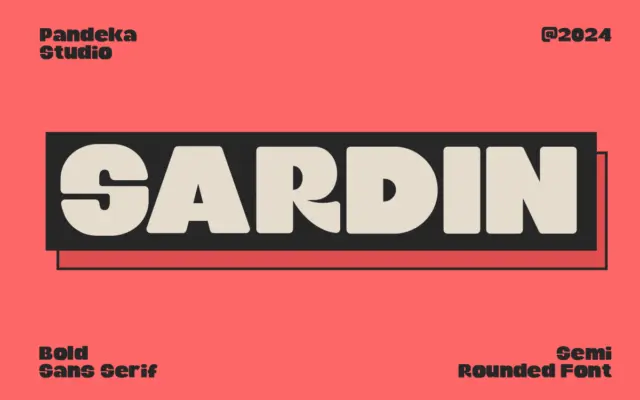
Design style Sardin is a heavyweight rounded sans that leans hard on its 90s cartoon reference. The strokes are thick…
Tantype
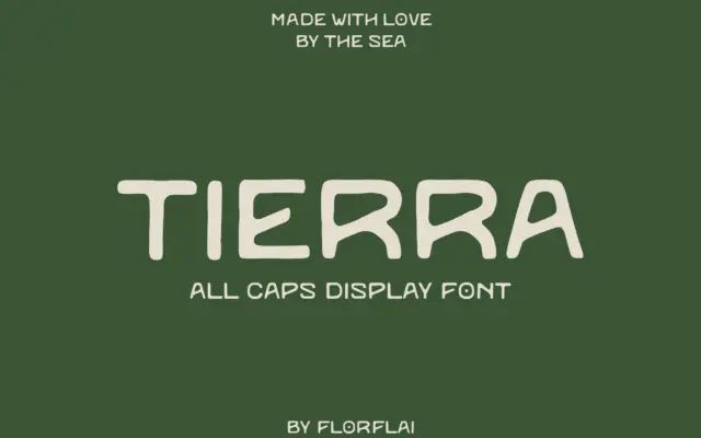
Design style Tierra is a sans serif drawn with a deliberately unsteady hand. The seller’s marketplace listing files it under…
Tantype
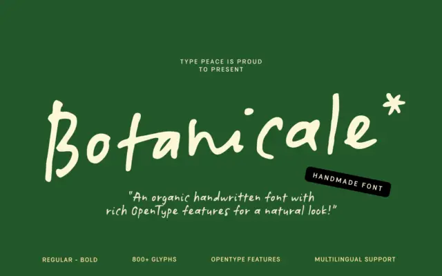
Design style Botanicale sits in the loose, unfiltered end of the handwritten category. The strokes wobble slightly, baselines drift, and…
Tantype
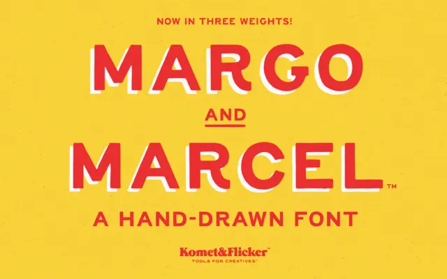
Design style Margo and Marcel is an all-caps sans built on an uneven, hand-drawn line. Strokes wobble slightly rather than…
Tantype