Serif
3.7
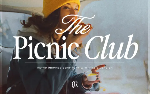
The Picnic Club: a groovy 80s-inspired serif for retro branding
Design style The Picnic Club leans on a specific decade rather than a vague idea of “vintage.” The letterforms carry…
 Tantype

Design style The Picnic Club leans on a specific decade rather than a vague idea of “vintage.” The letterforms carry…
Tantype
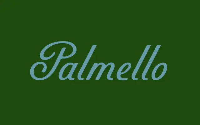
Design style Palmello belongs to the sign-painter school of script: letters that reference brush and pen work but don’t try…
Tantype
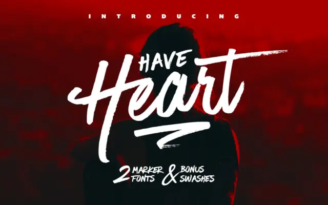
Design style Have Heart is built around the texture of a marker pen, not a brush or a pointed nib.…
Tantype
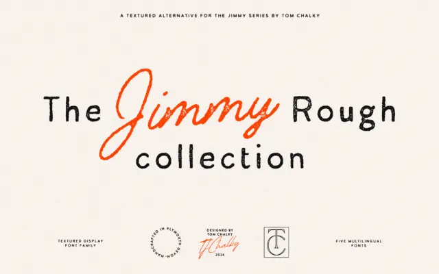
Design style Jimmy Rough is a collection rather than a single face: a sans, a serif and a monoline script,…
Tantype
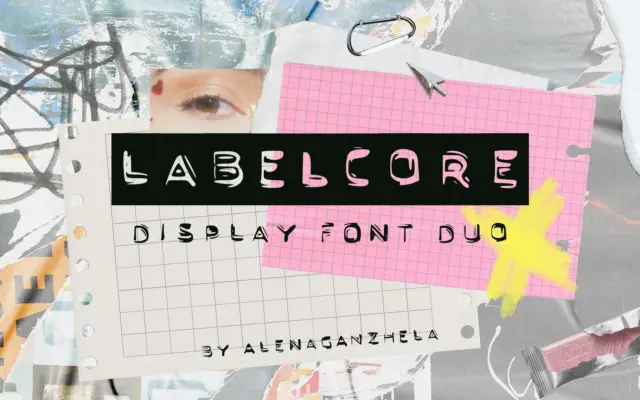
Design style LABELCORE takes its cue from the plastic embossed label makers that lived in every junk drawer in the…
Tantype
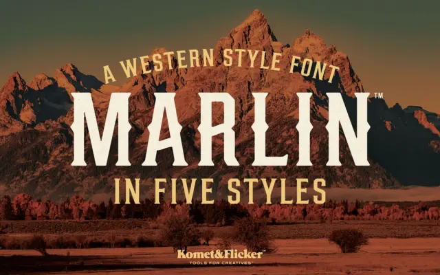
Design style Marlin sits squarely in the old-west signage tradition: condensed slab serifs, heavy vertical stress, and slightly worn edges…
Tantype
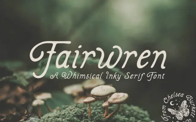
Design style Fairwren is a bold serif built on solid, slightly irregular strokes with inky edges that suggest a nib…
Tantype
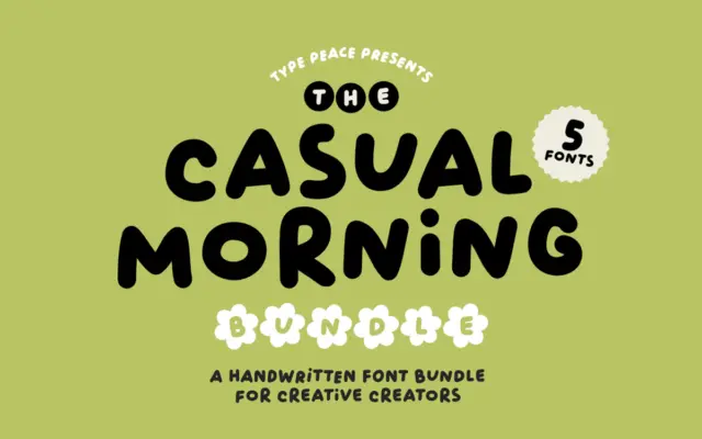
Design style Casual Morning is an all-caps handwritten face built on thick, marker-like strokes rather than fine calligraphic ones. The…
Tantype
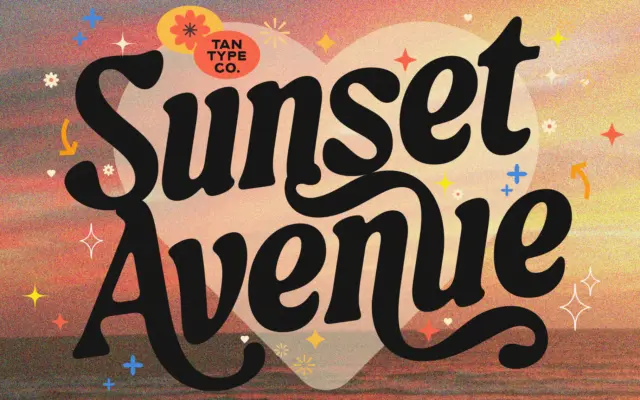
Design style TAN-SUNSET sits in serif territory but leans hard into personality rather than restraint. The strokes carry noticeable contrast,…
Tantype