
Sardin: a rounded bold sans built for cartoon-inflected branding
Design style
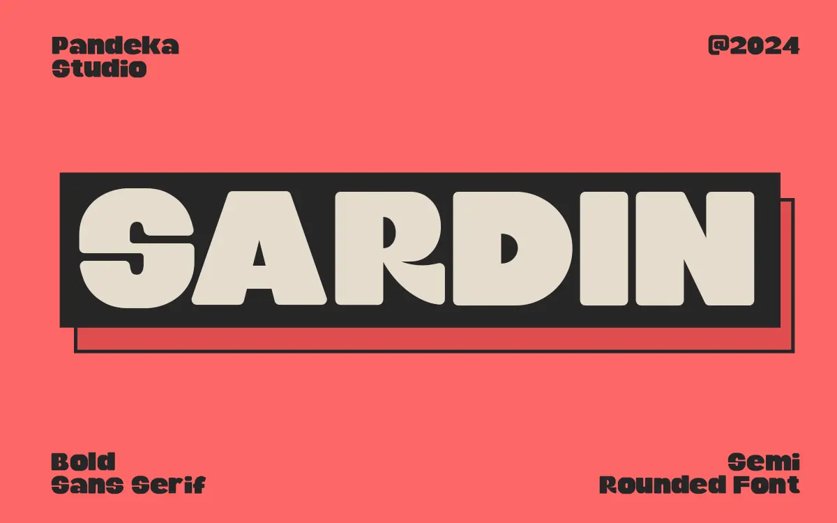
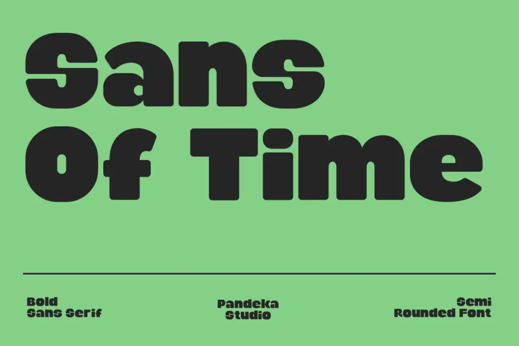
Sardin is a heavyweight rounded sans that leans hard on its 90s cartoon reference. The strokes are thick and even, terminals bulge slightly rather than tapering off cleanly, and joints look built up rather than drawn thin, which gives the letterforms a chunky, inflated quality. Bowls on letters like the o and e are noticeably rounded rather than geometric, and the overall rhythm feels bouncy rather than measured. It reads as a display face with a comic-strip attitude rather than a neutral workhorse, and it commits to that character consistently across the alphabet rather than softening it in a few letters and leaving the rest generic.
The bold weight is the whole point here. There’s no attempt at a lighter companion or a text-optimised counterpart, so what you see is what you get: one confident, thick-set voice. That’s a reasonable choice for a display face, but it does mean the typeface has a single register, and that register is loud.
Character set and features
The set covers Latin languages including Danish, French, German, Italian, Portuguese, Spanish, Swedish and several less common ones like Friulian and Rombo, so European-market branding work is well served. PUA encoding is used to make special characters and alternates reachable without a full design app, which matters if the intended user is working in Canva or similar tools rather than Illustrator — the seller’s mention of Cricut Design access points at a crafts-and-small-business audience as much as a professional one.
Formats include TTF, OTF, WOFF and WOFF2, so it’s usable across desktop design software and the web. Beyond that, the brief doesn’t specify ligatures, swash alternates or a numeral set beyond default, so treat any claims of extensive stylistic variation with caution — what’s confirmed is a solid rounded bold with broad language coverage, not necessarily a font with dozens of contextual alternates.
Use cases
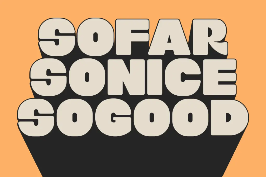
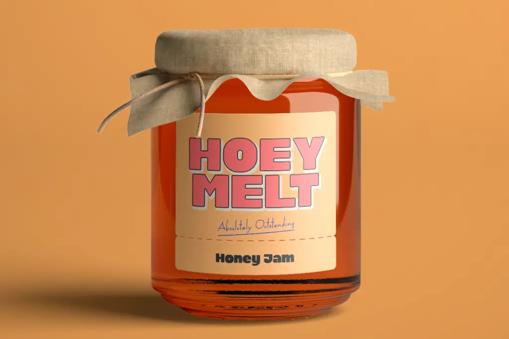
This is a logotype and headline font first. The rounded bold weight suits badges, stickers, packaging call-outs and short branding lines where a friendly, slightly retro, comic energy is wanted — think snack packaging, kids’ products, novelty merchandise, or any brand trying to signal approachable rather than austere. It pairs naturally with illustration or photography, since the letterforms have enough visual weight to hold their own next to busy artwork without disappearing.
It is not a body text font, despite marketing language suggesting otherwise. At small sizes the rounded terminals and heavy strokes will clot together, and there’s no lighter weight to fall back on for paragraphs of copy. Keep it to headlines, short packaging copy, single words on badges or emblem lockups, and social media graphics where a few words need to punch through. For anything requiring sustained reading — body copy, long editorial text — look elsewhere, and pair Sardin only with a plain, quiet secondary face so the display personality doesn’t get muddled by two loud voices competing.
What we liked, and what we didn’t
Strengths
- Consistent, committed rounded-bold character that reads clearly as a style choice, not a compromise.
- Broad Latin language coverage makes it usable across several European markets.
- PUA encoding and multiple formats make special characters accessible in tools like Canva without extra software.
Trade-offs
- Single bold weight only, with no lighter companion for text or hierarchy.
- Thick rounded terminals clot at small sizes, so it's unsuitable for body copy despite marketing claims.
Sardin delivers a confident, single-register rounded bold with genuine comic-strip character, well suited to logos, badges and packaging accents. It's not built for body text and offers no weight variation, so its usefulness depends entirely on how much you want that one loud voice.
Verdict

Tantype reviews typefaces in depth — every font is tested in real branding, editorial and screen layouts before a word gets written. 555+ fonts reviewed and counting.