
Tierra: a hand-built sans with rough edges for earthy, grounded branding
Design style
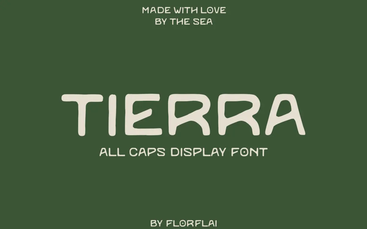
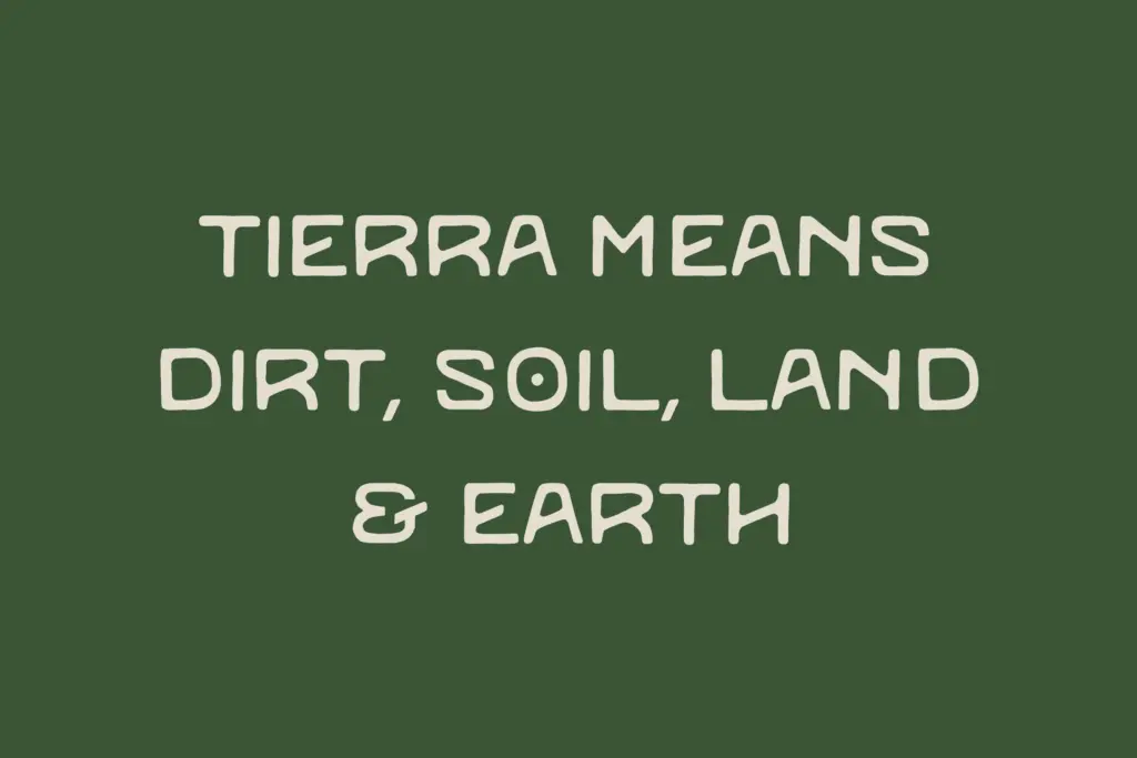
Tierra is a sans serif drawn with a deliberately unsteady hand. The seller’s marketplace listing files it under handwritten, and that’s the more accurate description: strokes waver slightly off their axis, terminals are cut rather than rounded cleanly, and letters don’t sit in perfectly even boxes. The name is Spanish for earth or soil, and the brief leans hard on that idea — subtle irregularities meant to echo texture in the ground. In practice this reads less like a literal soil metaphor and more like a plain, unfussy sans that someone has roughed up by hand rather than a plotter.
There’s no visible contrast between thick and thin strokes; the weight stays fairly consistent across the letterforms, which keeps the irregularity from tipping into chaos. Counters are open, x-height is generous, and the overall structure is closer to a grotesque skeleton than a calligraphic one. The imperfections are the whole point here — this isn’t a font trying to hide its handmade origin, it’s one that foregrounds it.
Character set and features
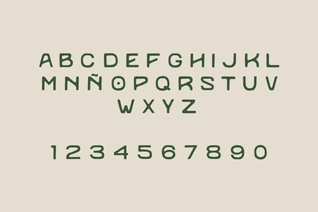
As a display-leaning handwritten sans, Tierra’s letterforms are built for short bursts of text rather than paragraphs. The irregularities that make individual letters interesting compound quickly in longer sentences — a heading of six or seven words holds its shape, but a full sentence starts to feel busy, with the eye tripping over the inconsistent stroke terminals rather than reading smoothly. That’s a natural consequence of the handmade approach, not a flaw exactly, but it does define where the font is useful.
The brief doesn’t specify extended language support, alternate characters, or ligatures, so treat this as a single-style working font rather than a full family with swash sets or stylistic alternates to lean on. What you see in the specimen is largely what you get: a consistent, slightly imperfect sans built around one voice.
Use cases
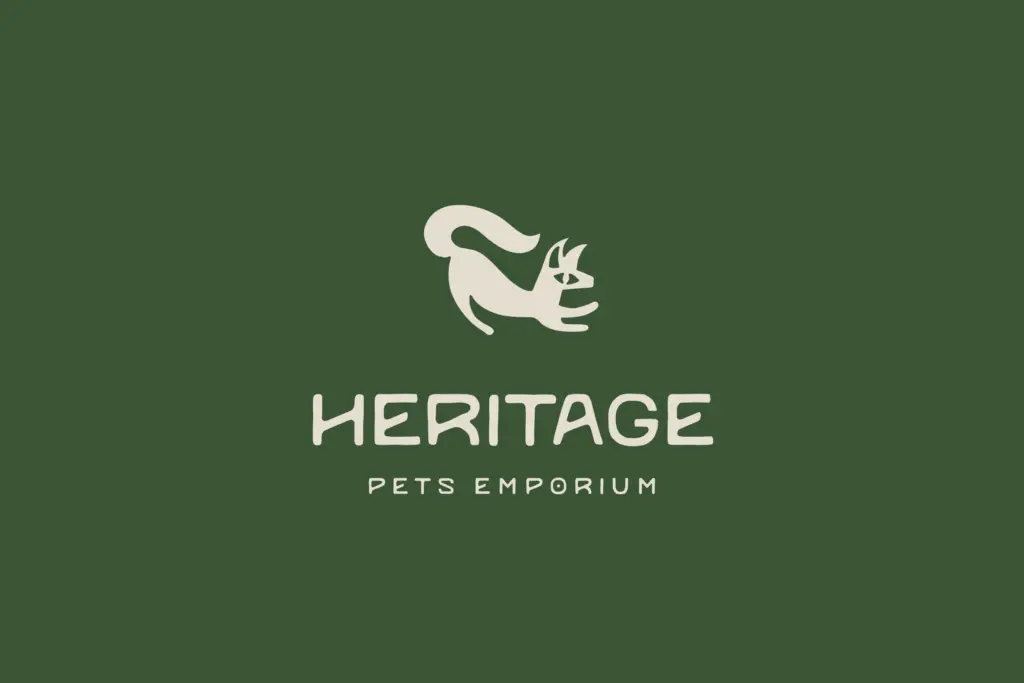
Tierra fits best in short-form, high-visibility settings — a logotype, a package front, a headline on a poster, a sign for a market stall or a small-batch product line. Anywhere a brand wants to signal handmade, natural, or artisanal without going full script or full brush lettering, this sits in a reasonable middle ground. It would pair well with a clean, quiet body-text sans, since Tierra itself isn’t built to carry long copy.
Environmental and sustainability-adjacent branding — the kind of project the seller’s own framing points toward, things tied to land, food, or craft — is a sensible fit given the irregular texture. It would also work for packaging labels, wordmarks, and editorial pull quotes where a bit of visual friction is welcome. Where it will struggle is anywhere that needs neutrality or high legibility at small sizes: body copy, UI text, dense signage. Keep Tierra to headlines and let something steadier do the reading work underneath it.
What we liked, and what we didn’t
Strengths
- The irregular stroke terminals give it a genuinely handmade feel without tipping into illegibility at display sizes.
- Consistent weight across letterforms keeps the roughness controlled rather than chaotic.
- Well suited to short, earthy, artisanal branding contexts like packaging and market signage.
Trade-offs
- Longer sentences become visually busy as the irregularities accumulate across words.
- No indication of alternate characters or extended features, so there's limited room to vary the texture within a project.
Tierra is a competent handmade sans built around consistent, deliberate imperfection rather than genuine calligraphic character. It earns its keep in headlines, logotypes, and packaging where a bit of texture is welcome, but it isn't built to carry paragraphs. A useful, single-purpose display font rather than a workhorse family.
Verdict

Tantype reviews typefaces in depth — every font is tested in real branding, editorial and screen layouts before a word gets written. 555+ fonts reviewed and counting.