
Peach Sangria: a bottom-heavy vintage script paired with a chunky poster serif
Design style
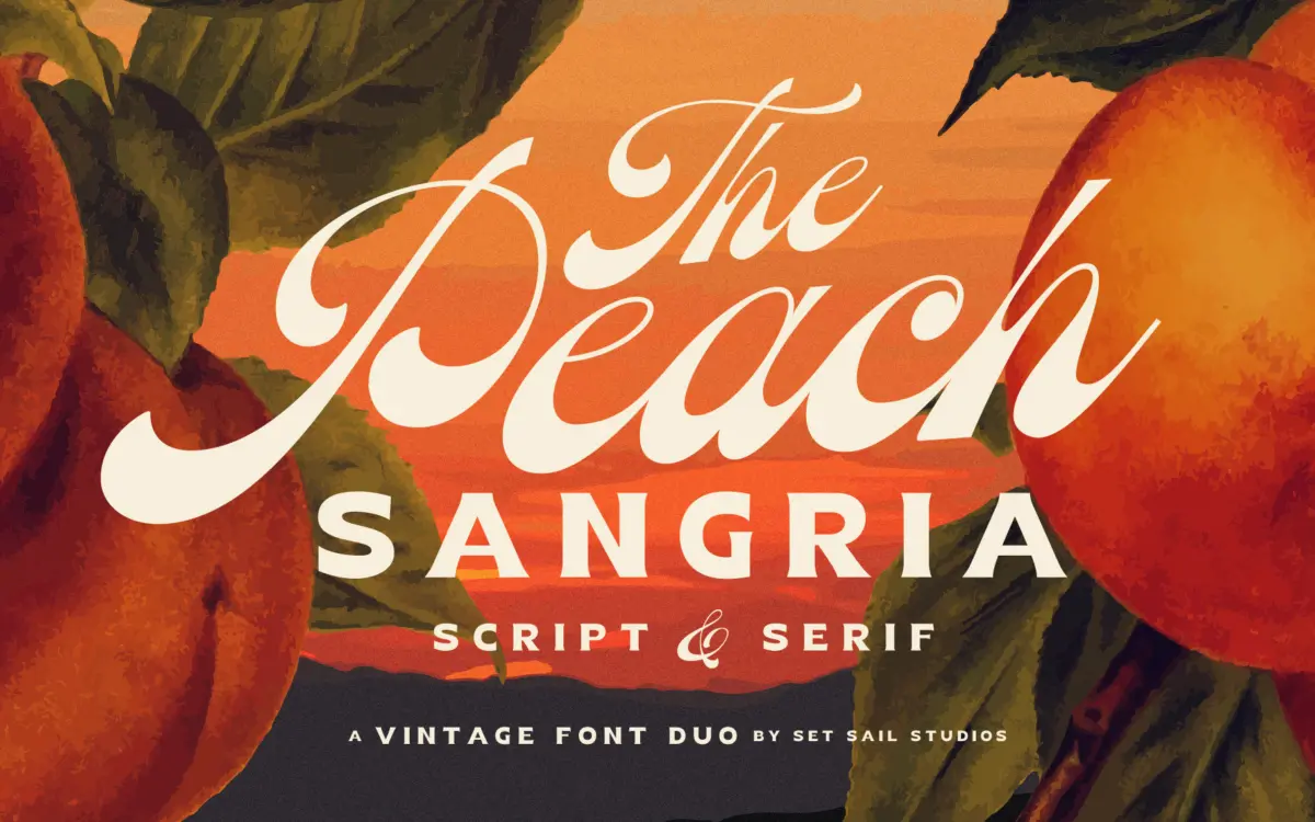
Peach Sangria is a two-font set built around a single idea: a connecting script with weight pooled low in the letters, paired with a blocky all-caps serif that can stand next to it without competing. The script leans into a retro mood rather than refined calligraphy — strokes swell toward the baseline, joins are loose and confident, and the overall feel sits closer to a hand-lettered badge or bottled-drink label than a formal invitation script. The serif is the plainer half of the pair: thick, upright, condensed enough to sit tight in a lockup, and clearly drawn as a companion rather than a standalone display face.
What Sam Parrett has done well here is restraint in the pairing. The serif doesn’t try to out-personality the script, and the script doesn’t need the serif to carry meaning — either can be read on its own, which is the actual test of whether a duo works. The vintage reference is present but not overworked; there’s no forced distressing or texture baked into the outlines, so the retro feel comes from the letter construction itself rather than a filter.
Character set and features
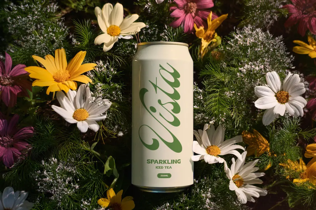
The script includes full uppercase, lowercase, numerals and punctuation, plus seven lowercase alternates that swap in characters without entry strokes — useful for breaking up repetitive letter shapes or for starting a word cleanly rather than with a trailing connector hanging in space. These are accessed through Stylistic Alternates or a glyphs panel, which is standard practice and not a hurdle for anyone already working in a layout app.
The serif is uppercase-only, with numerals and punctuation but no lowercase set. That’s a real limitation to note upfront: it’s built as a display and headline partner, not a text-setting font, so anyone expecting lowercase serif body copy from this half of the duo will need a separate typeface for that job. Language support is broad, covering most Western and Central European diacritics, which matters if the client base extends beyond English-only markets.
Use cases
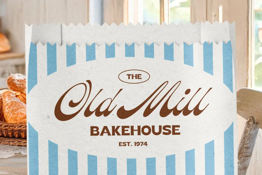
This duo sits comfortably in packaging and label work — the seller’s own framing around drinks and vintage branding is honest, and the script’s bottom-heavy rhythm reads well on a bottle or jar where horizontal space is generous but height is tight. Logo lockups, market and food branding, and wedding stationery with a slightly looser, less formal register than a copperplate script would also suit it. The serif works best as a short word or two: a brand name, a date, a single line of poster text, rather than anything requiring paragraphs.
Where it strains is in longer-form or highly formal applications. There’s no lowercase serif companion, so editorial or multi-line layouts will need another typeface brought in regardless. And the script’s heavy connecting joins mean it needs generous size and spacing to stay legible — shrink it down for a business card footer and the bottom-heavy strokes start to clot together.
What we liked, and what we didn’t
Strengths
- The bottom-heavy script has a distinct, confident rhythm rather than generic loops
- Alternate lowercase letters without entry strokes give real flexibility at word starts
- Broad European language support extends its usefulness beyond English-only branding
Trade-offs
- The serif is uppercase-only, so it can't cover body text or lowercase headline needs alone
- The script's dense joins lose clarity at small sizes and need generous spacing to breathe
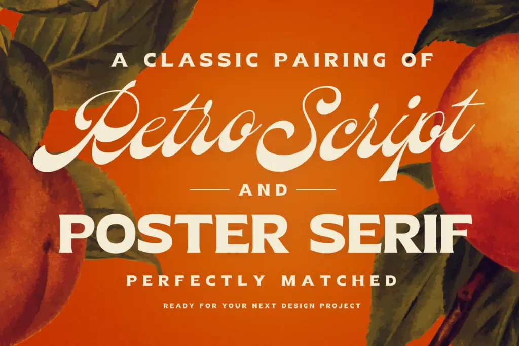
Peach Sangria is a well-matched script-and-serif pair aimed squarely at vintage branding and packaging work, with a genuine point of view in the script's heavy, low-slung strokes. It's less useful the moment you need lowercase serif text or small-size legibility, so treat it as a display and label tool rather than an all-purpose family.
Verdict

Tantype reviews typefaces in depth — every font is tested in real branding, editorial and screen layouts before a word gets written. 555+ fonts reviewed and counting.