
California Palms: a textured summer font trio for beach-brand work
Design style
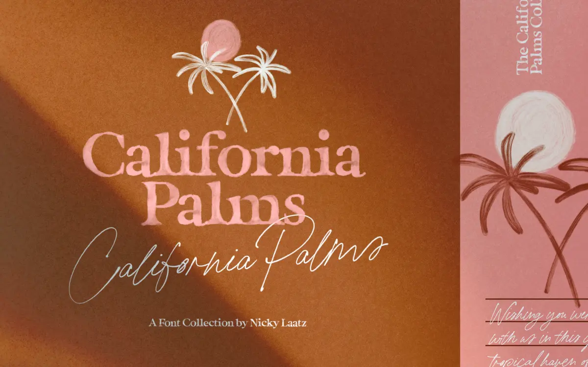
California Palms is less a single typeface than a small collection built around one seasonal mood. There are two serif variants — a Watercolour Serif and a Marker Serif — plus a companion script, and all three lean into a hand-rendered, sun-bleached feel rather than any classical serif structure. These are fat, bouncy serifs with heavy, irregular strokes, closer to hand-lettering with a brush or marker than to typeset text. The watercolour version carries a visible pigment texture inside the letters, the marker version reads drier and more graphic, and the script ties the two together with loose, casual joins rather than formal calligraphic ones.
None of this is subtle, and it isn’t meant to be. The letters wobble intentionally, baselines drift, and the texture is doing a lot of the personality work. Judged as a serif in the traditional sense — proportion, contrast logic, historical reference — it doesn’t really apply. Judged as a seasonal lettering set meant to look like it was painted on a beach towel, it does what it sets out to do.
Character set and features
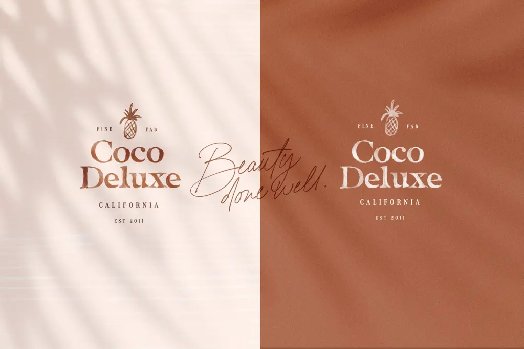
The collection ships as both SVG colour fonts and standard OpenType fonts, which matters more than usual here because the textures are the point. The SVG versions preserve the watercolour bleed and marker grain at any size, but they only work in apps that support SVG glyphs — Photoshop CC 2017 and later, Illustrator CC 2018 and later. Outside those, you’re using the regular OpenType files, which flatten the fonts to solid colour and lose the pigment texture that’s the main selling point of the watercolour style in particular. That’s worth knowing before you commit a layout to it — what looks painterly in the preview can look plain in a browser or a print workflow that doesn’t read SVG.
The script font comes in both SVG and regular form too, and reads as the most flexible piece of the set: it holds up fine as a flat colour font, so it’s not dependent on the SVG rendering the way the serifs are. Alongside the fonts, the package includes a set of summer doodle graphics — palm fronds, drinks, sunglasses, that kind of thing — clearly meant to be dropped in alongside the lettering rather than used as a standalone illustration set.
Use cases
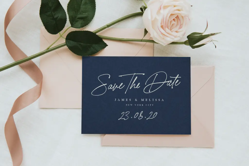
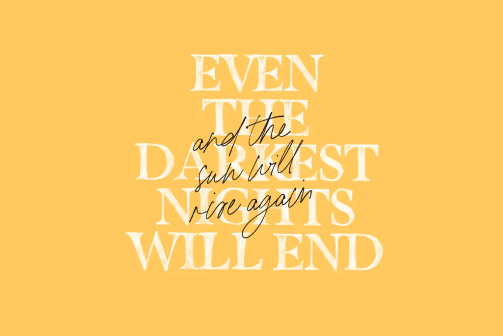
This is a mood-board font, built for a specific season and a specific tone: beachwear labels, cocktail menus, summer sale graphics, Instagram Stories, packaging for suncream or iced drinks, wedding stationery for a beach ceremony. The marker serif works reasonably well at small display sizes for headers; the watercolour version wants space and needs its SVG rendering intact to earn its keep, so it’s really a hero-image or title-card font rather than a workhorse.
It’s not a typeface for body copy, for anything that needs to look neutral or corporate, or for a brand that plans to outlive one summer campaign. Buy it knowing you’re buying a texture and a vibe, and check your software supports SVG fonts before you build a whole campaign around the watercolour variant.
What we liked, and what we didn’t
Strengths
- The watercolour and marker textures give real handmade authenticity that flat vector fonts can't fake.
- The included script pairs naturally with either serif without extra styling.
- The bundled summer doodle graphics extend the set beyond just lettering.
Trade-offs
- The watercolour texture only renders correctly in apps that support SVG colour fonts, otherwise it flattens to plain colour.
- The heavy, irregular letterforms aren't suited to body text or neutral, non-seasonal branding.
California Palms is a fun, texture-driven lettering set for beach and summer branding, but it's tightly tied to a seasonal mood and to SVG software support. Outside those conditions it loses much of its appeal. Buy it for exactly what it is, not as a general-purpose serif.
Verdict

Tantype reviews typefaces in depth — every font is tested in real branding, editorial and screen layouts before a word gets written. 555+ fonts reviewed and counting.