
Have Heart: a marker-pen script duo for hand-lettered branding
Design style
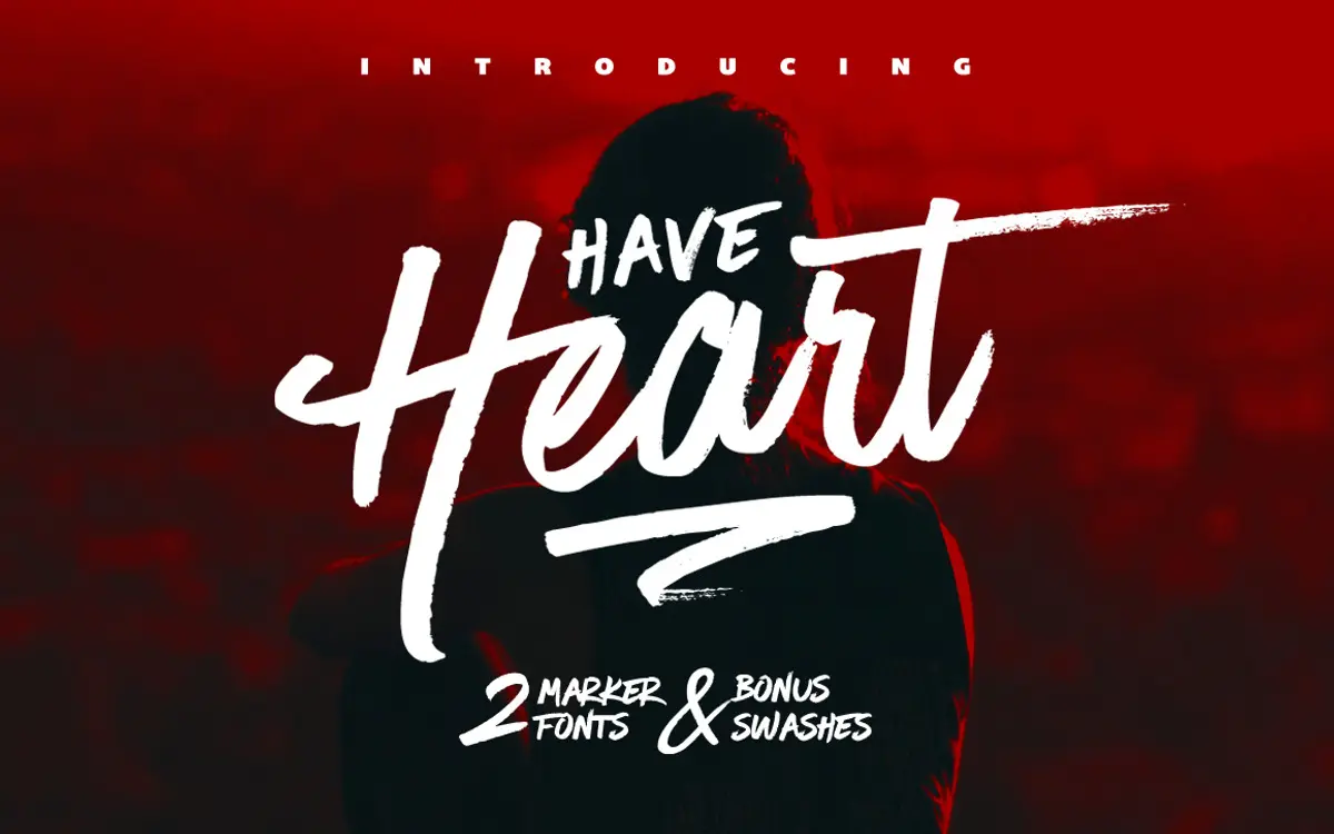
Have Heart is built around the texture of a marker pen, not a brush or a pointed nib. You can see it in the way strokes hold a fairly consistent width and end in slightly blunt, uneven terminals rather than tapering to a point. That gives the script a loose, handmade quality without tipping into the shaky, overworked look that a lot of marker-based scripts fall into. The two fonts in the set — Have Heart One and Have Heart Two — are drawn to sit together, one lowercase-friendly and looser, the other upper-case only and a touch more controlled, so you can layer a heading and a flourish word without hunting for a second typeface that matches the ink weight.
It reads as casual rather than elegant. There’s no false modesty in the joins — some letters connect, some don’t quite, and the baseline wanders slightly, which is exactly what gives it its hand-lettered feel. Designers looking for a refined calligraphic script should look elsewhere; this one is closer to what you’d get from a Sharpie and a steady hand than a dip pen.

Character set and features
Have Heart One is the fuller of the two, with upper and lowercase, a decent range of punctuation, numerals, and support for international languages, so it will handle accented European text without falling apart. It also includes stylistic alternates for several lowercase letters, accessible through the Glyphs panel in Illustrator or the Stylistic Alternates menu in Photoshop — useful for breaking up repeated letters in a word or loosening the rhythm of a longer line so it doesn’t look stamped out.
Have Heart Two is deliberately more limited: uppercase only, basic punctuation, numerals, again with international language support. It’s not meant to carry a paragraph — it’s the accent voice, built for short words, initials, or a single line sitting above or below the main script. The bundled set of twelve swashes rounds things out, giving you separate flourish marks to place under a word or wrap around a capital rather than relying on built-in swash alternates baked into the letters themselves. That’s a more manual way of working but it also means the swashes can be reused and repositioned freely, which suits people comfortable moving vector shapes around in layout software.
Use cases
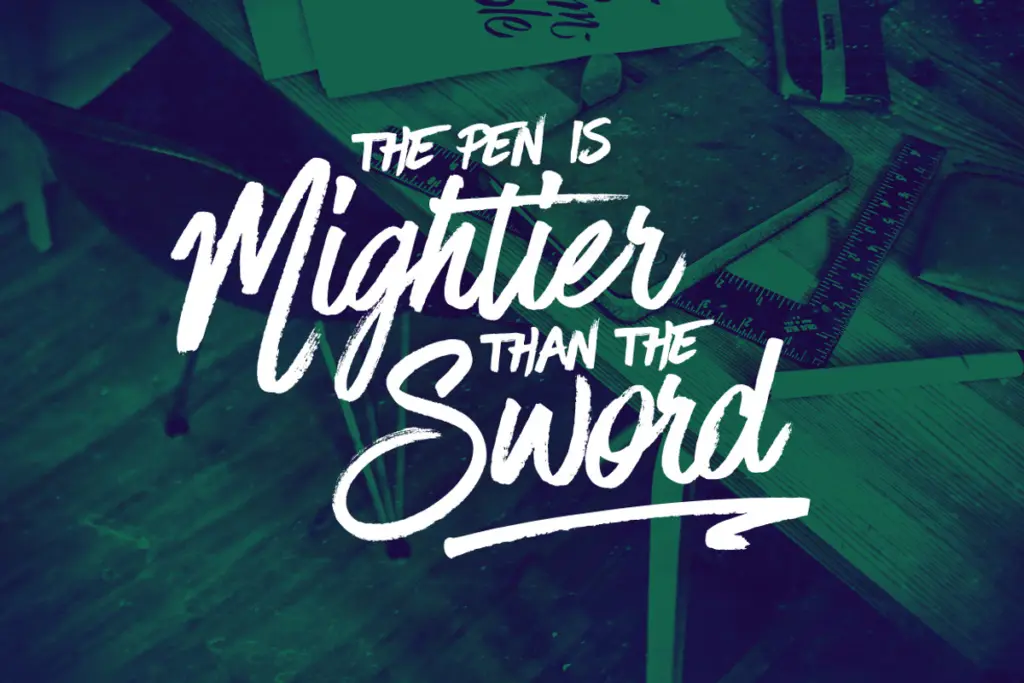
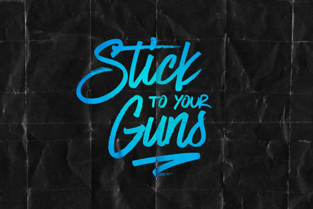
This is a font duo built for the kind of hand-lettered look you see on greeting cards, gig posters, packaging labels, and social graphics that want a personal, unpolished voice. It works well for short-form branding — a logotype, a badge, a single product name — where the irregularity reads as craft rather than a legibility problem. Wedding stationery could work too, provided the couple wants something more relaxed than a formal script, since Have Heart doesn’t have the poise of a traditional calligraphic face.
It’s less suited to body copy or anything that needs to sit quietly on a page — the texture and stroke weight make it a display tool, not a reading typeface. Pair it with a plain sans or serif for supporting text, and let this one do the shouting in short bursts.
What we liked, and what we didn’t
Strengths
- Two complementary weights let you build layered hand-lettered compositions without mismatched ink textures.
- Stylistic alternates in the lowercase font break up repeated letters convincingly.
- Separate swash glyphs give more flexible placement than baked-in swash ligatures.
Trade-offs
- The wandering baseline and blunt terminals limit it to short display use, not body text.
- Have Heart Two's uppercase-only, punctuation-light set restricts it to accent roles rather than standalone use.
Have Heart is a solid, honest marker-pen script that delivers exactly what it promises: a casual hand-lettered look for short display work. It's not refined enough for elegant occasions or long-form text, but for logos, packaging and playful headlines it does its job without fuss.
Verdict

Tantype reviews typefaces in depth — every font is tested in real branding, editorial and screen layouts before a word gets written. 555+ fonts reviewed and counting.